
Palettes here run from purple walls, shelving, and ceiling to Sherwin-Williams Simply White, and the room’s natural light decides among them.
Charcoal walls absorb light and camel with blue turns heavy without daylight. In a small or dark room, white with blue-gray bounces more light back.
1. Blue With Warm Accents
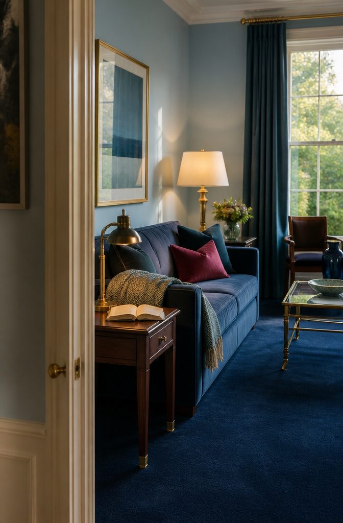
Blue stops looking beachy once you pair it with a color from the other side of the wheel.
Farrow & Ball’s Dix Blue has hints of green and black, which makes it a strong choice for color drenching, where one shade covers the whole room.
A small hit of fuchsia, such as a pillow or a lamp, gives it a vintage feel. It also holds its own beside a deep aubergine room.
For a warmer version, put pale blue walls over a navy carpet and add gold through frames, lamp bases, or hardware.
Navy and pale blue with gold reads regal rather than coastal. Gray-blue next to brown and marigold works too, and it leans retro.
2. Green and Earthy Tones
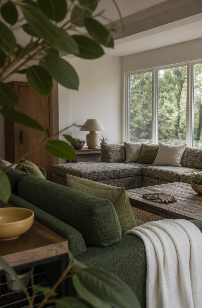
Forest green suits a room with trees outside the window. Benjamin Moore Peale Green looks as if it were sampled from the leaves, and it ties in well with a patterned sectional.
For a softer, sage version, a soft green from Ralph Lauren Home keeps a living room calm. Benjamin Moore Lafayette Green belongs on the same shortlist if you want a deeper green.
To keep a green room from feeling flat, pair cool olive with warm brown, soft yellow and crisp white. If you’d rather leave the walls light, a green upholstered sofa carries the whole palette.
Muddied olive is the current warm-earth shade. Set it with soft ivory, warm cognac and a hint of black for a cozy room.
3. White and Natural Neutrals
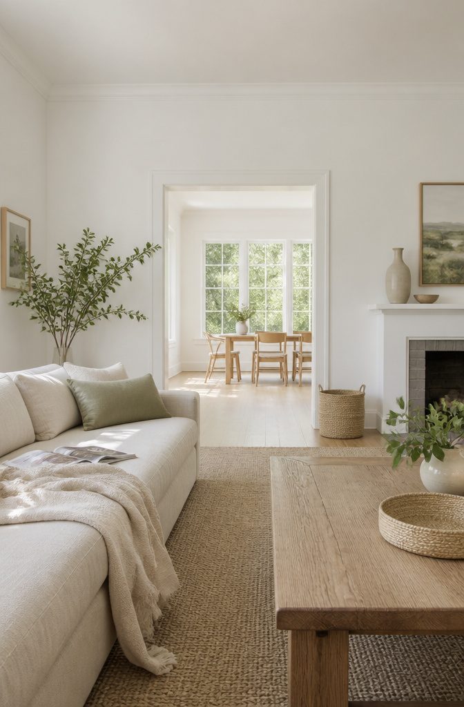
White is the most popular living room color, and Sherwin-Williams Simply White shows why.
Its subtle yellow undertones sit well beside soft natural wood, neutral upholstery and layered textures, so the room feels bright and cozy rather than stark. For a pure white, Benjamin Moore Decorator’s White is the pick.
Seapearl and Dune White are good light neutrals, and White Dove, Chantilly Lace and Pale Oak OC-20 are worth a sample too. Farrow & Ball Matchstick, inspired by pale straw, runs warmer.
Light neutrals reflect more light and make walls recede.
Keep walls, trim and ceiling close in tone and the room reads as more spacious. If you want stronger color in a small room, put it in accessories.
4. Pink and Peach
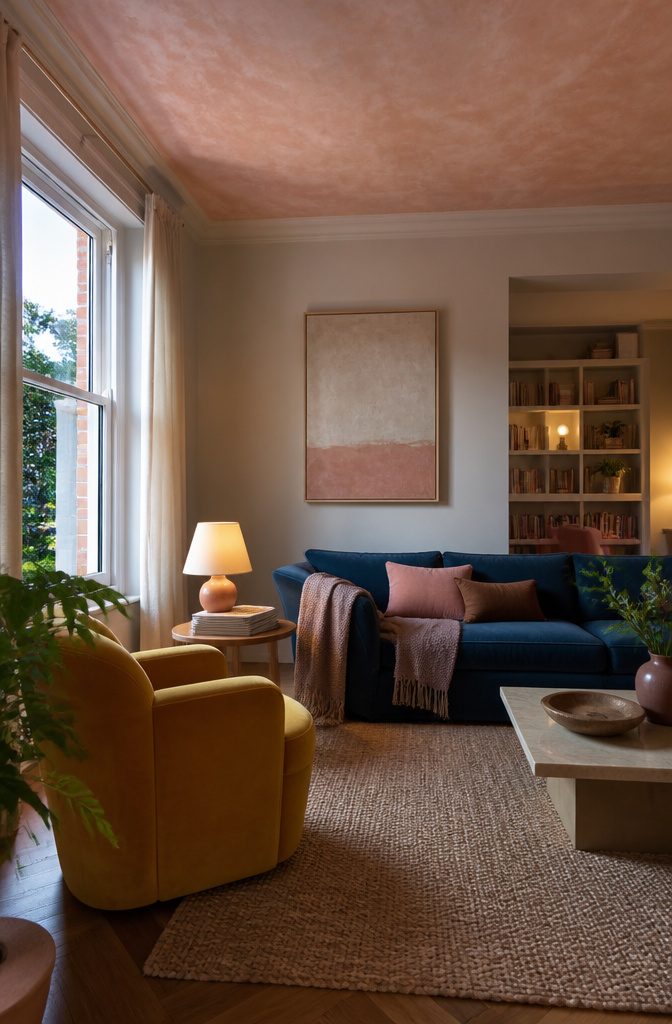
Farrow & Ball’s Middleton Pink is a delicate pastel that sits comfortably behind loud furniture.
In a Nashville living room, it backs mustard yellow chairs and sapphire blue sofas without competing with either. If your sofa or chairs already carry strong color, pink walls make a quiet backdrop.
For a lighter touch, paint only the ceiling. Setting Plaster on a ceiling gives the room a blushing glow while the walls stay neutral.
Peignoir and Pink Ground bring a flirty softness to walls.
Benjamin Moore Salmon Mousse leans toward peach and warms a room that feels cool. To brighten a dim living room further, lacquer the walls in any of these shades, since the glossy finish reflects light.
5. Purple With Cool Gray
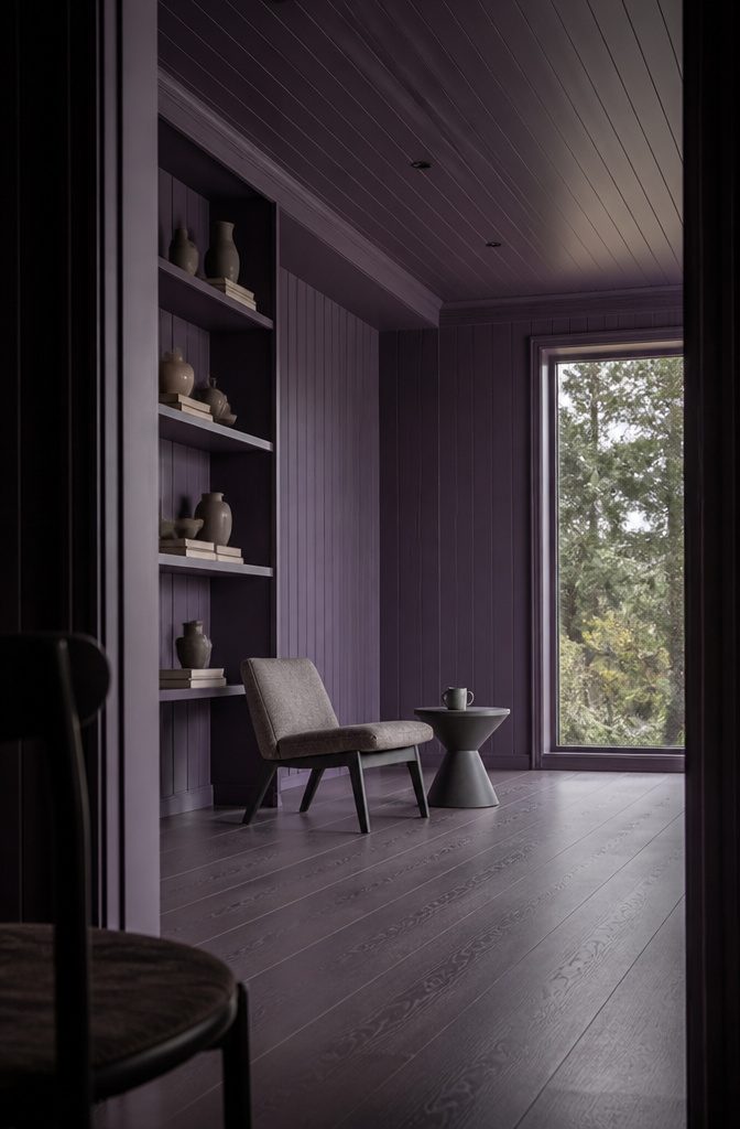
Purple on the walls, the built-in shelving, and the ceiling wraps a room in one color, and shiplap paneling looks better painted this way than left plain. Cool gray accents keep that much purple from reading sweet or costume-like.
The gray cools the color down and gives your eye a neutral place to rest. Leaving out the area rug also helps ground the room, so the purple stays the main event.
This is a bold choice. Run the purple across walls, shelving, and ceiling, and keep the gray to accents.
The result is a room with a point of view. If you want a quiet living room, another palette on this list will suit you better.
6. Charcoal and High Contrast
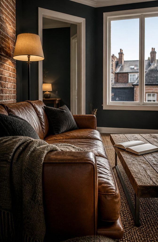
Soft charcoal walls, crisp white trim, and a cognac leather sofa make a living room that reads edgy and modern without feeling cold.
The leather supplies the warmth. Exposed brick, reclaimed wood, or distressed leather add texture so the gray doesn’t go flat.
Charcoal is easier to live with than true black, and an inky wall keeps its mood no matter how many pops of color you layer on.
Dark walls absorb light, so the room feels dimmer, especially in the evening. Use charcoal in a room with good window light, and plan on warm lamps at different heights to make up for the rest.
7. Warm Retro Colors
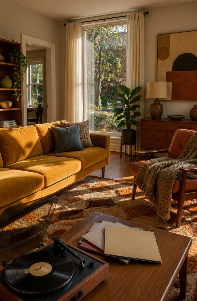
Marigold and brown carry this palette, and the 1970s feel comes from giving them most of the room.
Put marigold on the pieces people see first, like a sofa, an accent chair, or one bold wall. Use shades of brown for the supporting layer: wood furniture, a leather piece, a rug.
Gray-blue, green, and crisp ivory stay in the background as small doses of cool contrast.
Ivory works for curtains and trim, while gray-blue and green fit pillows, a throw, or a plant. If the cool colors grow past accents, the warmth that makes the room read as retro starts to fade.
8. Jewel Tones
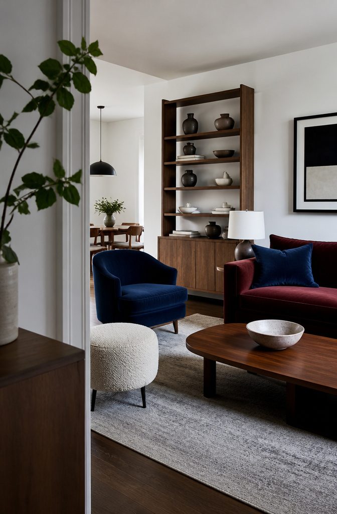
Jewel tones read as rich instead of loud when a neutral does most of the work.
Crisp white walls and brown wood hold back ruby and sapphire, and a touch of bouclé softens the look further. Keep both colors subdued, a barely-there ruby and a muted sapphire, on a pillow, a chair or one wall.
Citrine and aquamarine seem like an odd pair at first.
Off-white and graphic black balance them and give the palette a modern, slightly retro feel. Use the black in small doses, such as a frame, a lamp base or table legs, so the two bright hues still lead.
9. Cottage and Coastal Palettes
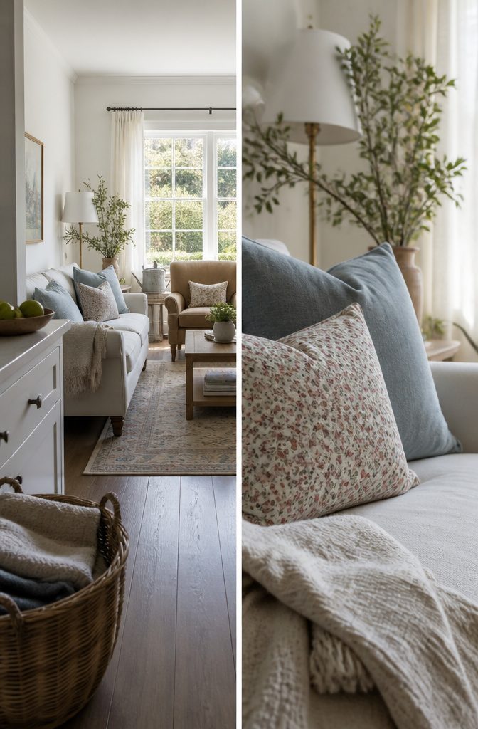
Camel and blue with dusty pink accents makes a cozy cottage room. Warm camel sets the mood, blue cools it, and the pink adds a soft, sweet note.
Layer in pattern, especially florals, on pillows or curtains. Without it, the palette reads as plain rather than cottage.
The coastal look works the opposite way: it relies on texture more than color.
White and ivory form the base, and blue-gray pillows and textured accents add depth. It’s a safe choice if you like neutrals.
For a small or dark room, pick white and blue-gray.
The pale base bounces back more light and keeps the space from feeling closed in. Camel and blue needs a room with good daylight to look cozy rather than heavy.
10. Desert and Terra-Cotta
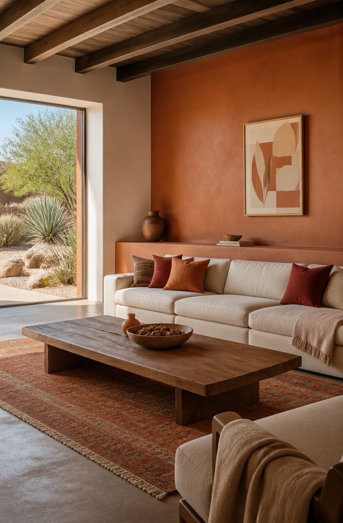
Siena, coral, burnt orange, brick red and terra-cotta make a warm, earthy backdrop with a hint of the Southwest. Earth-tone palettes are having a strong moment, and they hold up for years while still feeling current.
Brick red is the heaviest of the group, so use it in small doses: a rug, a pair of pillows, or one painted wall.
To keep the room from feeling heavy, pair these shades with crisp white or warm ivory and a good amount of wood.
White gives a clean, modern look, and ivory softens it. A wood coffee table or media console adds the natural texture these colors look best against.
11. Blue-Gray and Mauve
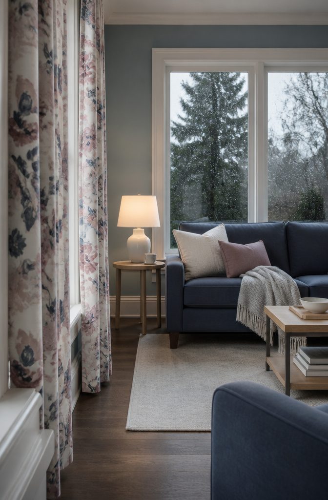
Soft blue-gray walls, crisp white trim and furniture, and rich Aegean blue make a living room that reads cool and calm.
On their own, those three can tip into chilly. Add one mauve accent and the room warms up, since mauve’s pink tint sits comfortably beside the blues.
Floral drapes are the easiest way to bring it in. A print that carries mauve alongside the blues ties the walls, furniture and window together and adds a playful note.
Stop at the drapes and a pillow or two. Too much mauve pulls the room away from its cool base, and the accent stops doing its job.
12. Warm Minimalist Neutrals
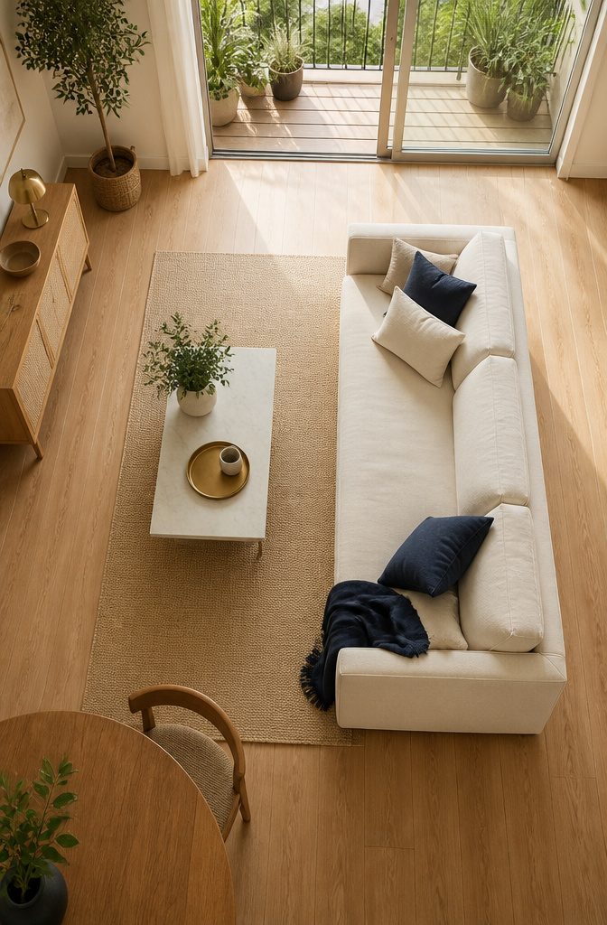
White and cream walls with a few deep navy and brass accents make a living room feel airy and bright without looking bare. The light base opens the space, and the accents give your eye somewhere to land.
Keep them small and spread out: navy and brass read as contrast only when most of the room stays pale. It leans coastal, and it holds up as a timeless look rather than a trend.
This palette suits renters because the accents are all movable. Navy pillows, a throw or curtains, plus brass in a lamp, frames or a tray, carry the whole look without touching the walls.
Start with two navy pieces and one brass piece, then add more only if the room still feels flat.
13. Contemporary Luxe
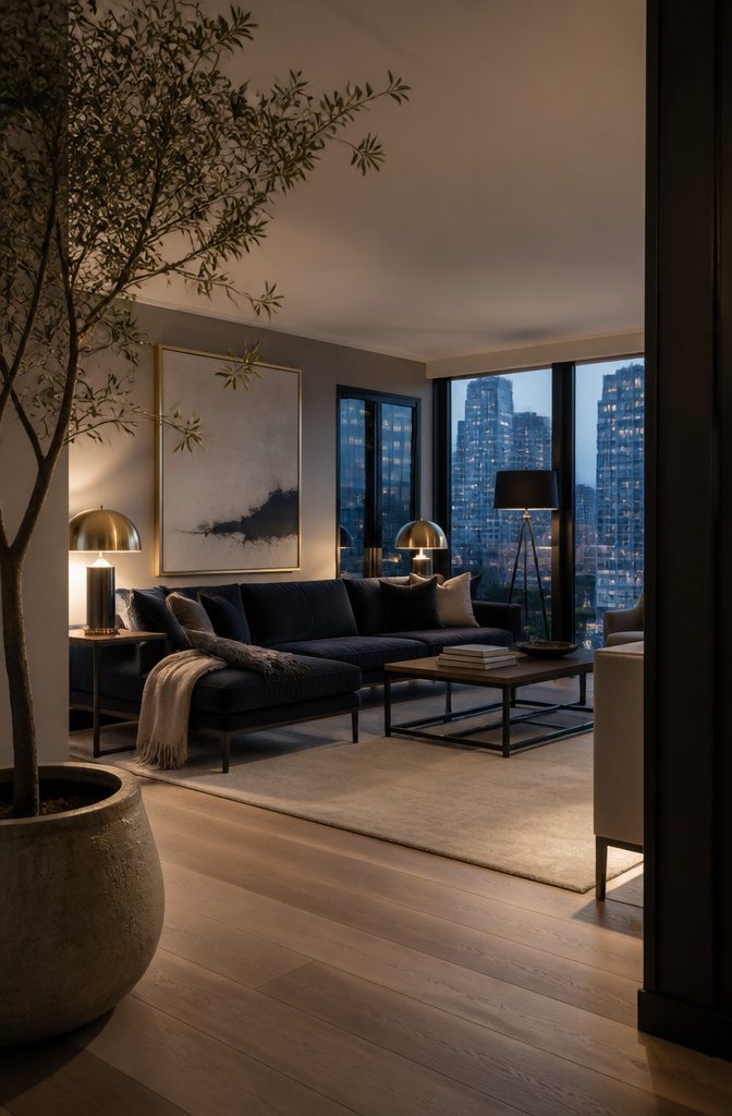
Contemporary luxe gets its glamour from what you touch and what catches the light, so wall color is only half the job.
Velvet adds depth and a soft sheen, brass adds warm metallic glints, and matte black adds crisp edges that keep the warmth from turning sweet.
Spend on the three materials rather than a rare paint color: a velvet sofa or pair of accent chairs, brass lamps or frames, and matte black on a coffee table base or floor lamp.
The look comes from a high-rise New York apartment, and it suits renters because every piece moves with you. Repeat each finish in just a few spots so the room reads warm and polished, not like a showroom.
14. Scandi-Boho Colors
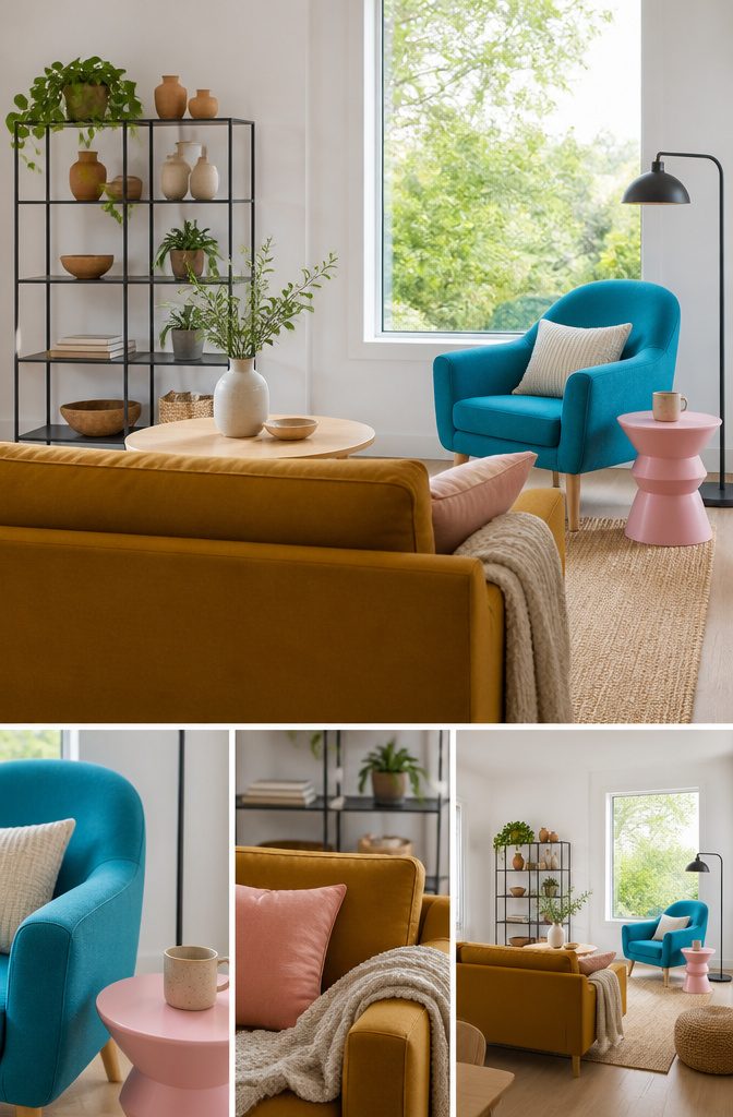
Warm ochre, bold aqua blue and soft pink make a loud trio, and they work because they sit mostly on furniture instead of walls.
Put one color on a sofa, one on an armchair and one on a side table or pillows. Keep the walls white, so the three colors get a quiet backdrop and nothing painted competes with them.
Dark charcoal handles the rest. Small accents like a picture frame, a lamp base or a thin metal shelf give your eye a place to rest between the colors.
Charcoal stays an accent here, not a wall color. Pink is the softest of the three, so give it the smallest piece and let ochre or aqua take the largest.
Test Paint in Your Light
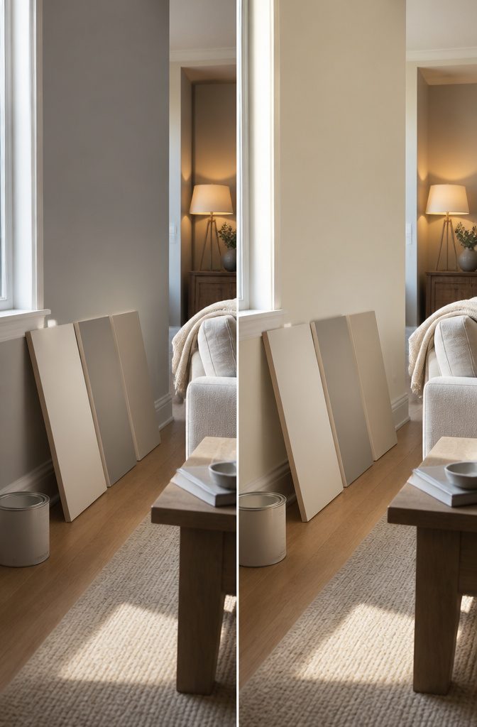
Natural daylight, fluorescent tubes and incandescent bulbs each pull a paint color in a different direction. A gray that looks crisp at noon can turn flat or yellow under a warm lamp at night.
Brush a large swatch on the actual wall, or paint a board and carry it around the room, and check it in the morning, in the afternoon and with the lamps on before you buy a full can.
Weigh the room’s natural light first, then the feel you want.
A color that looks calm in a bright room can turn heavy in a dim one, and the mood you pick shapes how the space feels every day. Brand is a smaller decision.
Splurgy Farrow & Ball and Sherwin-Williams can both work, but the pricier can only earns its cost if you love the swatch on your own wall. Repeating a color or a close shade from room to room connects the home.
Frequently Asked Questions
What is the most popular color for a living room?
White. Benjamin Moore’s White Dove and Chantilly Lace repeatedly top its list of popular paint colors, and Sherwin-Williams Simply White works well because its slight yellow undertone looks bright and cozy beside natural wood.
Designers like white for its versatility, since color can then come from fabrics and art.
Which colors and color combinations are best for a living room?
A living room can be light, dark, or anywhere in between, so no single palette is right. Designers favor deep greens like Benjamin Moore Lafayette Green, warm peaches like Salmon Mousse, whites, and light neutrals.
For combinations, pick one anchor object, such as a rug or a sofa, and draw your colors from it, or pair a neutral base with color in pillows and art.
What is the most popular living room color palette right now?
Warm neutrals and earth tones are the most prominent, with terra-cotta, burnt orange, olive, ivory and cognac leading the group. Moody high-contrast schemes, such as charcoal walls with white trim and a leather sofa, are the other popular direction.
What paint color brightens a dark living room?
Warm soft peach or pink brightens a dim room best, for example Benjamin Moore Salmon Mousse or Farrow & Ball Peignoir. Lacquered walls in these shades help further, because the glossy finish reflects light back into the room.
What color is best for an accent wall in a living room?
Pick a shade already in your palette, such as marigold or brick red, and keep it to one wall.
Some designers skip paint and use a material change like stone or wood cladding instead, while others prefer cohesive painted walls with color on the furniture.
How many colors should a living room color palette have?
Use 3–4 colors: a dominant color for walls and large upholstery, a secondary color for rugs, drapes or accent chairs, and 1 or 2 accents for pillows, art and small decor.
A color in the palette can show up in just a few small spots and does not need to dominate.
What colors make a living room look bigger?
Light neutrals make a room look bigger because they reflect more light and make the walls recede.
Painting the walls, trim and ceiling in close tones adds to the effect. If you want stronger color in a small room, put it in accessories.
What is a timeless living room color palette?
White or cream walls, warm wood, and a single accent color make a timeless base.
Navy and brass is a classic accent pairing, and muddied olive with soft ivory, warm cognac and a hint of black is a lasting earth-tone option. Keep bolder choices in pillows, throws and other pieces that are easy to swap.