
Backsplashes for white cabinets range from quiet white subway tile to black stone and patterned encaustic, and the right pick depends on how much contrast you can live with.
The bolder the choice, the harder it is to undo, since replacing tile is a demolition job. Herringbone alone runs $12.80–$60.56 per square foot.
1. White Subway Tile
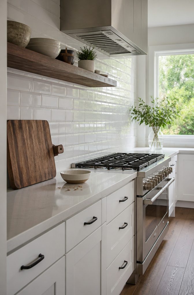
White subway tile on white cabinets is the safe backsplash choice, and it suits modern and contemporary kitchens. It also sits comfortably beside stainless steel appliances.
The risk is a kitchen that feels sterile.
Add dark or natural wood to prevent that: an open shelf, a cutting board leaning against the tile, or a stool at the counter. Wood adds character without costing the tile and cabinets their airy look.
Because the tile is the safe choice, it won’t give the room a personality.
The wood, or whatever contrast you bring in, has to do that work. Skip it and you get a clean kitchen that looks like every other one.
Recommended Products

✿ 1.4 Times Coverage Area: 10 sheets thickened self-adhesive tiles, 12" X 12" each (The small piece is 3.3" X 1.8"), which covers 40% more area than 10"x10" tile 🌹 2-3...
2. Natural Stone and Marble
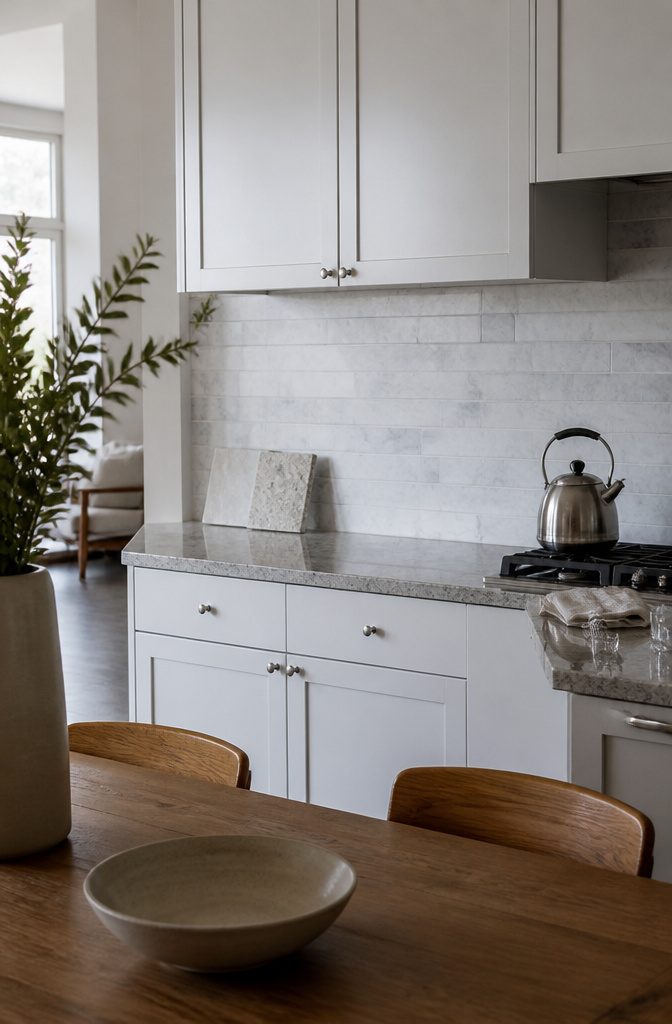
White cabinets leave a kitchen with little variation, and natural stone fills that gap with texture and shifts in color. Marble tile on the backsplash does this well, and a granite countertop below it adds the same kind of depth.
The finish is the decision that matters.
Polished marble has a glossy surface and reads as high-end, so it suits a kitchen where you want the stone to be the statement. Honed marble is softer and flatter, with a subtler look.
For a quieter white kitchen, choose honed marble: it brings in the color variation without competing with the cabinets. Hold a sample of each next to a cabinet door before you buy.
Recommended Products

Premium Grade Daisy Field Flower Pattern Carrara Marble Waterjet Mosaic Tile. Italian Bianco Carrera White Venato Carrara Marble Waterjet Daisy Field Flower Pattern Wall and Floor Honed Tiles are perfect for any residential / commercial projects. The Carrara White Marble Big Daisy Flower Pattern Mosaic Tile can be used for kitchen backsplash, bathroom flooring, shower surround, spa, fountain, etc.

𝗣𝗿𝗼𝗱𝘂𝗰𝘁 𝗗𝗶𝗺𝗲𝗻𝘀𝗶𝗼𝗻𝘀 - 12"(L)x2.5"(H)x0.8"(D), 305mmx64mmx22mm, 5 picecs/Box.

𝗣𝗿𝗼𝗱𝘂𝗰𝘁 𝗗𝗶𝗺𝗲𝗻𝘀𝗶𝗼𝗻𝘀 - 12"(L)x3/4"(H)x3/4"(D), 305mmx16mmx16mm, 10 picecs/Box.
3. Colorful or Patterned Tile
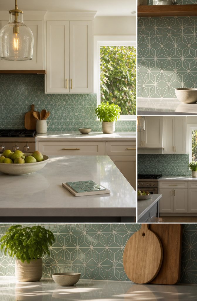
White cabinets act as a neutral backdrop, so color has nothing to compete with. Mosaic, glass, or geometric-patterned tile becomes the focal point of the kitchen.
Seafoam-toned tile is the gentlest way in, giving a subtle contrast rather than a statement. Choose a bright color or a geometric pattern if you want the backsplash to be the first thing people notice.
Test samples under your own lights before buying. Lighting makes colors like blue pop, and grout color can change how the tile looks.
A bold pattern is harder to change later, because swapping tile means demolition, not a repaint. If you might sell or move within a few years, pick the seafoam.
Recommended Products

BEACH INSPIRED DESIGN: Seafoam green glass, white marble-look pieces and shell accents create a relaxing coastal atmosphere for kitchens, bathrooms and spa-inspired spaces.

What's in the box: 5 sheets gray stone marble tiles with cushioning foam around. Very well packed. 5 sheets tiles covering 5 sq. feet.

4. Black Accents and Black Stone
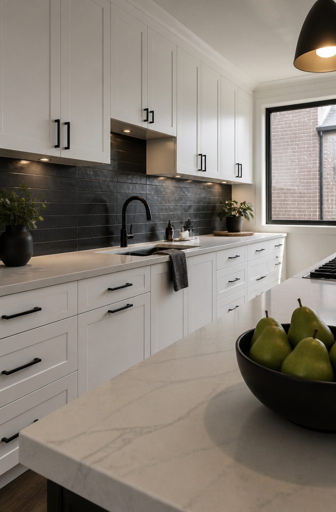
Black tile against white cabinets gives the strongest contrast of any backsplash color. Choose a matte or lightly polished finish, which cuts glare and deepens the black instead of letting it flash under your cabinet lights.
Black marble is the luxury version of the look, and it reflects light well. Black tile is the easier route if you want the same drama with less commitment.
Match the faucet and cabinet pulls to the backsplash in black. Repeating the color in hardware makes the scheme read as one deliberate choice.
Black on the wall makes the kitchen graphic and high-contrast, and that look is hard to soften later. If you want a calm room, pick another backsplash.
Recommended Products

Matte Black Texture Design:Matte black finish with a natural stone-inspired texture adds depth and a modern look to kitchens, bathrooms, laundry rooms, fireplaces, and accent walls.

𝐏𝐫𝐞𝐦𝐢𝐮𝐦 𝐌𝐚𝐭𝐞𝐫𝐢𝐚𝐥𝐬:Made of PVC composite laminate, anti-scratch, high impact, color fadeless, more durable and stronger than other plastic self-adhesive tiles. Brushed surface finishing with realistic look, high waterproof and stain-resistant performance, protect the walls from splash and iol.

𝐏𝐫𝐞𝐦𝐢𝐮𝐦 𝐏𝐞𝐫𝐟𝐨𝐫𝐦𝐚𝐧𝐜𝐞: Our peel and stick wall tiles are designed with high-performance PVC polymer material, offering waterproof, heat-resistant, stain-resistant, anti-scratch, and fadeless properties. Rest assured, the super-strong adhesive ensures the tiles stay securely in place!
5. Textured White Tile
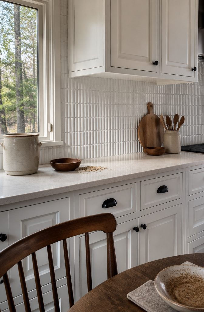
Textured white tile adds depth to a white kitchen without adding a second color.
The raised surface catches light and casts small shadows, so the wall reads as patterned even though every tile is the same shade. Texture does the work a printed pattern would, and it never fights the cabinets.
It looks best next to cabinets with their own detail, such as shaker doors or white cabinetry with detailed moldings.
The two layers of white then read as richly layered yet cohesive. Plain slab doors against a heavily textured wall can look mismatched, so keep the detail level similar on both.
This suits you if you want a calm kitchen that still has something to look at. It’s a better choice than bold pattern for anyone who tires of loud design quickly.
Recommended Products

Tile Wallpaper :💎 Size: 17.5x80 inch per wallpaper roll, total 9.58 sq.ft(44.5cmx2m). Luxury off white gold black dark marble chevron herringbone brick with metallic gold grout tiles in modern contemporary design. Stunning designs with perfect pattern matching.

ROLL SIZE: 17.7"x80", the herringbone wallpaper can cover 9.83 sq.ft. Each small rectangle tile is 2.5"W x 6.3"L. Perfect for kitchen backsplash, shelves, drawer, fireplace, table, desk, school locker, bathroom shower walls, accent walls, etc.

10 SHEETS PACKAGE :Marble look design, but its surface is smooth. The vinyl tiles are made of eco-friendly material, come in one box of 10 sheets,12"x12" each.Not only cost-effective, but also has high-quality performance.
6. Brick and Mixed Materials
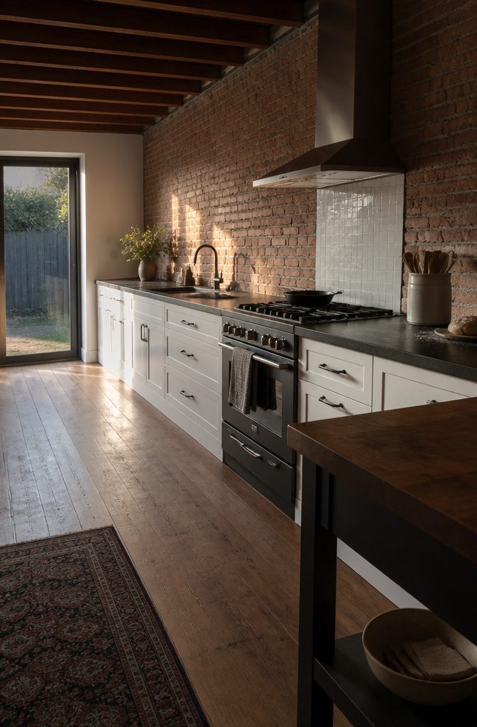
Brick behind white cabinets gives you a rustic kitchen that still looks finished, and it works even better next to a dark countertop.
The rough, uneven surface breaks up the white, and the dark counter keeps the wall from feeling washed out.
Mixing brick with stone, glass, or tile can make the kitchen look like yours instead of a catalog page. It also goes wrong fast.
Limit the mix to two materials, such as brick with a small glass-tile panel behind the range, and let the cabinets and countertop carry the rest. A third material usually reads as indecision, not personal style.
Recommended Products

𝐏𝐫𝐞𝐦𝐢𝐮𝐦 𝐌𝐚𝐭𝐞𝐫𝐢𝐚𝐥𝐬:Made of PVC composite laminate, anti-scratch, high impact, color fadeless, more durable and stronger than other plastic self-adhesive tiles. Glossy/Poished surface finishing with realistic ceramic look, high waterproof and stain-resistant performance, protect the walls from splash and iol.

2-3 Times Thickness: Each tile is 2mm-2.5mm thick, offering durability and solidity, providing a high-quality alternative to soft sticker tiles

𝐏𝐫𝐞𝐦𝐢𝐮𝐦 𝐌𝐚𝐭𝐞𝐫𝐢𝐚𝐥𝐬:Made of PVC composite laminate, anti-scratch, high impact, color fadeless, more durable and stronger than other plastic self-adhesive tiles. Glossy/Poished surface finishing with realistic ceramic look, high waterproof and stain-resistant performance, protect the walls from splash and iol.
7. Fish-Scale Tile
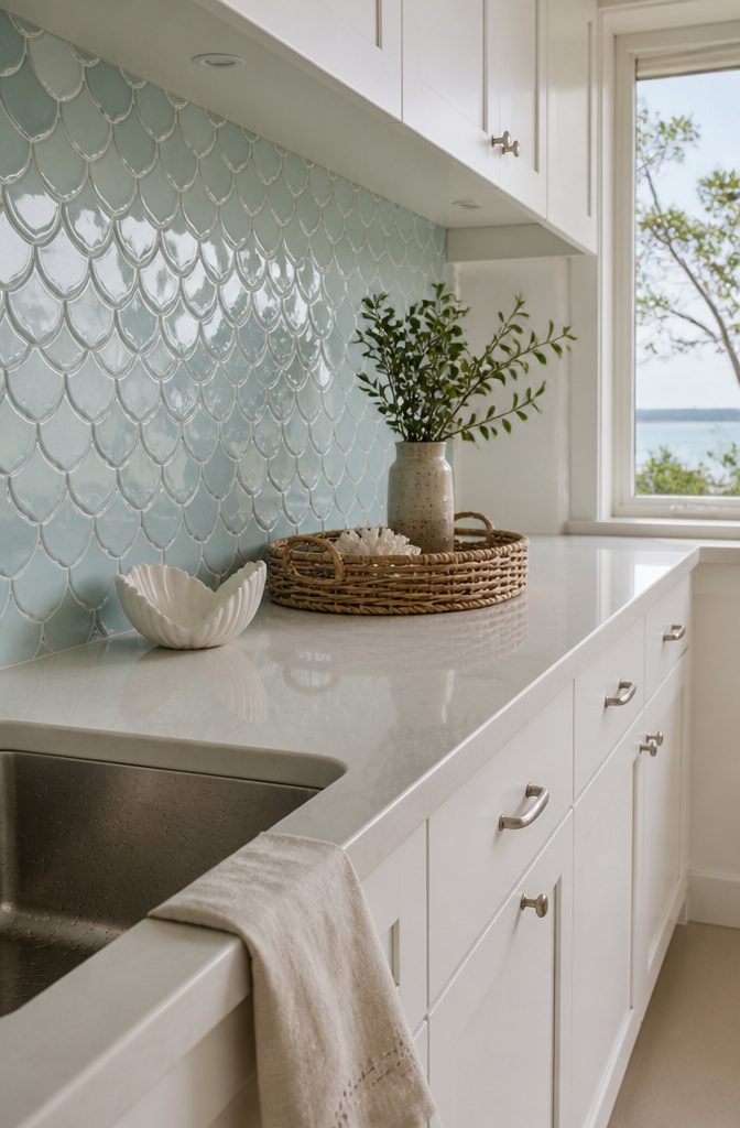
Fish-scale tile gives a white kitchen the movement that flat rectangles can’t. The rounded, overlapping shapes look playful and organic, and the surface adds texture and a shimmer that shifts as the light changes.
Against plain white cabinets it reads as relaxed and coastal, so it works best when the cabinets are simple and you want the backsplash to carry the personality.
Check the material list before you buy.
Some fish-scale designs use biopolymeric adhesives, and a few even use real fish collagen. If you want an animal-free product, or just want to know what ends up on your wall, read the product details first.
Recommended Products

【Mesh Backing】Penny Tile Italian Carrara marble 1 inch round tile honed mounted on a sturdy mesh, easy to install and cut with a wet saw

Size: 10.6''(268mm)x10.6''(268mm)x0.3''(8mm), 5 sheets/box, 3.86 sq.ft/box, chip size: 1 inch

【Premium Natural Marble】Genuine Pollen Thassos marble, unique veining; Rigorous inspection to ensure consistent thickness and minimize color variation between boxes
8. Iridescent Glass Tile
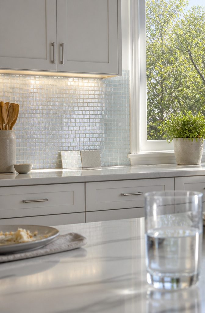
Iridescent glass tile reflects light instead of absorbing it, so a kitchen with white cabinets looks brighter and a little larger.
It comes in various hues and sizes, so you can keep it quiet with a pale, pearly tone or push toward blues and greens. The finish reads sleek and contemporary.
Lighting decides whether the effect shows up at all. Under-cabinet lights and a nearby window make the finish pop, while a dim, flat-lit wall makes it look like plain glass.
The shimmer also shifts through the day, so check a sample on your wall in both morning and evening light before you buy.
Test grout color with the same sample, since it changes the look of the tile more than you’d expect.
Recommended Products

11.5 Sq.Ft High-Value Coverage (12.9" Sheets) Each box contains 10 extra-large sheets measuring 12.9" x 12.9" (327mm), providing a massive 11.5 sq.ft of coverage. Unlike standard 12" options, our larger format allows you to cover more area with fewer sheets (just 10 sheets vs. typical 11 sheets), significantly speeding up the installation process for large shower walls or backsplashes.

Has the look of sea glass tile

Eye-catching design: The 3D design and silver blue color of the tile create an eye-catching and unique appearance that can enhance any interior or exterior design.
9. Encaustic Tile
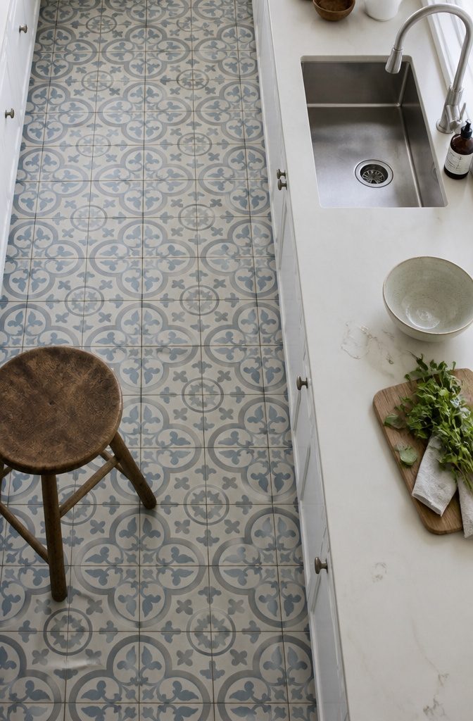
Encaustic tile is cement-based, with a matte, slightly textured surface and the intricate traditional patterns it’s known for.
Next to white cabinets, the matte finish absorbs light instead of bouncing it back, so the backsplash warms the room and throws no glare under pendants or under-cabinet lights.
With this tile, the pattern carries the look, not the color. A quiet palette of soft gray, muted blue, or cream still lets the white cabinets read clean, while the geometry gives the wall a vintage feel.
Keep the rest of the kitchen plain. Patterned tile next to busy hardware or crowded open shelving competes for attention, and the tile loses its effect.
Recommended Products

Material:Made of PVC composite laminate, anti-scratch, high impact, color fadeless, more durable and stronger. Matte surface finishing with realistic ceramic look, high waterproof and stain-resistant performance, protect the walls from splash and oil.

Application: The wall stickers are used for indoor decoration: kitchen, bedroom, living room, etc. Make the walls refreshed.

𝗣𝗮𝘁𝘁𝗲𝗿𝗻𝗲𝗱 𝗧𝗶𝗹𝗲 - Crafted from durable stone composite, these patterned tiles offer a colorfast, scratch-resistant, and low-maintenance solution. 12" x 12" x 0.12" for each piece, 1pc=1 sq. ft., 10pcs=10 sq. ft. Please measure your space before installation and verify the color upon receipt. We recommend purchasing a minimum of 10% overage to account for design cuts and patterns.
10. Herringbone Tile
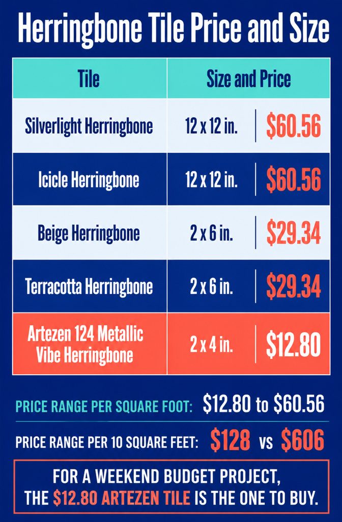
Herringbone gives white cabinets a geometric pattern that looks tailored without adding color, and it suits flat-front doors as well as Shaker. Finishes run from glossy porcelain to matte ceramic.
Prices span $12.80 to $60.56 per square foot, which is about $128 versus $606 for every 10 square feet. For a weekend budget project, the $12.80 Artezen tile is the one to buy.
| Tile | Approx. size | Price per sq ft |
|---|---|---|
| Silverlight Herringbone | 12 x 12 in. | $60.56 |
| Icicle Herringbone | 12 x 12 in. | $60.56 |
| Beige Herringbone | 2 x 6 in. | $29.34 |
| Terracotta Herringbone | 2 x 6 in. | $29.34 |
| Artezen 124 Metallic Vibe Herringbone AT25 Medium Gray | 2 x 4 in. | $12.80 |
Recommended Products
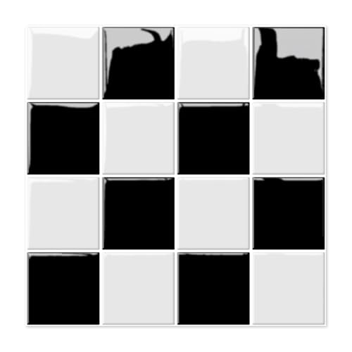
Effortless Installation: Simply peel and stick! No grout, mortar, or tools needed – transform your space in minutes with our user-friendly adhesive tiles. Perfect for DIY beginners and busy homeowners.

Premium Grade Basketweave White Carrara Marble Mosaic Tile w/ Nero Marquina Black Dots. Italian Bianco Carrera White Venato Carrara Polished 1 x 2 Basket Weave Mosaic w/ Black Dots Wall and Floor Tiles are perfect for any residential / commercial projects. The Carrara White Marble Basketweave Mosaic Tile with Nero Marquina Black Dots can be used for kitchen backsplash, bathroom flooring, shower surround, dining room, entryway, corridor, kitchen backsplash, spa, etc.

Minimalist Design: The simple design is timeless and won't cause aesthetic fatigue, as simplicity often exudes a more sophisticated charm
11. Concrete-Look Tile
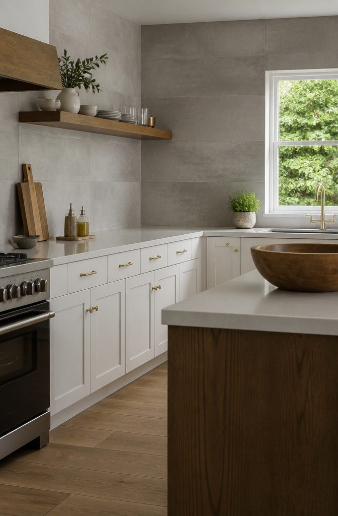
Concrete-look tile gives white cabinets a matte gray backdrop that reads as modern or industrial.
Cement-based tile in a plain color or a minimalist pattern keeps the wall calm, so the cabinets stay the focus and the backsplash supplies the contrast.
Concrete-look tile has a cool tone, and next to white cabinets it can make the room feel cold. Gray and flat looks cool, and against white cabinets the whole kitchen can start to feel like a showroom.
Bring in warmth nearby: wood open shelves, a cutting board leaned against the wall, brass or matte black pulls, a pot of herbs by the window.
A lighter gray with soft variation feels friendlier than a dark, uniform one, so choose that if your kitchen gets little daylight.
Dark Grout With White Tile
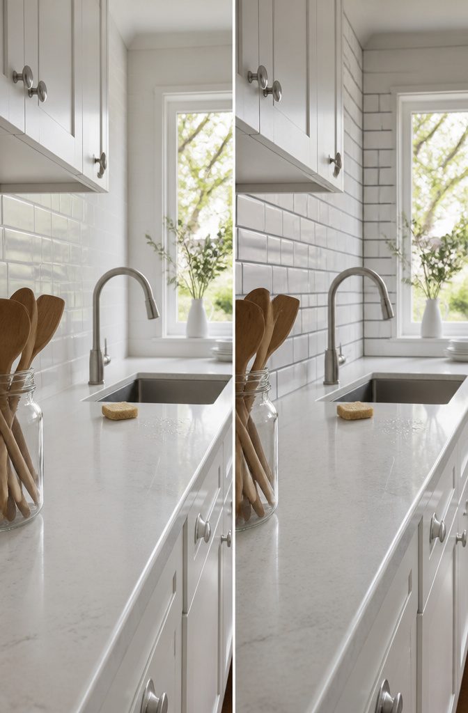
Grout color changes how the same white tile looks more than almost any other choice you make. Dark gray grout outlines every tile, so the layout becomes the pattern.
On subway tile, it turns plain offset rows into a visible brick grid. On herringbone, the zigzag gets sharper and more graphic.
White grout does the reverse.
The joints fade, the wall reads as one calm surface, and the layout barely registers. The same tile that looks busy with dark lines looks quiet without them.
Choose dark gray grout if you want the pattern to show, and white grout if you want the wall to stay in the background.
Glossy or Matte Under Your Lights
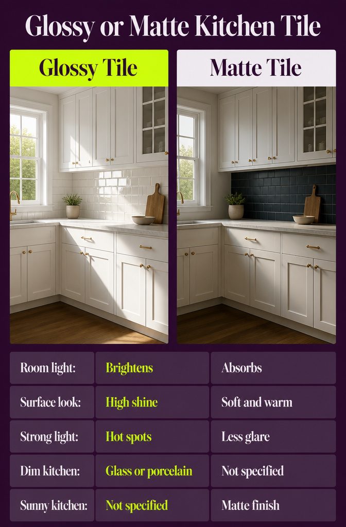
Glossy tile bounces light back into the room, so it brightens a kitchen with little daylight.
Matte tile absorbs more of that light and looks softer and warmer. Matte, cement-based encaustic tile shows this well: it gives white cabinets depth instead of shine.
Glare is the cost of gloss.
Under bright under-cabinet lights, or with a window facing the counter, a high-shine surface throws hot spots. A matte or lightly polished finish cuts that glare, which is why it works well on dark tile.
Lighting also changes color. Blue tile and iridescent glass stand out under strong light.
In a dim kitchen, glossy glass or porcelain is the better pick. In a sunny one, choose matte.
Match Countertop Undertones
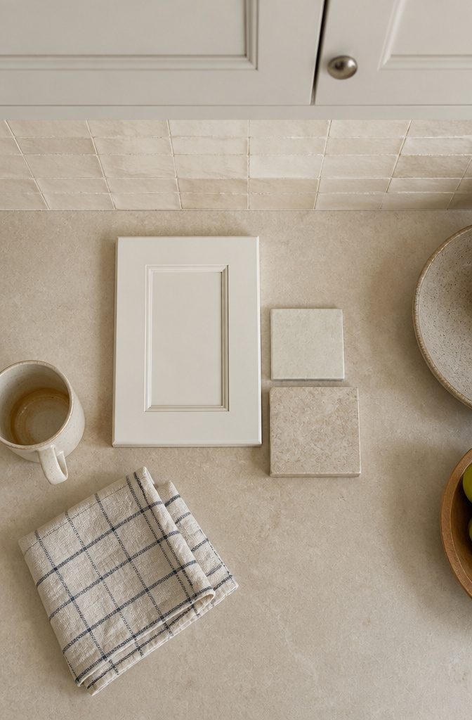
White cabinets are rarely a single white, so the backsplash has to agree with the countertop first.
Sort the countertop into cool (gray, blue or green cast) or warm (cream, beige, yellow or pink cast), then pick a backsplash with the same lean.
Hold the cabinet door against both. A stark white door looks yellow beside a cool gray tile, and a creamy white door looks dingy next to a bright one.
Order tile samples and set them against the counter and a cabinet door in your kitchen’s own light.
Some sellers ship samples free. If two options both look close, a design consultation settles it.
Frequently Asked Questions
What is the best backsplash for white cabinets?
White subway tile is the safest choice. It suits modern and contemporary kitchens and sits well beside stainless steel appliances.
White cabinets also work as a neutral backdrop for stone, patterned tile, black tile, or textured white tile, so pick based on whether you want a calm, rustic, or bold look.
How do I keep a white subway tile backsplash from looking sterile?
Add dark or natural wood nearby, such as an open shelf, a cutting board leaning on the wall, or a stool at the counter. Wood brings in character and leaves the tile and cabinets looking light and airy.
What grout color works best with a white tile backsplash?
Use dark gray grout if you want the tile layout to show as a pattern, and white grout if you want the wall to fade into the background.
Grout changes the look of the same tile more than almost any other choice, so test it on a sample first.
How does lighting affect a backsplash with white cabinets?
Strong light makes colors like blue and iridescent glass stand out, while bright under-cabinet lights or a window facing the counter can make glossy tile glare.
A matte or lightly polished finish reduces that glare, and glossy tile helps in a dim kitchen. Check samples on your own wall in morning and evening light before you buy.
Which tile materials look good with white kitchen cabinets?
Each material gives a different texture. Glass and iridescent tile reflect light and make the kitchen look brighter, matte encaustic (cement-based) tile adds warmth and pattern, and marble brings in color variation.
Concrete-look tile gives a cool gray backdrop, so add wood or brass nearby to warm it up.