
Benjamin Moore Hale Navy is the safest bold choice, and blue topped a Google Trends analysis in 13 states, one more than white.
Navy shows fingerprints and scratches readily, so anyone who hates smudges should pick a mid-tone like sage, greige, or taupe instead.
White, Cream, and Ivory
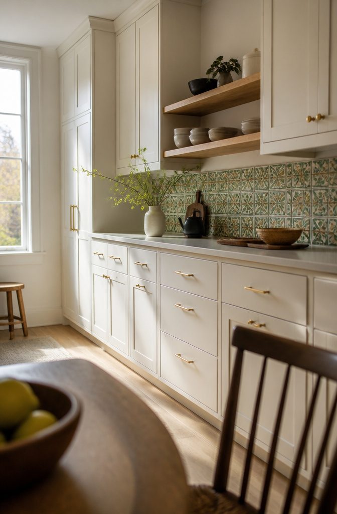
White is the flexible default.
It placed second in 12 states in a Google Trends analysis of kitchen cabinet colors, just behind blue at 13. Benjamin Moore Cloud White and Chantilly Lace make a calm backdrop for a colorful backsplash or statement hardware.
A paint with a high light-reflectance value bounces more light around the room, which makes a small kitchen feel bigger, and buyers tend to prefer a fresh, timeless color.
For something warmer, try cream or ivory: Sherwin-Williams Snowbound, Benjamin Moore Seapearl, or Farrow & Ball Slipper Satin. They soften white’s glare and look good with brass pulls and oak shelves.
Skip white if you want cabinets that hide fingerprints and scuffs. Light tones show wear faster, and mid-tones or textured finishes forgive far more.
Recommended Products
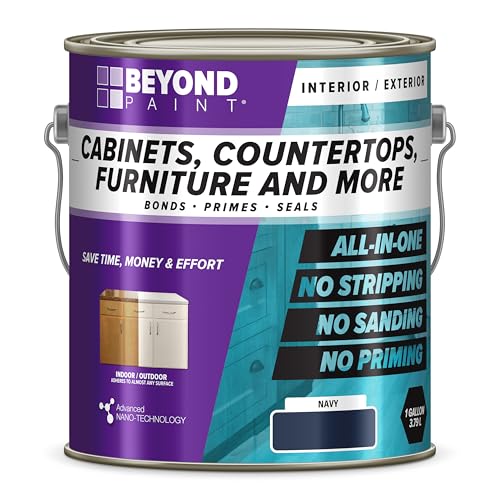
All-surface uniquely formulated paint solution: Easily refinish furniture, cabinets, countertops, doors, trim, floors and more

ALL-IN-ONE Paint - NO Sanding, NO Priming, NO Top Coat Required, Low Luster, Velvet Sheen Finish

All-surface uniquely formulated paint solution: Easily refinish furniture, cabinets, countertops, doors, trim, floors and more
Gray, Charcoal, and Greige
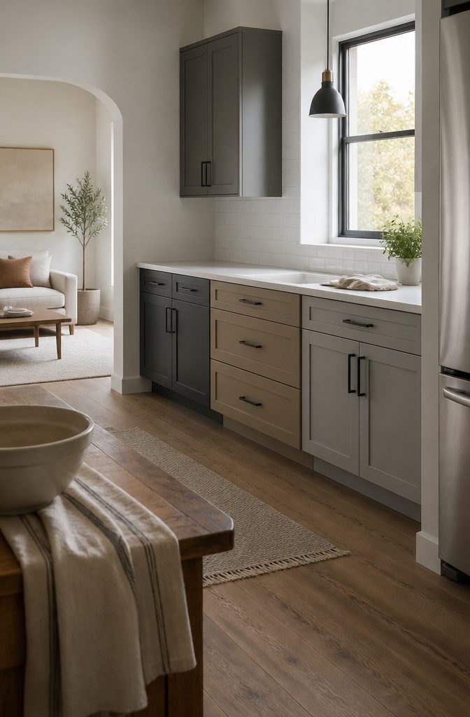
Greige is the easiest place to start. It pulls more gray than beige, so it reads warm, and it works with both brass and matte black hardware.
Benjamin Moore Pale Oak and Sherwin Williams Agreeable Gray are common picks. For a cooler light gray, try Ammonite by Farrow & Ball or Elemental MEN7060-2, a gentle blue-gray that sits well beside white counters and stainless steel.
Mid-tone grays hide fingerprints and scratches better than white or black, and a matte finish hides more than gloss. For drama, Sherwin Williams Dorian Gray or a deep charcoal looks good with white subway tile.
Skip charcoal in a small, low-light kitchen, where it can feel heavy. Greige works better there.
Recommended Products

ALL-IN-ONE Paint - NO Sanding, NO Priming, NO Top Coat Required, Low Luster, Velvet Sheen Finish
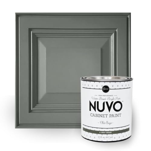
Olde Sage is a grey green, satin finish cabinet paint - part of our Rustic Collection.

ALL-IN-ONE Paint - NO Sanding, NO Priming, NO Top Coat Required, Low Luster, Velvet Sheen Finish
Green and Chartreuse
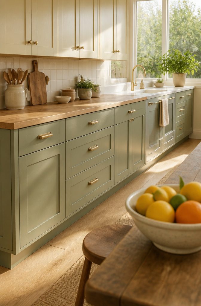
Sage is the easy choice. It is a mid-tone that hides wear, and it looks good with brass hardware and butcher block.
Farrow & Ball’s Breakfast Room Green leans gray-green. Olive runs darker: Benjamin Moore Palmer Green works with light or dark accents, and Sherwin-Williams Rosemary looks modern beside cherrywood.
Forest and emerald are the dramatic end, and wood and brass suit both. Balance dark green with lighter elements, like cream uppers or white counters, and give it good light.
Mint, such as Frosty Glade MEN7008-4, suits bright rooms with white counters. Chartreuse (Valspar Vintage Chartreuse VO20-3) pairs with gray, black or brown.
Skip deep greens if fingerprints bother you, and skip chartreuse if a bold, personal color makes you nervous.
Recommended Products

Hearthstone is a warm greige, satin finish cabinet paint - part of our Rustic Collection.

Includes Three Shades to Match 90% of Surfaces: We offer two color shades of Matte Beige and one Matte White to instantly achieve the perfect color match. Eliminating the need for color charts, returns, and waiting for the right color to arrive. Instead, match to one of the two beige colors or mix colors and match to your desired shade.

ALL-IN-ONE Paint - NO Sanding, NO Priming, NO Top Coat Required, Low Luster, Velvet Sheen Finish
Blue, Navy, and Teal
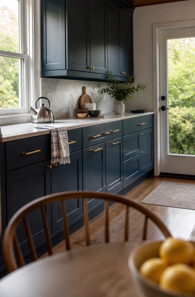
Blue ranked first in 13 states in a Google Trends analysis of kitchen cabinet colors, ahead of white at 12. Benjamin Moore Hale Navy is the safest place to start.
It looks rich with brass pulls and light counters, and cool metals like silver suit it too. Farrow & Ball Hague Blue is a cobalt, more striking than navy, and a gentler step for anyone nervous about color.
Powder and dusty blues read fresh and coastal in kitchens with plenty of daylight. Teal and turquoise are the bolder, blue-green end, and white counters keep them from overpowering the room.
Skip navy if fingerprints and scratches bother you, because both show more on it. Skip teal if you’re unsure about a bold look.
Recommended Products

Package includes:2 light-filtering neutral burlap natural linen curtain panels. Each panel features a dual hanging design with 24 back tabs and a rod pocket, fitting most standard rods for quick installation. The generous width delivers full window coverage and creates neat, tailored draping for a tidy minimalist look.

Easy Application: The innovative bottle design features a built-in precision brush, eliminating the need for extra tools. The fine brush allows for accurate and detailed repair of small blemishes and scratches, making the touch-up process effortless and worry-free. Suitable for both beginners and experienced DIY enthusiasts.

Basic Information: 2 LINEN PANELS in 1 package. Each panel measures width 42 x 36 length. 3-Way Hanging Options: Hang these curtain panels (1) using the back loops to create an elegant pleated effect, (2) from the 3 inch rod pocket for a classic look, or (3) using clip rings for easy, slide open and closed (clip rings are not included)
Black Cabinets
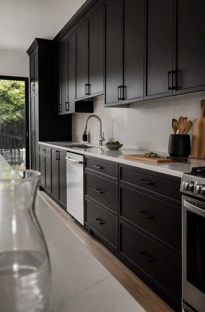
Black cabinets look best against light counters and walls, like white marble or light quartz, which keep the dark color from feeling heavy.
Two shades to test are Benjamin Moore Baby Seal Black 2119-30 and Blackest by Clare. Black hardware and stainless steel appliances both sit well against them.
Dark matte paint shows fingerprints, smudges, and scratches fast. A satin or semi-gloss topcoat helps the finish hold up better, so choose the sheen before you buy the paint.
Skip black if your kitchen is small and gets little natural light, because it makes the room look even smaller. Renters who don’t want to repaint at move-out should pass too.
Recommended Products

【New Design, New Features】Our under cabinet lights features a new design with 65 LEDs per light, delivering up to 350 lumens of brightness, brighter but not dazzling. 3 color temps adjustable and 3 levels of brightness designs are our exclusive features. It is energy-saving and environmentally friendly with a 2500mAh rechargeable battery and motion sensing and night sensing functions. A magnetic design and hidden hooks design make it easy to install without any tools. Perfect choice for your home lighting.

New COB Technology Church Light:With COB technology,the stage spotlight output high-intensity,high-uniformity,higher quality LED arrays
Yellow Cabinets
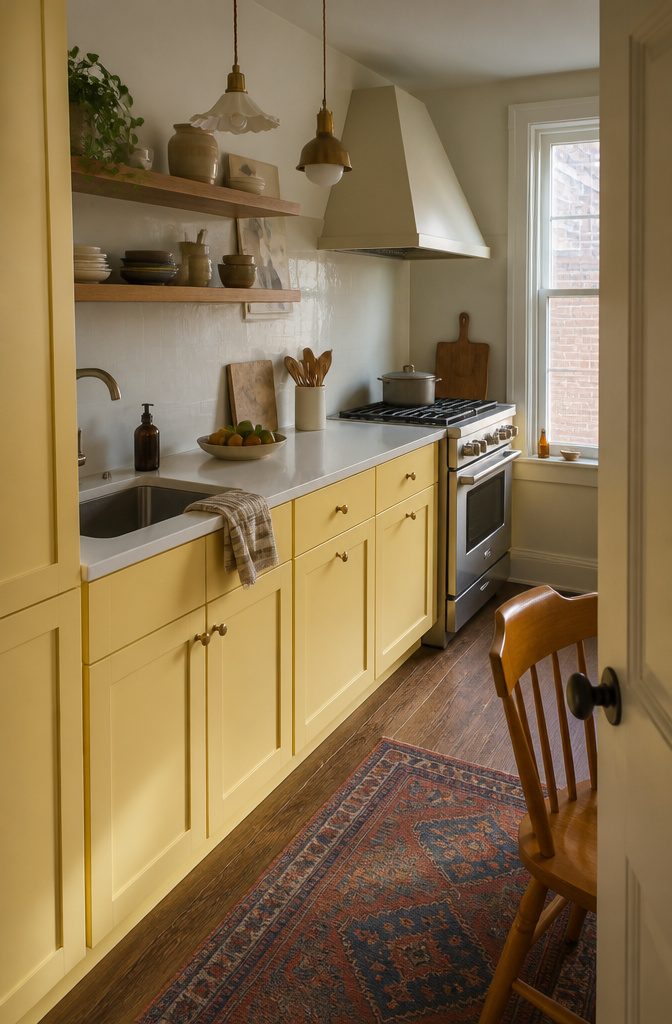
Yellow runs from butter and cream-yellow to full sunshine, and it brightens a kitchen that gets little natural light. Benjamin Moore Hannah Banana sits at the bold end, and it looks eclectic next to mismatched pendants and a vintage-look hood.
Shasta Daisy by Portola Paints covered the cabinets in a New York City galley kitchen, where the cheerful color worked against the tight layout.
Soft yellows are easier to live with than bright ones. Butter reads warm instead of loud, and it pairs well with natural wood, or with white countertops and stainless steel appliances for a retro feel.
Skip yellow if you plan to sell soon. A neutral appeals to more buyers, and a strong yellow narrows that group.
Recommended Products

CABINET TRANSFORMATION: Refresh outdated cabinets, vanities, furniture and trim with rich Pure White color and a smooth semi-gloss finish

ALL-IN-ONE Paint - NO Sanding, NO Priming, NO Top Coat Required, Low Luster, Velvet Sheen Finish

BY REFINISHING PROS SINCE 1972 - Five decades of professional surface refinishing experience in every jar. While other cabinet paint brands started in marketing departments, Bathworks started in bathrooms, kitchens, and workshops - and we are still refinishing surfaces professionally today.
Pink, Blush, and Coral
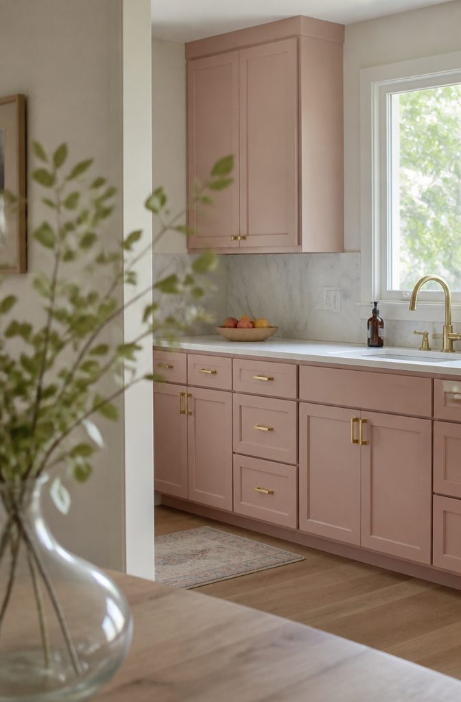
Dusty or blush pink reads more neutral than you’d expect, especially beside gray walls and white countertops, or with marble and gold hardware.
Pale pink also brightens a kitchen with weak natural light and brings out the pink undertones in white. Choose a muted pink, never a bright Barbie shade.
Coral is the warmer, peachy version. Behr Youthful Coral 170B-5 is one to sample.
Pair it with white quartz and brass, or calm it with taupe, white, or navy. Keep it muted so it doesn’t turn orange.
Skip both if you want broad resale appeal or can’t test a sample in your own light first.
Recommended Products

TRUE ALL-IN-ONE PAINT & PRIMER – Skip the extra steps. Evolve Tru Coat combines paint and primer in one, delivering excellent adhesion and coverage on wood, metal, masonry, and concrete with minimal prep.
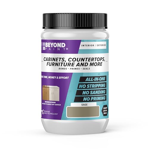
Beyond Paint furniture, cabinets and more all-in-one refinishing paint - quart - color: Sage
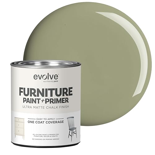
ULTRA-MATTE VINTAGE FINISH: Achieve a soft, velvety matte look perfect for farmhouse, shabby chic, and vintage-style furniture. This high-pigment formula provides a sophisticated, non-reflective finish for dressers, cabinets, and home decor.
Brown, Taupe, and Warm Neutrals
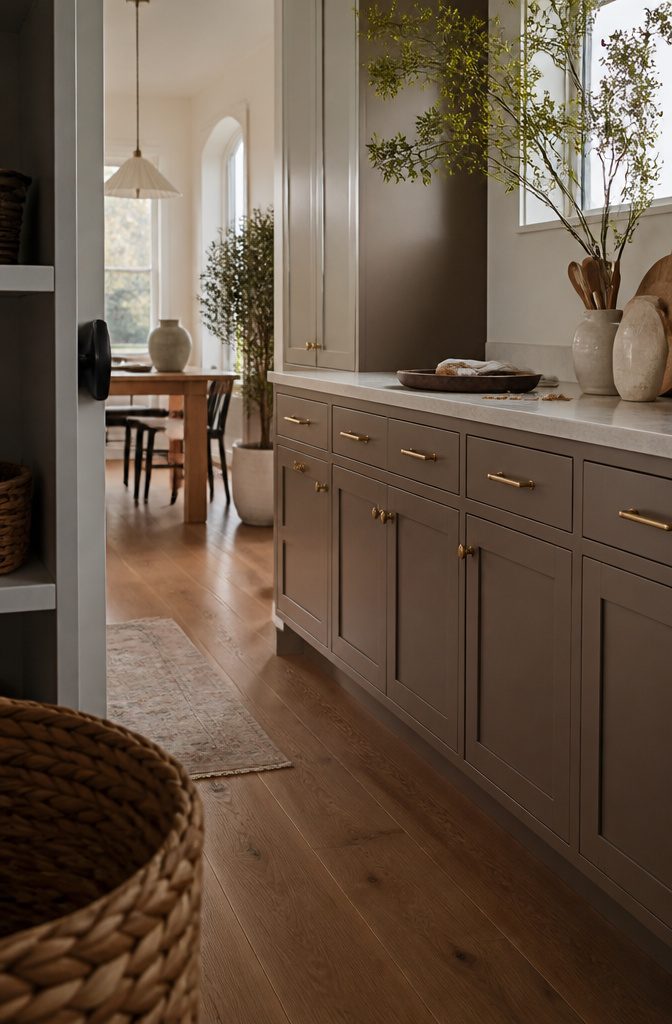
Taupe is the easiest swap for gray.
It sits between brown and gray, so it reads warmer without looking brown. Behr Perfect Taupe PPU18-13 and Benjamin Moore Smokey Taupe 983 are two paints to start with.
Mushroom and beige work the same way and suit light or dark countertops. Mid-tones like these hide fingerprints and daily wear better than stark white.
For more depth, Baked Bean MEN7088-6 from Pittsburgh Paints is a brown-red that looks classic against wood floors. Espresso looks best with light countertops and brass or copper hardware.
Skip espresso if your floors are dark and the room gets little light. The combination makes the kitchen feel closed in.
Recommended Products

CABINET TRANSFORMATION: Refresh outdated cabinets, vanities, furniture and trim with rich Dark Gray color and a smooth semi-gloss finish

ALL-IN-ONE Paint - NO Sanding, NO Priming, NO Top Coat Required, Low Luster, Velvet Sheen Finish
𝙉𝙊𝙏𝙀: Intentional headspace allows room for stirring, dipping, and transit. The stated paint quantity remains unchanged. If you have any questions, please contact our customer service team.
Natural Wood Finishes
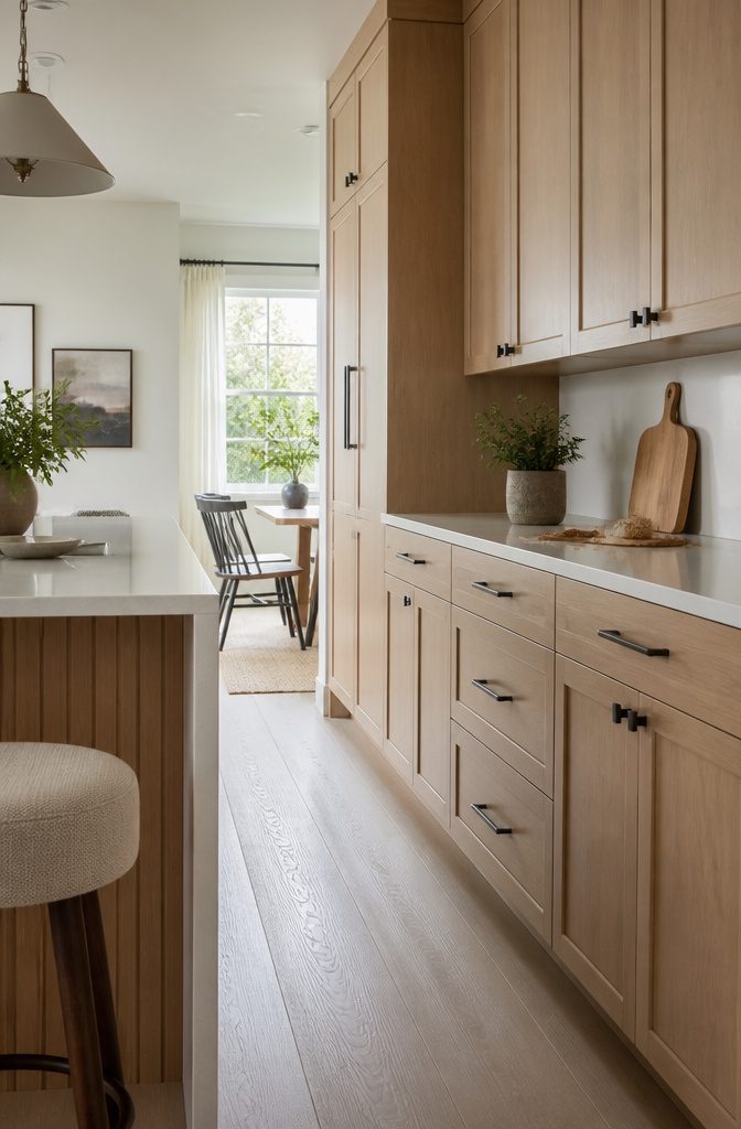
Light oak and maple bring warmth and visible grain, and they suit Scandinavian-style kitchens. Walnut and mahogany run darker and richer, which fits traditional rooms.
Whatever the species, choose a neutral undertone and avoid yellow, orange or red ones. Mahogany with a strong red cast can overwhelm a kitchen when it covers every cabinet.
Natural veneers vary slightly in tone and grain, and that doesn’t affect the warranty.
Lock in a master sample so the full order matches what you approved. Veneer adds 15–40% to cost and 10–21 days to the schedule.
Skip stained wood if you rent, or if your floors already carry a strong wood undertone. Two competing woods look muddy.
Recommended Products
Basic Information: 2 LINEN PANELS in 1 package. Each panel measures width 42 x 30 length. 3-Way Hanging Options: Hang these curtain panels (1) using the back loops to create an elegant pleated effect, (2) from the 3 inch rod pocket for a classic look, or (3) using clip rings for easy, slide open and closed (clip rings are not included)

Package includes:2 light-filtering neutral burlap natural linen curtain panels. Each panel features a dual hanging design with 16 back tabs and a rod pocket, fitting most standard rods for quick installation. The generous width delivers full window coverage and creates neat, tailored draping for a tidy minimalist look.

Elegant Design: This spatula holder features a unique cream white design with a modern touch that blends into any home decor and add some artistic color to your kitchen counter, stove top, coffee bar and restaurant
Red, Terracotta, and Orange
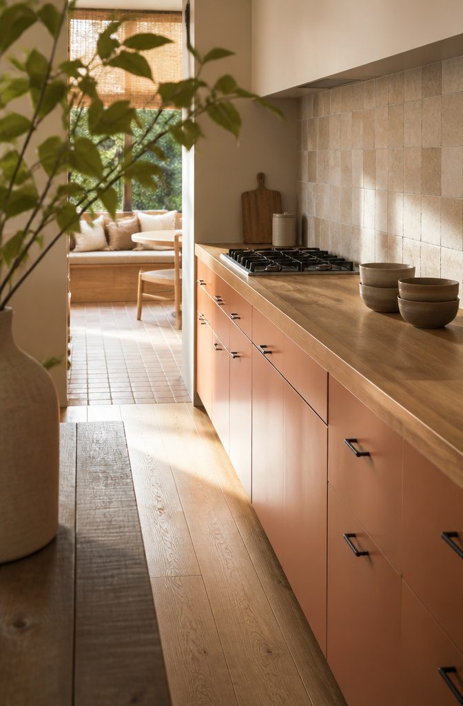
Deep, rich reds feel more sophisticated than cherry red. Burgundy works best on an island or a few accent cabinets, with lighter walls and countertops around it.
Behr’s Red Red Wine (S-H-130) is a good swatch to start with. Red pulls the eye, so keep accessories restrained.
For orange, burnt orange or terracotta is the easiest version to live with, much more than bright orange.
Terracotta looks warm beside natural wood and stone countertops and gives a Mediterranean feel. If you want the brighter route, Valspar’s Island Orange 2010-2 pairs with green, turquoise, and white.
Skip this family if you want a quiet room. Skip it too if your wood floors already lean red or orange, because the two will compete.
Purple, Eggplant, and Lavender
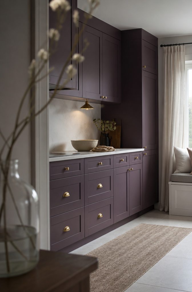
Eggplant is the dramatic pick, and muted, smoky purple beats bright royal purple every time, which reads like a fairy tale.
Behr’s Oriental Eggplant PPU17-2 is one to sample. Keep everything else quiet: light countertops, veined marble, gold accents.
Lavender goes soft.
Dusty Benjamin Moore Lily Lavender 2071-60 feels calm and a little romantic, and it looks modern beside white or a bold orange. Pushed brighter, it starts to look like a child’s bedroom.
Skip purple if you rent, plan to sell soon, or can’t test a sample in the room’s light. Many buyers won’t share the taste, and both depths shift with daylight and bulbs.
Two-Tone Combinations
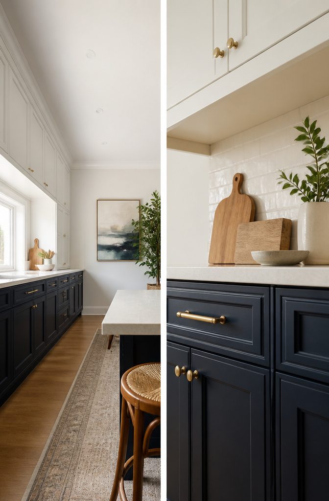
Light uppers over darker lowers is the easiest two-tone move in a small kitchen. The pale top half keeps the room bright, and the contrast can make the ceiling feel taller.
White uppers over navy lowers works, and so does cream over sage green. In a larger kitchen, you can paint only the island, such as a navy island against white perimeter cabinets.
Budget 3–8% more cost and 3–7 extra days of lead time compared with a single color. Skip two-tone if you want the lowest-cost, simplest plan, or if you can’t find two colors that both suit your countertop.
Gold and Mixed Metals
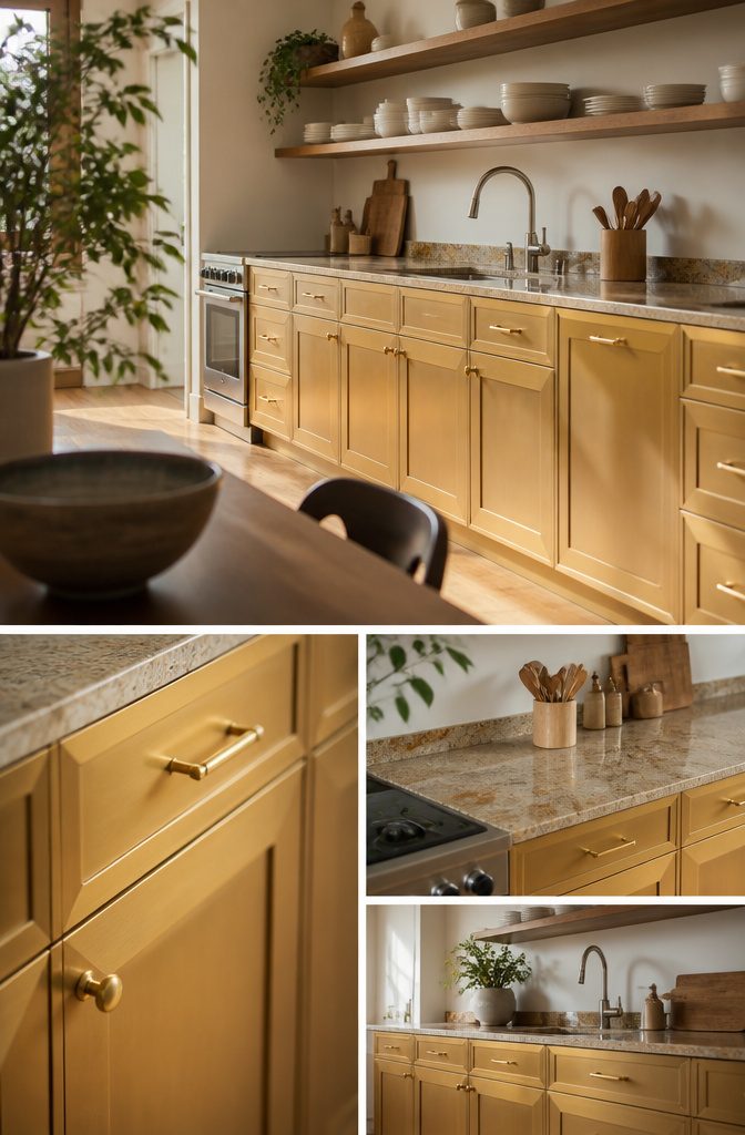
Gold as a cabinet color is a different move from gold hardware.
A golden finish, such as Valspar Summer Gold 3005-1B, adds shine and pairs well with granite countertops for a warm modern look. Mixed metals, where painted cabinets meet more than one metal tone, suit modern and industrial kitchens.
Let the hardware follow the paint: brass or matte gold lifts cream and green, while cool metals like polished nickel suit blues and grays.
Match the cabinet color to the backsplash and work in 3 or more coordinated colors so the metals look planned.
On a tight budget, skip metallic paint and change only the hardware, which gives the metal look on its own.
Match Light, Room Size, and Finishes
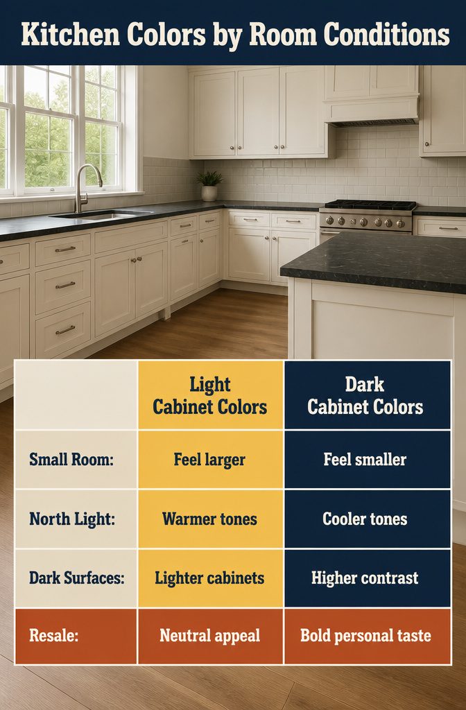
Light shades like white, cream, and light gray reflect light and make a small or dark kitchen feel bigger.
Navy, deep green, or charcoal add depth to a large kitchen with plenty of windows, but in a small, low-light room they read heavy and make it feel smaller. North-facing kitchens favor warmer tones, and south-facing ones handle cooler colors.
Dark counters, floors, or backsplash need lighter cabinets for contrast, while light surfaces can take a bolder color. Light cabinets with darker counters look classic.
Dark cabinets with light counters look more contemporary but need good lighting. In a small kitchen, light cabinets with medium-tone counters work best.
For resale, stick with neutrals. Bold colors suit you, not every buyer.
Test Samples and Pick a Sheen
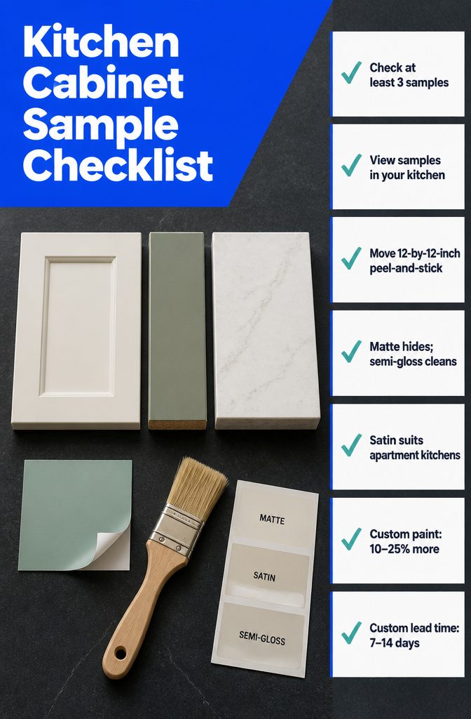
Check color and sheen in your own kitchen, not under store lighting.
- Review at least 3 samples: a door, an edge and a countertop, placed side by side in the actual room.
- A Samplize 12-by-12-inch peel-and-stick sample lets you move a color around the kitchen without opening a paint can.
- Matte hides imperfections, semi-gloss wipes clean more easily, and satin is a good middle choice for apartments.
- Sprayed finishes give a glossy, contemporary look, but chips are hard to repair. Hand-painted finishes take longer and touch up easily.
- Custom paint adds 10–25% to the cost and 7–14 days to the lead time.
Frequently Asked Questions
What are the most popular kitchen cabinet colors for 2026?
Blue and white lead.
In a Google Trends analysis of kitchen cabinet colors, blue placed first in 13 states and white second in 12. White stays the flexible default, and navy such as Benjamin Moore Hale Navy is the safest blue to start with.
Are dark kitchen cabinet colors still in style?
Yes. Navy, deep green, charcoal, and black all work for 2026 when you balance them with lighter elements such as cream uppers or white counters and give them good light.
In a small, low-light kitchen they read heavy, so pick a lighter shade there.
What kitchen cabinet color hides fingerprints and scratches best?
Mid-tones such as gray, sage, and taupe hide daily wear best, and a matte or textured finish hides more than gloss.
White and other light tones show wear faster, and navy, black, and deep green show fingerprints and scratches readily. A satin or semi-gloss topcoat helps dark paint hold up.
What color cabinets make a kitchen look bigger?
Light colors, especially white, followed by cream, light gray, and other pale shades.
They reflect more light around the room, so a small or dark kitchen feels more open. Navy, deep green, and charcoal tend to make a small room feel smaller.
Should kitchen cabinets be lighter or darker than the countertops?
Either can work, but keep contrast between them.
Dark counters, floors, or backsplash call for lighter cabinets, while light surfaces can take a bolder cabinet color. Light cabinets with darker counters look classic, and dark cabinets with light counters look more contemporary but need good lighting.
What paint sheen is best for kitchen cabinets?
Satin is a good middle choice and works well in apartments.
Matte hides imperfections best, and semi-gloss wipes clean most easily. Decide on the sheen before you buy the paint, since it affects how the color wears.
How many cabinet color samples should I review?
Review at least 3: a door, an edge, and a countertop, placed side by side in your own kitchen.
Check them in that room’s light, not store lighting. A 12-by-12-inch peel-and-stick sample lets you move a color around without opening a paint can.
How much more do two-tone kitchens cost?
Budget 3–8% more than a single color, plus 3–7 extra days of lead time. If you want the lowest-cost, simplest plan, a single color is the better choice.
Does veneer variation affect the cabinet warranty?
No.
Natural veneers vary slightly in tone and grain, and that does not affect the warranty. For a large order, lock in a master sample so the finished cabinets match what you approved.