
Your brand’s colors are a set of up to 7: 1–2 main colors, 1–3 neutrals and 1–2 accents, each with one job.
They have to match how you describe the brand. Navy, muted pale blue, light grey, charcoal and white read calm and serious, so they clash with a cheerful, bold, creative Summer brand.
Record a Starting Palette
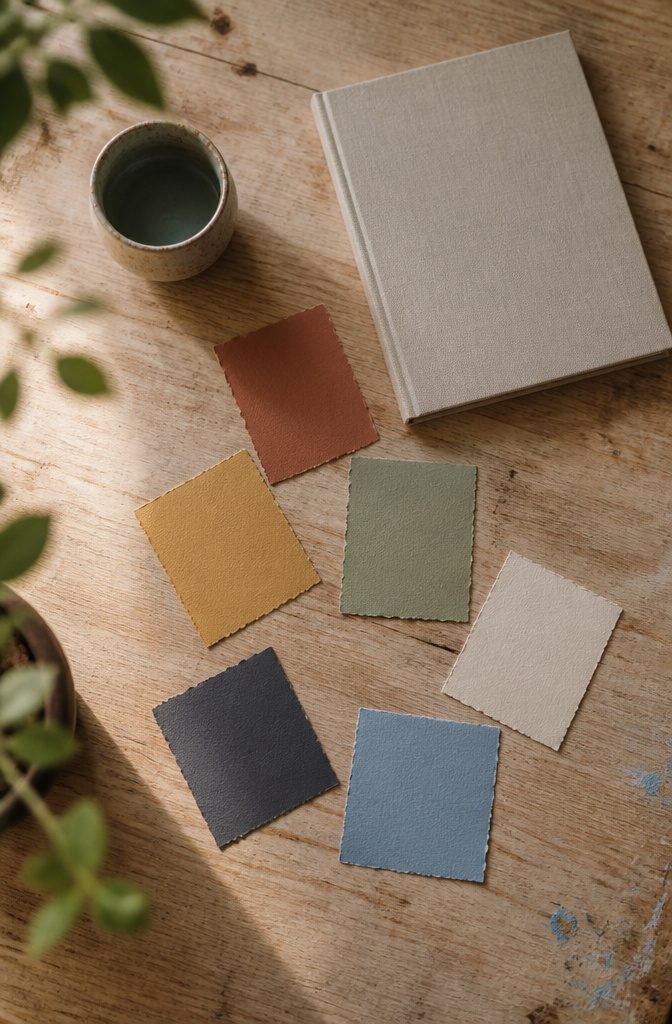
Before you open a swatch library or a palette tool, write down the palette already in your head.
List 4–6 colors from memory, using plain names, hex codes, or paint chip labels. Skip the research and don’t edit as you go, because your first instinct is the useful part.
Keep the list where you can find it.
It is a baseline for testing the brand against, and you don’t have to commit to it. After you’ve worked through the later steps, pull it out and compare.
Colors that still hold up likely fit the brand. Colors that fall away were probably personal taste.
Recommended Products

All-in-One Seasonal Color Guide: Representing Spring (Bright, Light, Warm), Summer (Soft, Light, Cool), Autumn (Soft, Warm, Deep), and Winter (Bright, Cool, Deep). These seasonal colour analysis keychains are designed to make shopping, styling, and travelling easier(Each card comes with a removable protective film on both sides. Please peel before use)

12-Season Template Theory: Designed based on the 12-season color theory,each set includes an exclusive, simply designed seasonal color analysis guide—featuring tools and test charts—to help you determine your season and make the most of your color choices.

12-Season Template Theory: Designed based on the 12-season color theory, each set includes an exclusive, simply designed seasonal color analysis guide—featuring tools and test charts—to help you determine your season and make the most of your color choices.
Describe the Brand
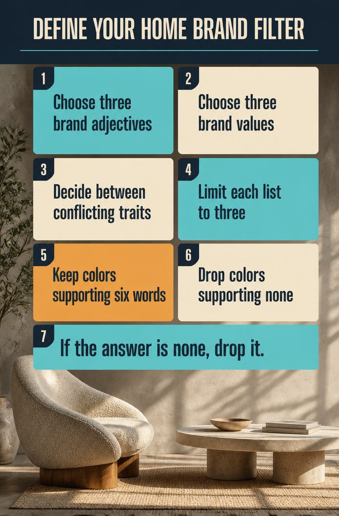
Pick 3 adjectives and 3 values for the brand before you look at a single swatch. These six words become the filter for every color decision later.
- Adjectives describe how the brand looks and feels. Modern, warm, sophisticated and whimsical are common choices. Some pairs need a decision: "sophisticated" and "whimsical" pull in different directions, so choose the one you’d rather be known for.
- Values describe what the brand stands for. Mindfulness, dependability, stability, comfort and ambition are good starting points. A bookkeeper might lean on dependability and stability, while a yoga studio might choose mindfulness and comfort.
- Stop at 3 of each. A longer list filters nothing, and every color will seem to fit.
When you test a color later, ask which of the six words it supports. If the answer is none, drop it.
Recommended Products

REAL CMYK - Design Swatch is a realistic representation of straight CMYK industrial printing. With Design Swatch, you'll know what to expect when using a certain color from the deck.


Easily mix, match, and plan flawless color schemes with this expansive card deck featuring 200 colors
Choose a Brand Season

Name the season your brand feels like: Spring, Summer, Fall, or Winter.
If the brand sits between two, pick a mix of two. A brand can be mostly Summer with some Fall, and the palette can lean that way.
Once you have a season, test your colors against it. A palette has to agree with the season you named, along with your adjectives and the shops you admire.
A palette of navy, muted pale blue, light grey, charcoal, and white does not fit a Summer brand described as cheerful, bold, and creative. Those colors are subdued, and the words describing the brand are not.
If the colors and the season disagree, change one of them. Change the colors if the season matches how you want clients to feel.
Recommended Products

SIMPLE AND PORTABLE - Scan any flat surface to find the closest matching paint colours and products in the Color Muse app. Color Muse pairs to the app via wireless so that you can scan colours anywhere.
Color Mixing Bible by Ian Sidaway is a valuable guide to all artists
Look at Where Clients Shop
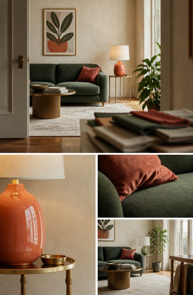
Imagine your ideal client shopping anywhere with no spending limit, for clothes, office decor, accessories, or supplies.
Pick the stores that client would choose, even when they differ from the ones you like. Crate & Barrel, Kendra Scott, Magnolia, Madewell, Kate Spade, and Jonathan Adler are typical picks.
Next, write down the words that come to mind for each store.
Crate & Barrel might give you "clean" and "classic," while Jonathan Adler might give you "playful" and "bold." Circle the words that repeat across several stores.
Those repeats are your style. The store names alone say little, but the shared words show whether your look is relaxed, polished, or colorful, and they give you a test for every color you consider later.
Recommended Products

500+ ESSENTIAL SPANISH FLASH CARDS IN ONE SET: This Master Spanish 500+ card set includes with 150 regular verbs, 100 irregular verbs, 50 reflexive verbs, 100 house items and common nouns, 50 adjectives, 50 phrases, and practice cards — giving you a, all-in-one Spanish learning system with these spanish flashcards.

BRIGHT COLORS AND WONDERFUL TO TOUCH -- These lightweight, colorful stones have immediate visual appeal plus their warm, smooth surface makes them a wonderfully tactile early math resource. Children will be fascinated by the pebbles' bright colors, odd shapes and warm feel which make stacking even more fun.
Describe the Ideal Client
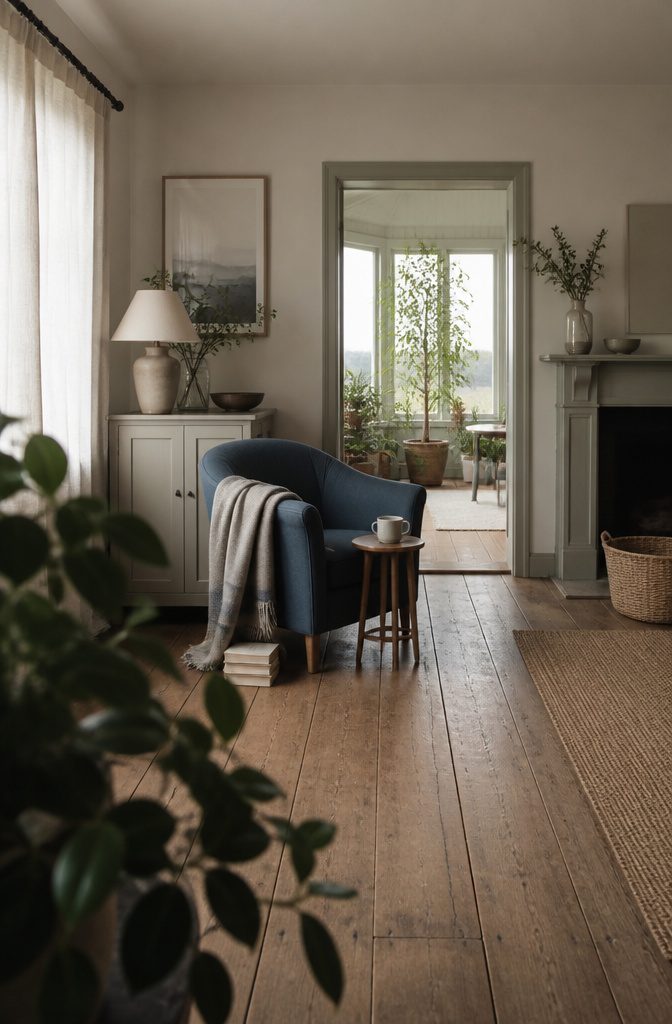
Write a short profile of one specific person, not a broad demographic. Cover these angles:
- Career: what they do all day, and whether their workplace is formal or relaxed.
- Location: city or small town, coastal or inland. Surroundings shape which tones feel familiar.
- Clothing: the colors in their closet. The ones they wear on repeat are your best clue.
- Hobbies: how they spend a free Saturday.
- Books: the covers on their shelf and the genres they pick.
- Social accounts: who they follow and the colors those feeds share.
- Home style: cozy, minimal, bold, or collected.
A vague audience lets every color seem fine.
A specific person rules colors out. Someone in neutral clothes with a minimalist home and a calm feed will likely ignore a loud, saturated palette, so you can drop it and test softer options.
Recommended Products

12-Season Template Theory: Designed based on the 12-season color theory,each set includes an exclusive, simply designed seasonal color analysis guide—featuring tools and test charts—to help you determine your season and make the most of your color choices.

All-in-One Seasonal Color Guide: Representing Spring (Bright, Light, Warm), Summer (Soft, Light, Cool), Autumn (Soft, Warm, Deep), and Winter (Bright, Cool, Deep). These seasonal colour analysis keychains are designed to make shopping, styling, and travelling easier(Each card comes with a removable protective film on both sides. Please peel before use)

Portable Color Reference: These acrylic color swatch cards are a practical tool for anyone who knows their seasonal color type. No more guessing which shades work for you when shopping for clothes or makeup.
Set the Feeling
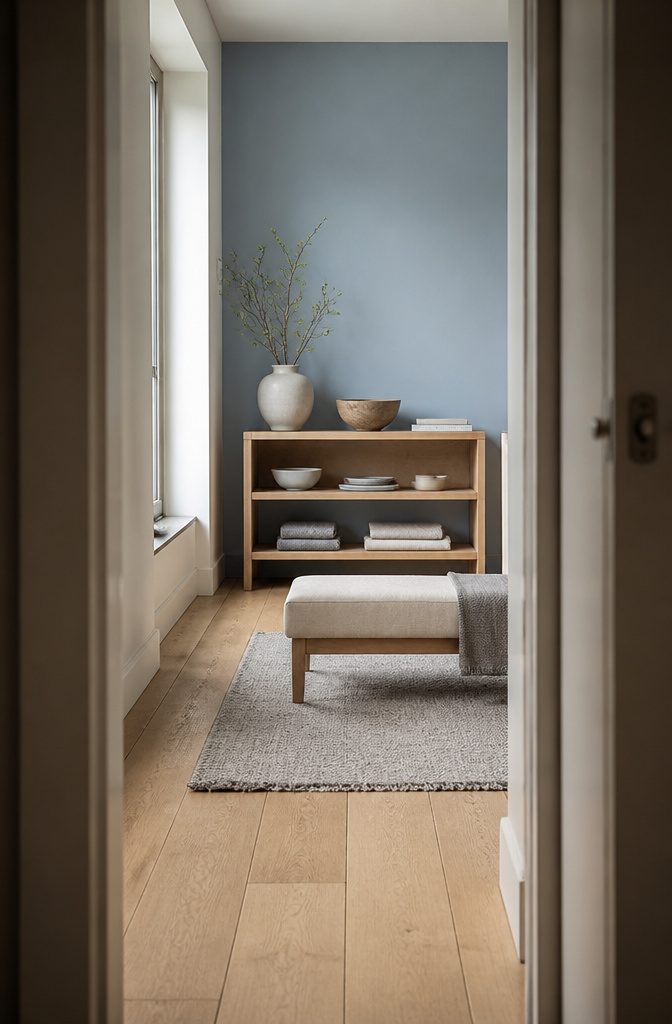
Your brand essence is the emotion a visitor should feel at first glance of your logo or website.
Pick one feeling the colors must support, such as calm, trust, energy, or warmth, and write it at the top of your notes before you look at a single swatch.
Two competing feelings pull the palette in opposite directions and leave the visitor with a muddy impression. If you catch yourself writing "calm but bold," choose which word wins and let the other play a supporting role.
Every color you consider later gets the same test: does it strengthen that feeling or dilute it? A color you love that fails the test belongs in a "maybe later" pile, not in your palette.
Recommended Products

Nail Tech Salon Essential: Cut consultations to seconds - 200 nail tester swatches on rings, so clients point, not open bottles. Nail swatches sticks hold your color library in a nails supply kit

Notice: This color card is compatible with various types of pens. Multiple layers of water-based pen coloring may cause slight surface pilling. Thank you for your understanding.

12-Season Template Theory: Designed based on the 12-season color theory,each set includes an exclusive, simply designed seasonal color analysis guide—featuring tools and test charts—to help you determine your season and make the most of your color choices.
Check Colors Against the Brand
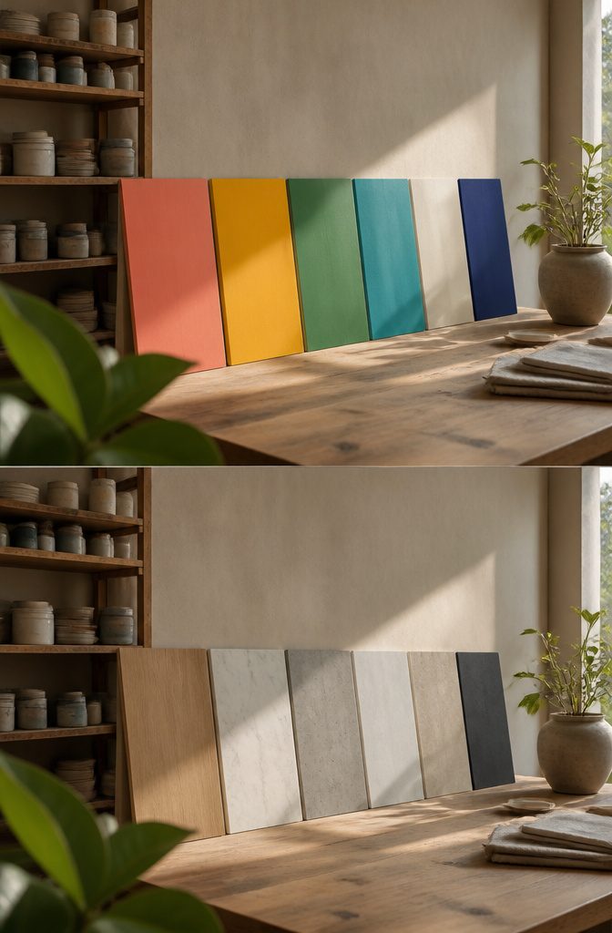
Set your 4–6 starting colors beside your adjectives, values, season and the feeling you want people to have when they see your brand. Navy blue, muted pale blue, light grey, charcoal and white read calm and serious.
If your adjectives are cheerful, bold and creative and your season is summer, that palette clashes with the brand. Either the colors or the adjectives have to change.
Color plays a part in emotions and buying. Fast food brands lean on red and yellow, and many natural products use brown and green.
Compare each of your colors with its usual meaning. They don’t all have to match exactly, but they should start to line up with your words.
Recommended Products

1. NEW EDITION WITH 224 NEW PANTONE COLORS - Access all 2,587 Pantone Spot Colors, including the latest PMS additions for modern creative projects. 2. PANTONE TO CMYK COLOR...
Assign Palette Roles
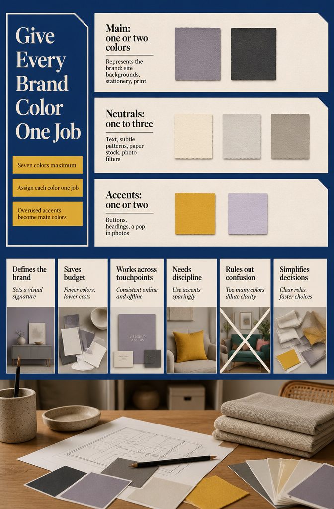
Cap the palette at 1–2 main colors, 1–3 neutrals and 1–2 accents, which is 7 colors at most. Give each color one job before you use it.
| Role | Count | Job | Example |
|---|---|---|---|
| Main | 1–2 | Represents the brand: site backgrounds, stationery, print | Dusty grey/lavender, charcoal grey |
| Neutral | 1–3 | Text, subtle patterns, paper stock, photo filters | Soft crème, pale grey |
| Accent | 1–2 | Buttons, headings, a pop in photos | Dirty saffron, pale lavender |
Use accents sparingly. An accent that shows up everywhere has become a main color.
Palette Tools and Free Limits
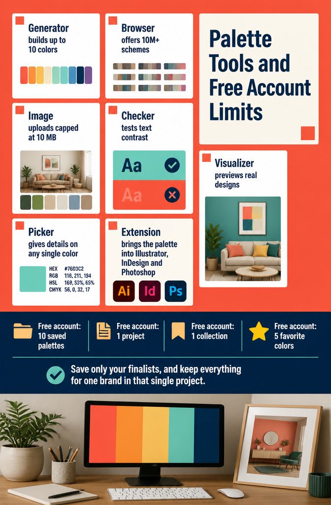
Coolors-style tools cover the whole build, and a free account is enough for one brand.
- Palette Generator: builds palettes of up to 10 colors.
- Palette browser: offers 10M+ ready schemes to start from.
- Image Picker: pulls colors from any image, with uploads capped at 10 MB.
- Contrast Checker: tests whether text and background pairs read clearly.
- Palette Visualizer: previews your colors on real designs.
- Color Picker: gives details on any single color.
- Extension: brings the palette into Illustrator, InDesign and Photoshop.
Free accounts allow 10 saved palettes, 1 project, 1 collection and 5 favorite colors. Save only your finalists, and keep everything for one brand in that single project.
Google News’s 15 Core Colors
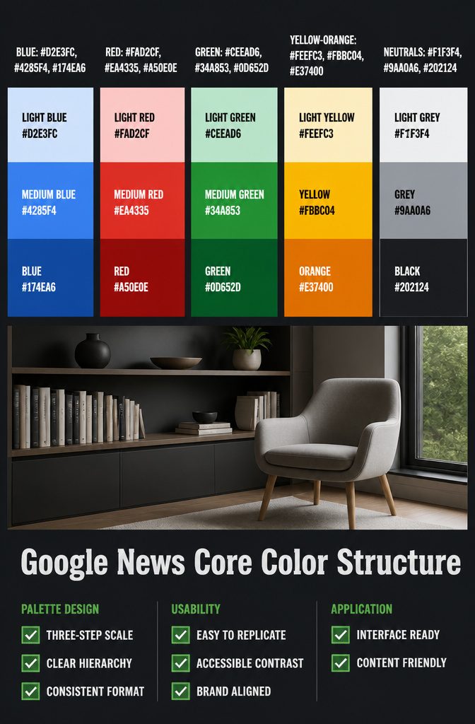
Google News records its palette as 15 named colors, each with one hex value.
Most hues come in a light tint, a medium tone and a dark shade, with a row of neutrals alongside, which is a clean format to copy for your own palette sheet.
| Family | Light | Medium | Dark |
|---|---|---|---|
| Blue | Light blue #D2E3FC | Medium blue #4285F4 | Blue #174EA6 |
| Red | Light red #FAD2CF | Medium red #EA4335 | Red #A50E0E |
| Green | Light green #CEEAD6 | Medium green #34A853 | Green #0D652D |
| Yellow and orange | Light yellow #FEEFC3 | Yellow #FBBC04 | Orange #E37400 |
| Neutrals | Light grey #F1F3F4 | Grey #9AA0A6 | Black #202124 |
Recommended Products


All-in-One Seasonal Color Guide: Representing Spring (Bright, Light, Warm), Summer (Soft, Light, Cool), Autumn (Soft, Warm, Deep), and Winter (Bright, Cool, Deep). These seasonal colour analysis keychains are designed to make shopping, styling, and travelling easier(Each card comes with a removable protective film on both sides. Please peel before use)
Frequently Asked Questions
What adjectives and values should I pick before choosing a brand color palette?
Pick 3 adjectives and 3 values, and stop there. Adjectives describe how the brand looks and feels, such as modern, warm, sophisticated, or whimsical.
Values describe what it stands for, such as stability, mindfulness, comfort, or ambition. A longer list filters nothing, so every color starts to look like a fit.
Can a brand color palette match more than one season?
Yes. If your brand sits between two seasons, name a mix of the two, such as mostly Summer with some Fall, and let the palette lean that way.
Then check the colors against that season. A muted navy and grey palette contradicts a cheerful, bold Summer brand, so either the colors or the season has to change.
How do I describe my ideal client when choosing brand colors?
Write a profile of one specific person instead of a broad demographic. Cover their career, location, clothing, hobbies, books, social accounts, and home style.
The colors they wear most often are the best clue. A specific profile rules colors out, while a vague one lets almost any color pass.
What feeling should a brand color palette create?
Choose one feeling, such as calm, trust, energy, or warmth. This is your brand essence: the emotion a visitor should have at first glance of your logo or website.
Two competing feelings pull the colors in opposite directions. If you write "calm but bold," pick which word leads and let the other support it.
How do I know if my brand color palette makes sense?
Compare your starting 4–6 colors with your 3 adjectives, 3 values, brand season, and chosen feeling.
Each color should support at least one of those words. For example, navy, pale blue, light grey, charcoal, and white clash with a cheerful, bold, creative Summer brand, so you would change either the colors or the brand words.