
Blue shades are told apart by undertone and intensity: Cerulean carries a hint of green that Azure lacks, and Royal Azure leans purple where Sapphire does not.
Intensity sets the job. Vivid blues like Dodger Blue belong in small accents, while deep ones like Prussian Blue darken a room and suit backdrops.
Dodger and Electric Blues
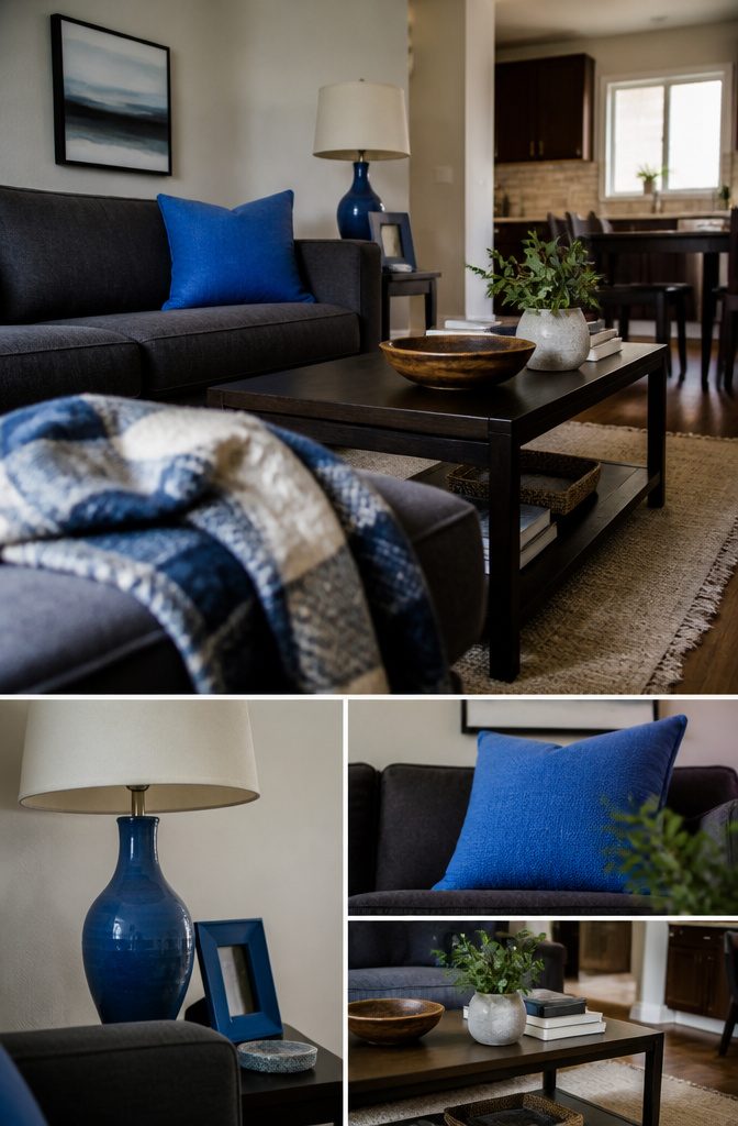
Dodger Blue, Medium Electric Blue and Rich Electric Blue are all vivid blues that pull the eye, so they work in small doses.
On a website they color call-to-action buttons and accents. In a rental, the same job goes to a throw pillow, a picture frame, a lamp base or a door mat.
Dodger Blue is the medium-bright one and the easiest to spot across a room.
Medium Electric Blue has a little more depth, so it looks less flat. Rich Electric Blue is the most intense, with a deep undertone that holds its own beside dark wood or charcoal.
Choose one of the three and repeat it in two or three small items. Keep the bright blue to accents, because a whole sofa or wall in it will tire the eye fast.
Rich Black and Prussian Blue
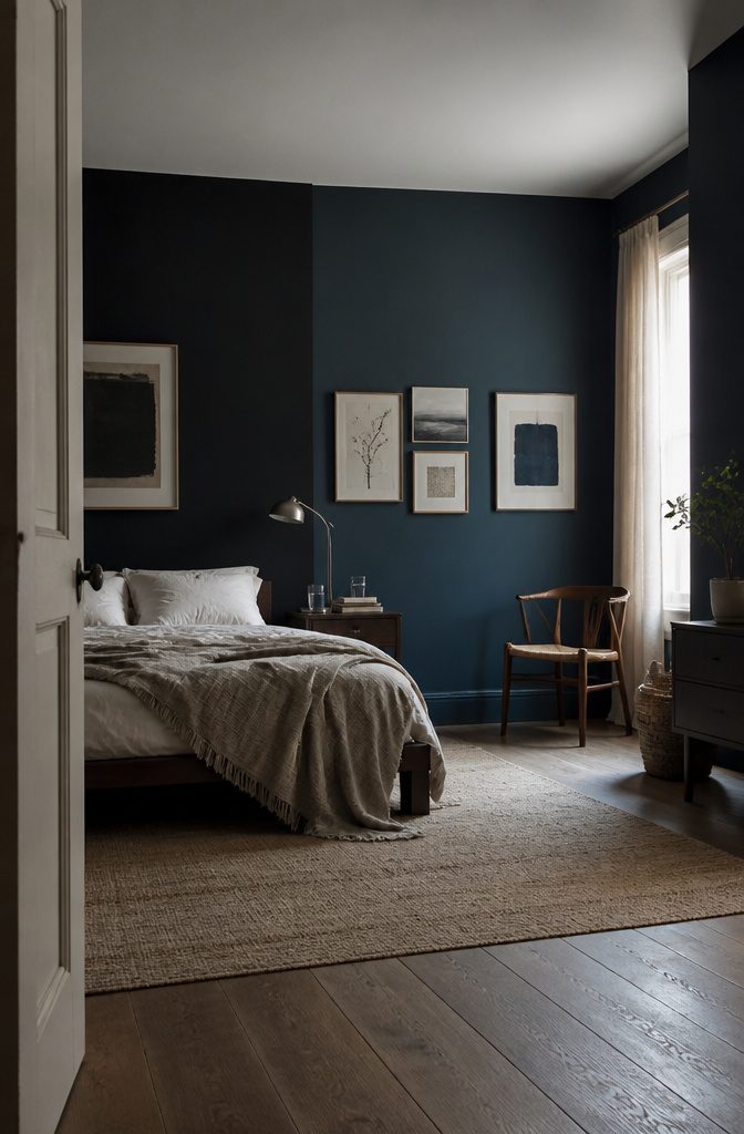
Rich Black looks like black at first glance, but its blue undertone gives it more depth than standard black.
That makes it a strong backdrop behind a bed, a sofa, or a gallery wall, where you want a look that is sophisticated and elegant instead of flat.
Prussian Blue is just as deep and dark. What separates the two is a blue undertone in Rich Black and a slight greenish undertone in Prussian Blue.
That green note makes Prussian Blue read as richer and a little mysterious, and it stands out within the blue family. It also works well as a dramatic backdrop.
Both shades darken a room, so in a small space the walls look closer together.
Ocean Boat Blue
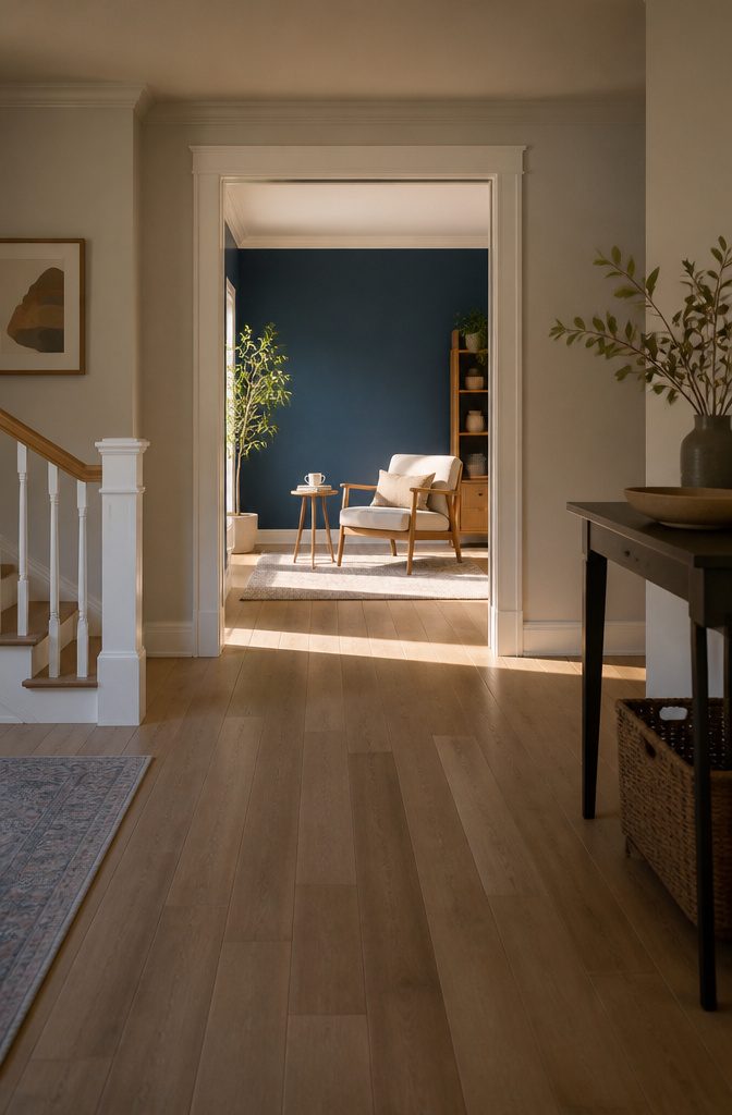
Ocean Boat Blue is a deep, rich blue with a hint of green, close to the color of open water.
The green undertone keeps it from reading as cold the way a pure navy can, and it gives the shade a calm, slightly dressy feel.
Use it where you want a room to settle down. Ocean Boat Blue works best as a background: the wall behind a bed, a reading nook, or a bathroom where the depth feels spa-like.
Because it is dark, give it light company. White trim and pale wood keep it from closing in a small room, and warm neutrals pick up the green in the blue.
True Blue
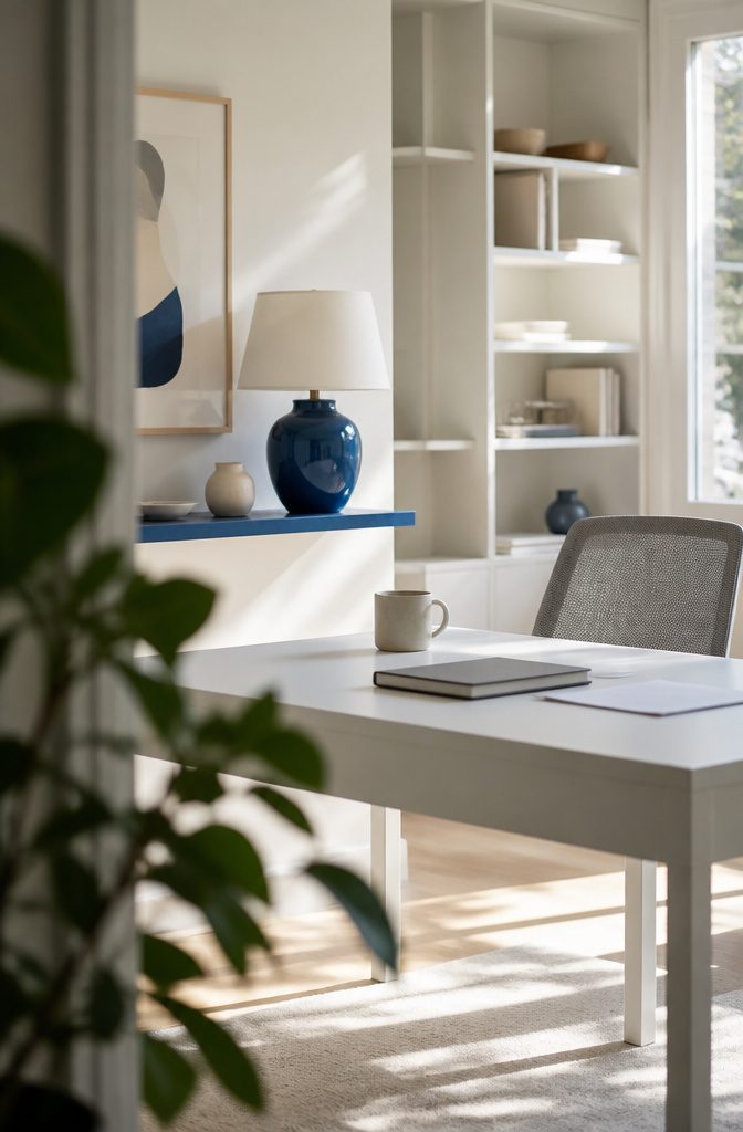
True Blue is the straight blue: vivid and pure, with no green pulling it toward teal and no purple pulling it toward violet.
That makes it a useful reference point, because you can judge any other blue by which way it leans away from this one.
Its intensity is the selling point.
Use it where you want the eye to land first, such as headers, titles, and logos. In a header it pulls attention to the key information.
On marketing materials it reads as clear and bright, and it gives a brand the trust and professionalism blue is known for. Keep it to small doses, since a full page of something this saturated competes with itself.
Sapphire and Royal Azure
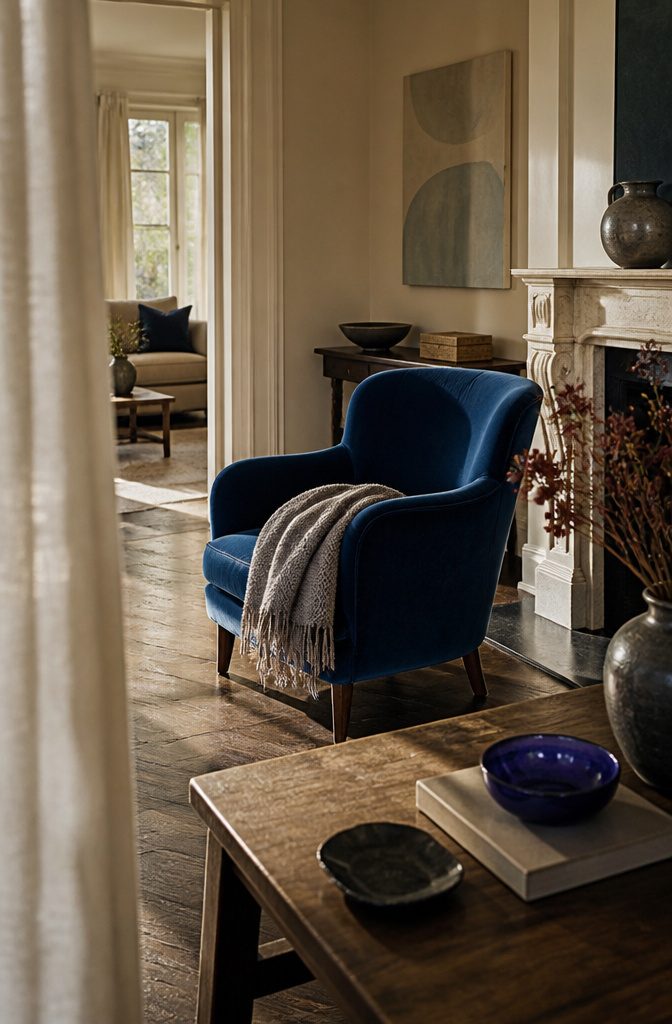
Sapphire is a deep, rich blue that reads as luxury and sophistication. It suits high-end branding and luxury product design, and the same depth works in decor, where it makes a room feel weighty rather than breezy.
Because the shade is so intense, use Sapphire as the single anchor color and keep everything around it quiet.
Royal Azure is the purple-leaning version of Sapphire.
It keeps the same richness but adds a hint of purple, which makes it a little more dramatic and a little more regal. Choose it for luxury branding or premium product design when plain Sapphire feels too expected.
Maya Blue and Ball Blue
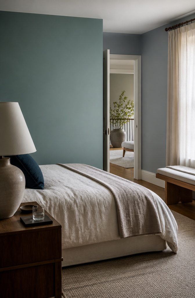
Maya Blue is a soft, muted blue with a hint of green.
The green warms it slightly, so it reads as relaxed and timeless rather than formal. That makes it a good choice for a background meant to calm a room without drawing attention.
Ball Blue is also soft and muted, but its hint of gray pushes it toward the sophisticated end. The gray cools it and quiets it further, leaving a serene, understated backdrop that looks more tailored than Maya Blue.
Choose Maya Blue for calm, Ball Blue for polish.
Both are low-intensity, so neither will carry a room alone. Pair them with a darker blue or a deeper neutral if you want contrast.
Cobalt, Ultramarine, Smalt and Zaffre
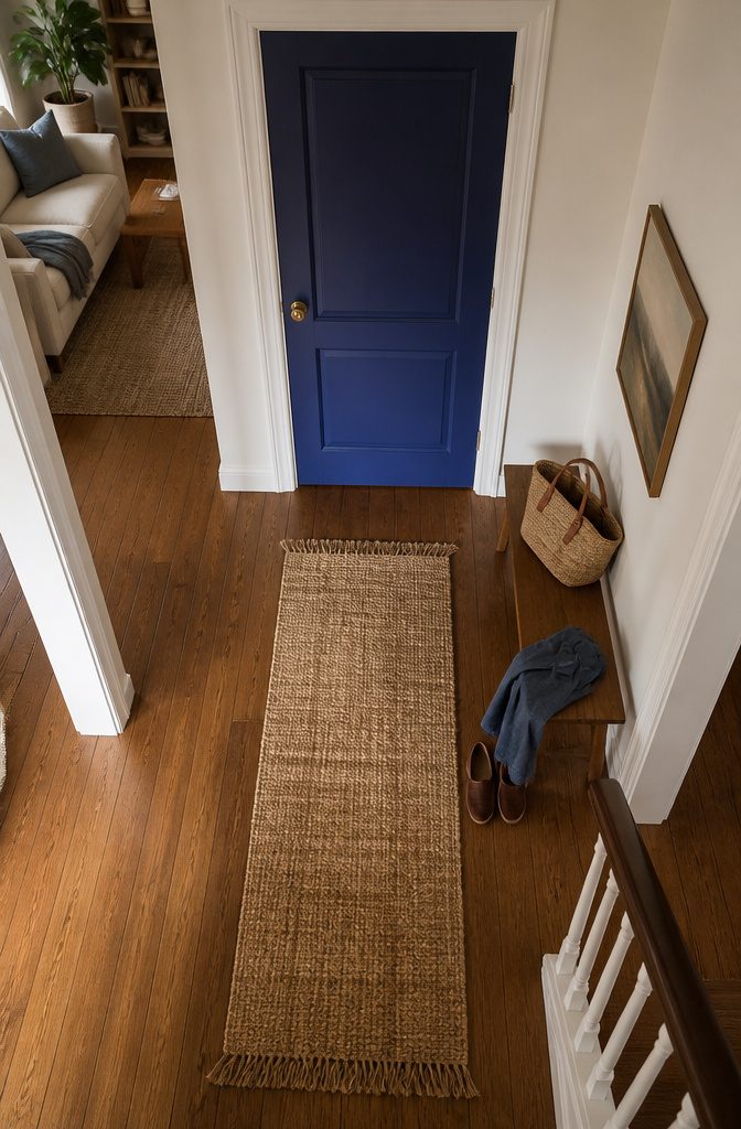
These four deep blues all lean slightly toward purple, and the differences between them are small. Cobalt is deep and saturated with a faint violet cast, and it suits bold elements like a single door or an accent chair.
Ultramarine is vivid and deep with the same purple hint, which makes it a good choice for headers or buttons.
Smalt is deep and lively, also with a purple hint, and works best as a bold accent. Zaffre is the most intense, leaning toward indigo instead of violet, and it fits high-impact presentations or branding.
Choose one per project. Two of them side by side look like a mismatch, because the gap is too small to read as deliberate.
Egyptian Blue
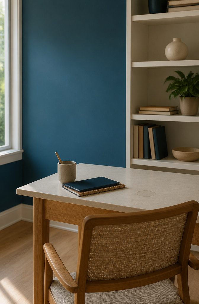
Egyptian Blue is a vivid, deep blue with a faint green undertone, and that undertone keeps a strong color from feeling harsh.
A blue with no warmth in it can read cold and sharp at full strength. A little green pulls the shade toward the middle of the color wheel, so it stays rich without the icy edge.
This is a shade to use as a background for presentations and infographics.
Its depth gives white or pale text something solid to sit on, and the color still looks lively on a screen. It works best in large areas, where the green undertone has room to show.
Azure and Cerulean
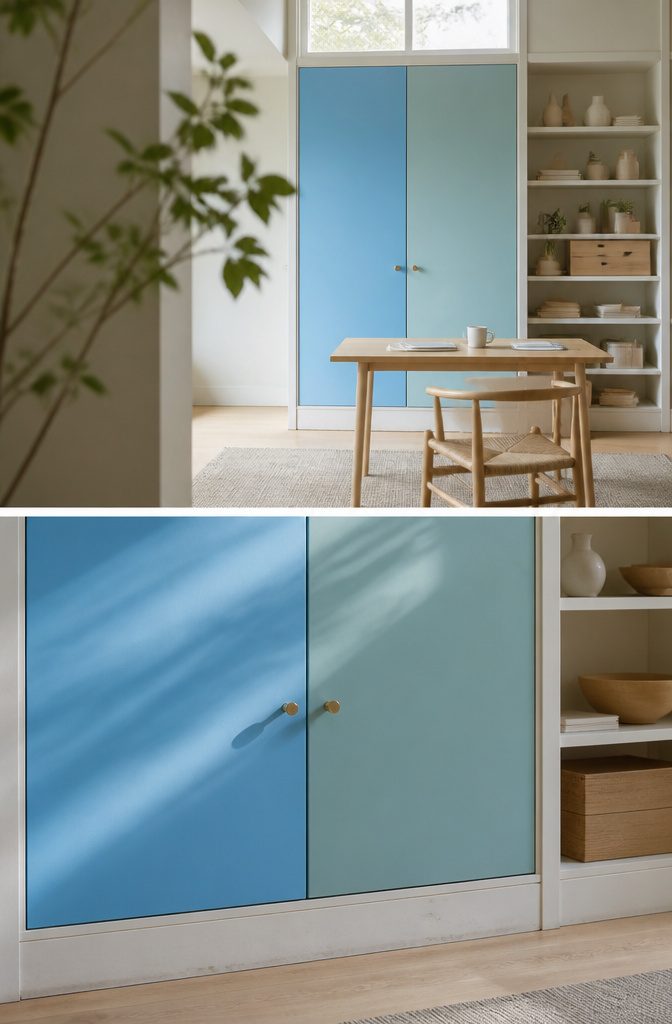
Azure and Cerulean are both sky blues, and the difference is a hint of green in Cerulean.
Azure is bright and clear, like a cloudless sky. That crispness and liveliness make it a good background shade when you want a design to feel clean and welcoming.
Cerulean is softer.
It pairs the calm of a light blue with that touch of green, so it reads serene and peaceful rather than crisp. Use it behind presentations or infographics where you want a soothing, quiet backdrop.
For a background, pick Azure for energy and Cerulean for calm. Hold the two swatches side by side before you commit, because the green lean is easy to miss when you see one alone.
CG, Sea and Pacific Blue
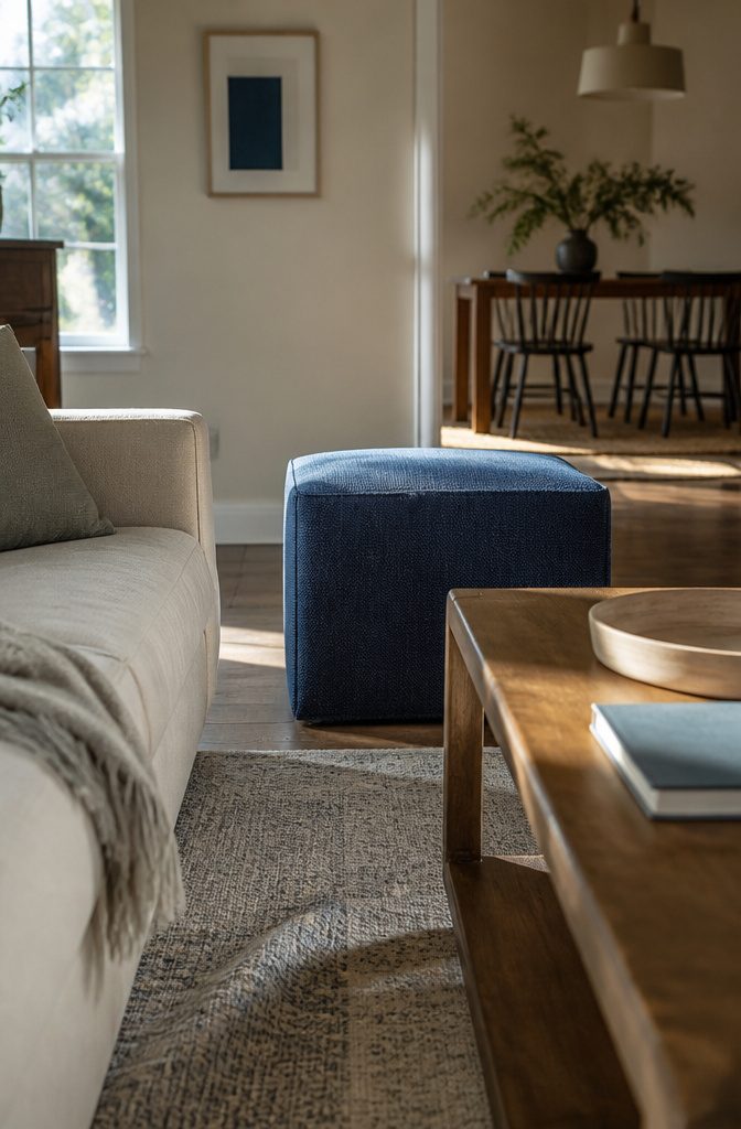
CG Blue, Sea Blue and Pacific Blue all describe the same thing: a medium-dark blue with the depth of navy and a hint of teal.
Names alone don’t tell them apart, and without color values to compare, treat them as one shade with three labels. Use whichever name your design tool or paint line lists, and check the swatch itself before you commit.
This shade works best where the eye needs to land.
Save it for key elements, such as call-to-action buttons or important information in a digital design. Its intensity holds attention, so a small dose does more than filling a whole page or wall with it.
Bondi Blue
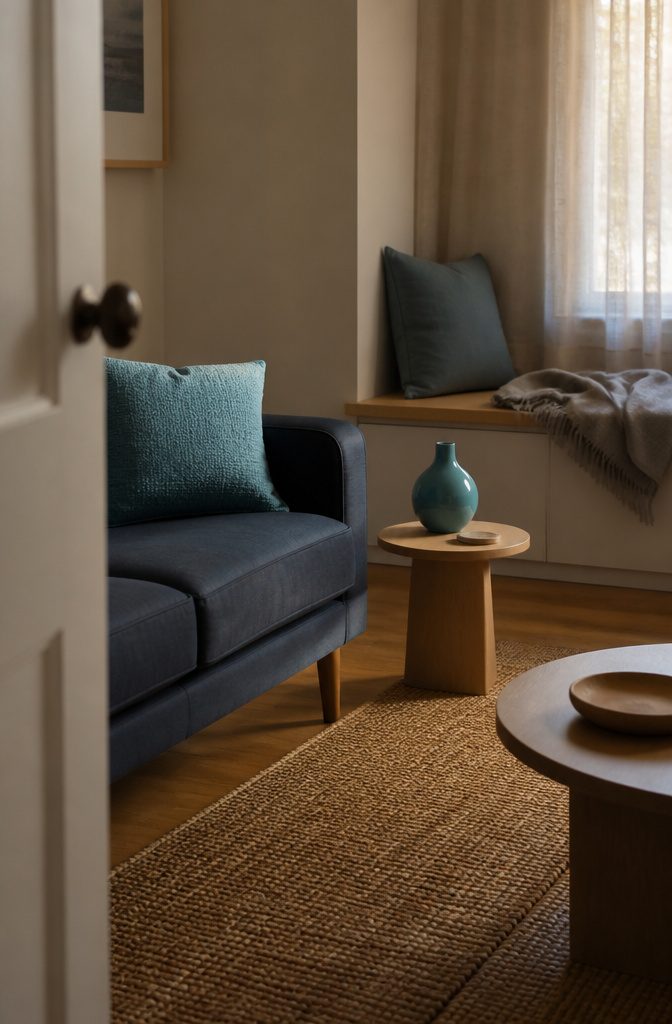
Bondi Blue is the lightest and most turquoise shade in this group. It sits at medium-light, and the hint of green running through the turquoise keeps it lively where the deeper blues read as serious.
That brightness decides where it belongs. Use it for call-to-action buttons and small accent elements, where a touch of energy and clarity does the work.
Skip it as a large background fill. A shade this fresh is better spent in small doses, set against calmer, darker blues that let it stand out.
UA Blue
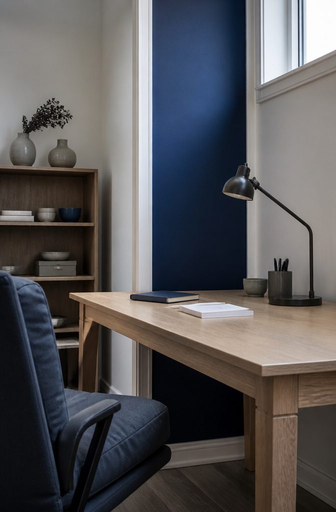
UA Blue is a navy that keeps some of its brightness. Plain navy tends to sink into the background, but this shade has enough lift to stand out among other blues while still looking serious and authoritative.
Use it in small, deliberate doses. Headers and accent elements in professional presentations are where it works best: a title bar, a divider line, a call-out box.
Set it against white or a light neutral so the depth reads clearly. For long blocks of text, a lighter background is the safer choice, since a color this deep gets heavy over many lines.
Bleu De France and Brandeis Blue
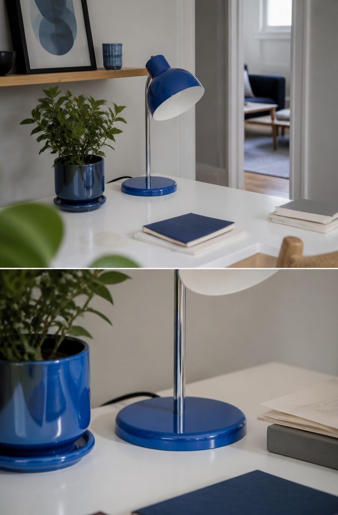
Bleu De France and Brandeis Blue are the same kind of color: vivid, medium-bright blues that sit close together, so the choice comes down to the job each one does.
Bleu De France adds elegance. It reads as refined and sophisticated, which suits a logo, a brand color, or a website where you want some energy without shouting.
Brandeis Blue adds clarity. Its intensity makes headers and call-to-action buttons stand out, so use it where the eye needs to land first.
If you’re picking one for a small project, Brandeis wins for anything people must read or click. Bleu De France wins for anything that represents you or your brand.
What Blue Does to a Mood
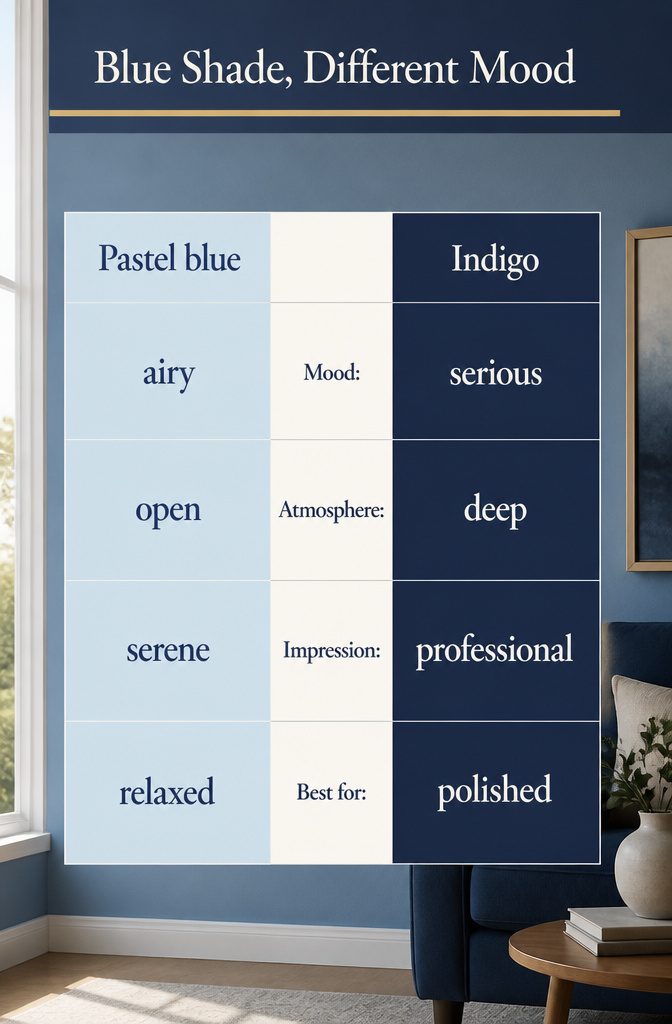
Blue reads as calm and tranquil, and the shade you pick changes how that calm comes across. The range runs from the palest pastels to the deepest indigos, and each step along it carries a different message.
Light blues suggest serenity and openness. Darker blues suggest professionalism and depth.
Choose the shade for the mood you want to send, not for how it looks alone on a swatch. A pastel blue and an indigo are both calm, but the pastel feels airy and the indigo feels serious.
If you want something relaxed and open, go light. If you want it to look polished and professional, go dark.
Where Blue Gets Used
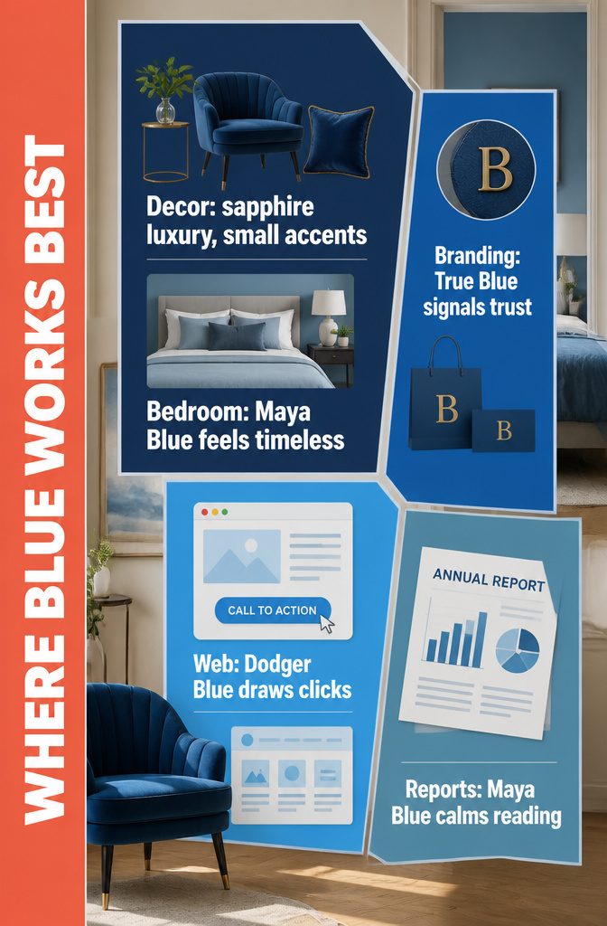
Blue shows up in five places, and decor is the one you can change in a weekend.
- Interior decor: Sapphire adds a touch of luxury, so use it small, in a velvet pillow or one accent chair. Maya Blue gives a calm, timeless feel that suits a bedroom.
- Branding: True Blue in a logo or marketing materials reads as trustworthy and professional, and it makes a bold, memorable impression.
- Web design: Dodger Blue on call-to-action buttons draws the eye. Azure makes a bright, welcoming background.
- Presentations and infographics: Maya Blue keeps a report calm to read. Use one blue for headings and a lighter one behind them.
Frequently Asked Questions
What mood does a blue color palette create?
Blue reads as calm overall, and the shade changes the tone.
Light blues suggest serenity and openness, while darker blues suggest professionalism and depth. A pastel blue feels airy, and an indigo feels serious.
Which blue is best for a calm bedroom or background?
Maya Blue is the calm choice: a soft, muted blue with a hint of green that suits a bedroom.
For a deeper look, Ocean Boat Blue works on the wall behind a bed. Pair it with white trim and pale wood so it doesn’t close in the room.
Which blues work best for buttons and calls to action?
Dodger Blue and Brandeis Blue are the strongest picks, since both are vivid and draw the eye first.
Bondi Blue is a lighter, turquoise option for small accents. CG, Sea and Pacific Blue also suit key elements like buttons.
What is the difference between Rich Black and Prussian Blue?
Rich Black has a blue undertone, and Prussian Blue has a slight greenish one.
The green note makes Prussian Blue look richer and a little mysterious. Both are dark enough to make walls in a small room seem closer together.
What is the difference between Azure and Cerulean?
Cerulean has a hint of green that Azure lacks.
Azure is bright and crisp, like a cloudless sky, while Cerulean is softer and more serene. Compare the two swatches side by side, because the green lean is easy to miss on one alone.
How many blues should I use in one room or design?
Pick one bright blue and repeat it in 2 or 3 small items, keeping it to accents. Avoid putting Cobalt, Ultramarine, Smalt or Zaffre next to each other, because the gap between them is too small to look intentional.
Which blue is best for a logo or brand?
True Blue is a safe choice for a logo, since it reads as trustworthy and professional.
Sapphire suits luxury branding, and Bleu De France gives a refined, elegant look with some energy. Royal Azure is an option when Sapphire feels too expected.