
Beige is a light brown made from faint red and yellow, lightened with white; its HEX value is #F5F5DC.
The undertone changes how it reads: orange warms it, yellow makes it sunnier, and extra brown pushes it toward khaki. Tape swatches side by side before buying, since a single card hides the difference.
Beige Color Values
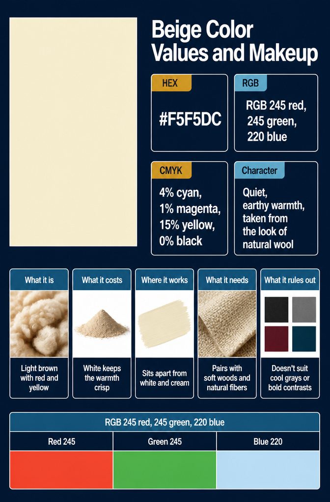
Beige is a light brown made from the faintest amounts of red and yellow, then lightened with white.
The white keeps it crisp, so the warmth is present but only just. That makes it a light, sandy neutral that sits apart from both white and cream, and a dependable one because it never pushes hard in any direction.
The values to copy are HEX #F5F5DC and RGB 245 red, 245 green, 220 blue.
For print, the CMYK mix is 4% cyan, 1% magenta, 15% yellow and 0% black. Red and green are equal and blue is lower, which is the numeric version of that soft yellow cast.
Its character is quiet, earthy warmth, taken from the look of natural wool.
Beige Undertones and Shades
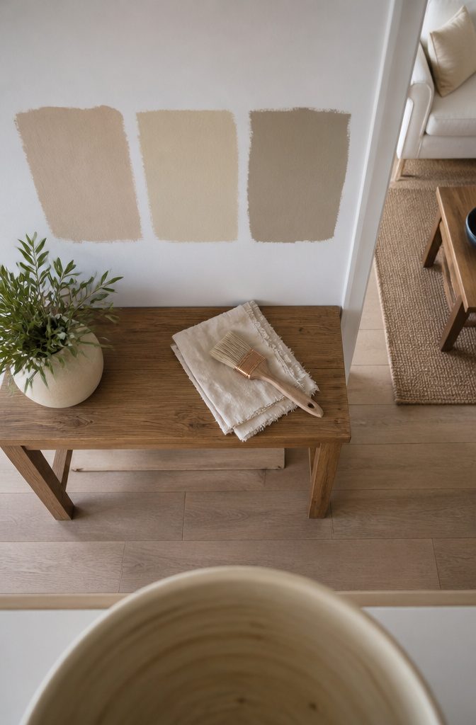
Beige is a light brown made with the faintest touches of red and yellow, then lightened with white. The white keeps it crisp, so the warmth stays mild.
Small changes in the mix shift the color.
An orange undertone makes a warmer beige, while a yellow undertone makes it sunnier and more optimistic. Extra brown pulls it toward khaki, which looks more formal.
Two beiges look different side by side because each leans a different way: one toward orange, one toward yellow, one toward brown.
Alone, either can pass as "just beige." Tape swatches next to each other on your wall before you buy, because undertone shows up in comparison far more than on a single card.
Pairing Beige With Other Colors
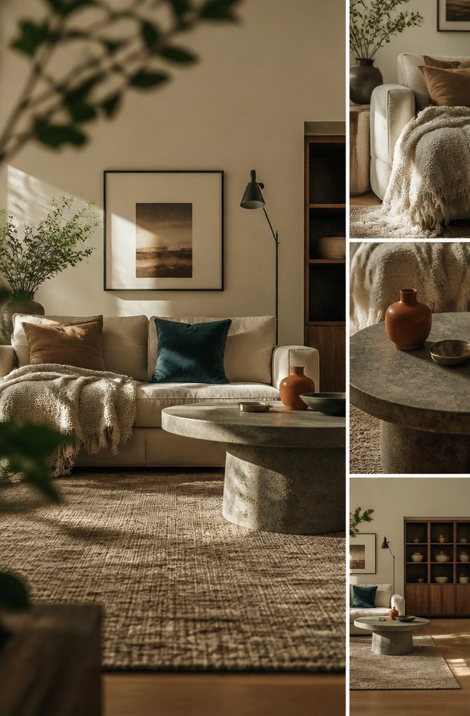
Beige works with any color, so what sits beside it sets the mood. Pair it with other earthy tones for an eco-conscious look.
Put it next to bright colors and it tones their energy down, so a saturated orange or teal feels calmer against beige. Gray or white beside beige reads as timeless and upscale.
Beige (#F5F5DC) with black (#000000) is the sharpest contrast of the group.
The black gives crisp edges, and the beige keeps the room from feeling stark. Use black in small doses, such as frames, hardware, or a single chair, so it accents the beige instead of taking over.
Recommended Products

STYLE: Easily update your kitchen and bathroom cabinets or furniture with our casual cabinet hardware collection.

PREMIUM MATERIAL: Plustool Gold Cabinet Handles are made of high-precision quality stainless steel with perfect brushed brass finish, which do not leave any fingerprint; The flat surface of dresser handles is smooth without losing texture, not easy to fade,rust,oxidation and easy to clean; Durable and strong, elegant addition to any home

Seller provides 24/7 customer care service, any product issue will be responded via email within 24 Hours.
Gold and Brass With Beige
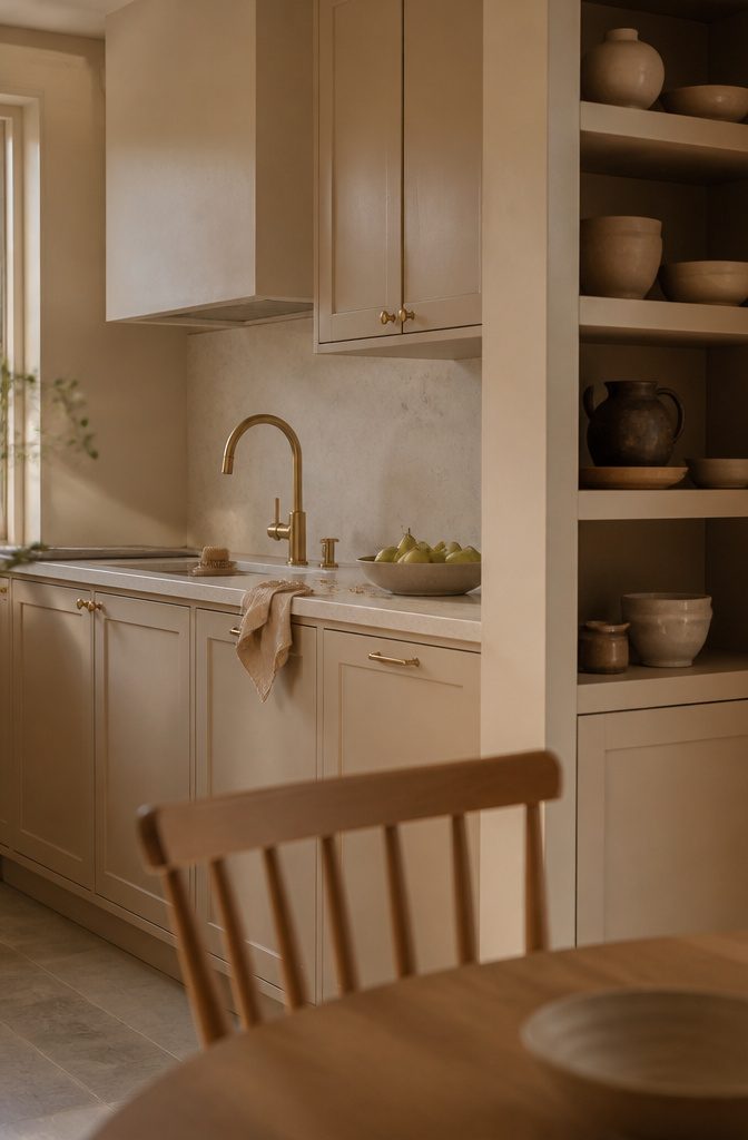
Beige is light and warm enough to make metallics look expensive. The shimmer of gold and the luster of brass both read as sophisticated and luxurious against it, because a soft neutral gives the metal nothing to compete with.
Pick one metal for the room and let beige carry everything else around it. A lamp base, a set of cabinet pulls, or a picture frame is enough.
Gold and brass work best as a few small accents repeated across the room, since the shine already draws the eye and too much of it turns the look loud instead of luxe.
Beige History and Cultural Meaning
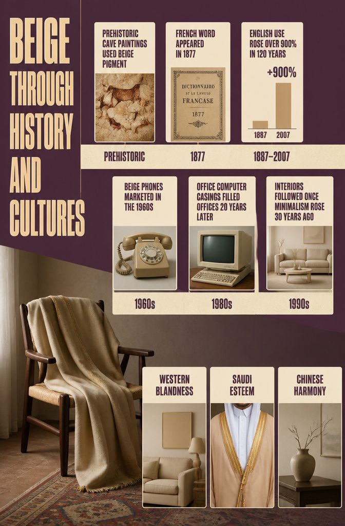
Beige is the French word for natural wool.
It appeared in French in 1877 and in English after 1887, but the color is far older: beige pigments show up in prehistoric cave paintings. English use then climbed fast.
Its rise in use has been so massive, in fact, that it’s grown over 900% in use in 120 years.
AT&T marketed a phone as beige in the 1960s, and beige computer casings filled offices 20 years later. Interiors followed once minimalism rose 30 years ago.
In many Western cultures beige reads as boring, and a bland attitude gets called "beige."
In Saudi Arabia it is a color of esteem, seen in the traditional bisht cloak. In China it signals sophistication and harmony.
Recommended Products

Raw Material: Made of 26Nm/2 pure Merino wool fine yarn, this 100% merino wool sweater has a wool fineness of 17.5-17.9-micron, with beautifully soft and fluffy texture, 2-Ply densely-knitted yarn of Long Staple finest fibers to deliver Best Anti-Pilling Performance.

PREMIUM MATERIAL: The front side is made of thicked Boucle fabric, back side is made of canvas. Thick and durable enough for long-term use

A POLO COLLAR WE ADDED FOR INTENTION — The buttoned placket gives this sweater a cleaner line than a plain crewneck, a detail we chose to make it feel more considered. The collar is knit with a soft edge, so it sits flat without curling.
Frequently Asked Questions
What is the meaning of the color beige?
Beige stands for quiet, earthy warmth.
The name is French for natural wool, which is the look the color borrows. It is a dependable neutral that stays in the background and lets other colors take the lead.
What category is beige in?
Beige is a neutral.
More precisely, it is a light brown with faint red and yellow tones and a good deal of white, which places it between white and cream. Its HEX code is #F5F5DC.
What does it mean when someone is described as beige, and how do cultures view the color?
In many Western cultures, calling a person, activity or attitude "beige" means it is bland or conventional.
Other cultures read the color very differently. In Saudi Arabia it signals esteem and appears on the traditional bisht cloak, and in China it stands for sophistication and harmony.
Which color best complements beige?
Black gives the strongest contrast, and it works best in small amounts such as frames, hardware or a single chair.
Gray or white next to beige looks timeless and upscale. Gold and brass accents also look luxurious against it.