
The schemes run from pale butter yellow and mist blue to navy and deep moss green, and the light in the room decides which one fits.
Sunlit bedrooms can carry the dark shades. A dim bedroom with navy on all four walls feels closed in, so go lighter there.
1. Soft Blue With White
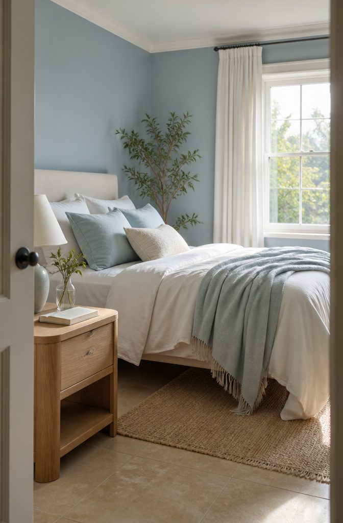
Mist blue suits a bedroom that gets morning light, because the pale tone reads as calm instead of cold.
Light blue is among the shades known to create a calming environment and promote restful sleep, and sky blue with cream is a soft, soothing pairing.
Use white or cream for the bedding and trim, and choose cotton for sheets, curtains, and throws. If you’re laying new flooring, satin beige tiles or blue tiles give the room a hotel-like look.
Beige also warms the blue, so the room doesn’t feel icy. Skip cool bright white on every surface if you want that restful feel; cream is gentler.
2. Sage Green With Neutrals
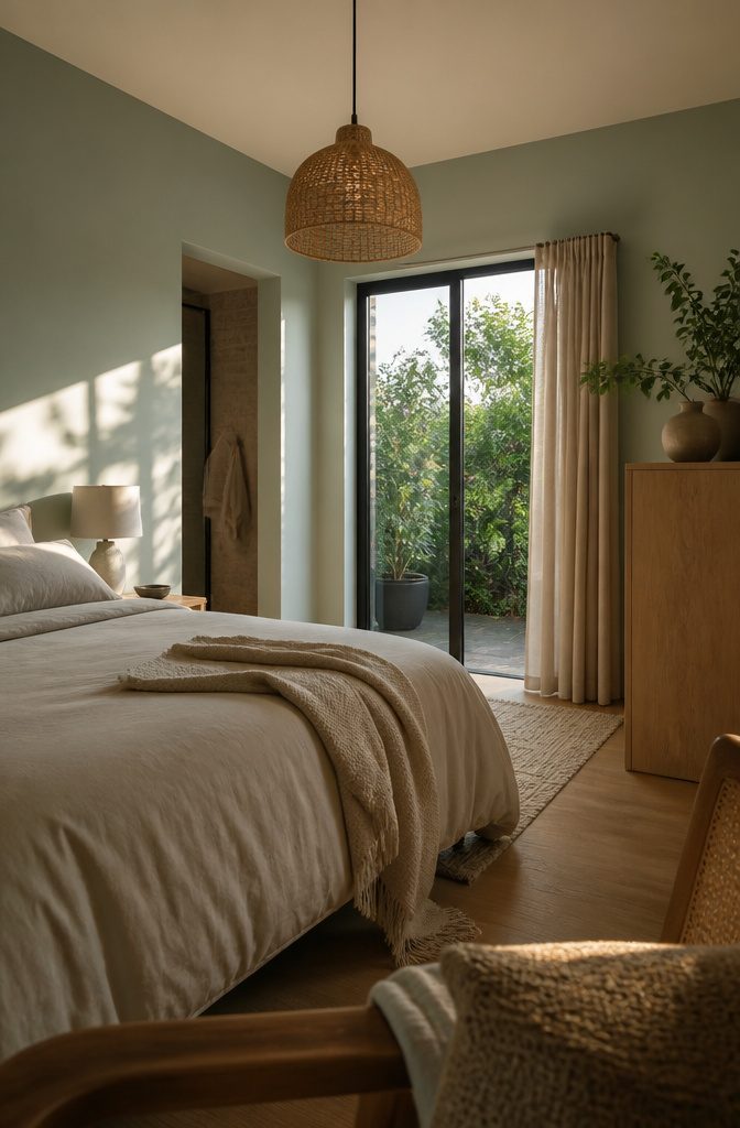
Sage green behaves like a neutral, so it sits easily beside oak-look floors, cane lighting, and beige bedding. Keep the supporting colors warm (oatmeal, sand, light wood) so the green doesn’t turn cold or flat.
Choose the undertone by the light in the room.
Sage with subtle blue undertones cools a space, which suits a west-facing bedroom that gets strong afternoon sun. Stone-effect tiles and brushed steel accents go well with that bluer version and give it a more modern, composed look.
If you want something lighter, mint green with white is soft and soothing, though it reads fresher and less earthy than sage.
3. Lavender and Mauve
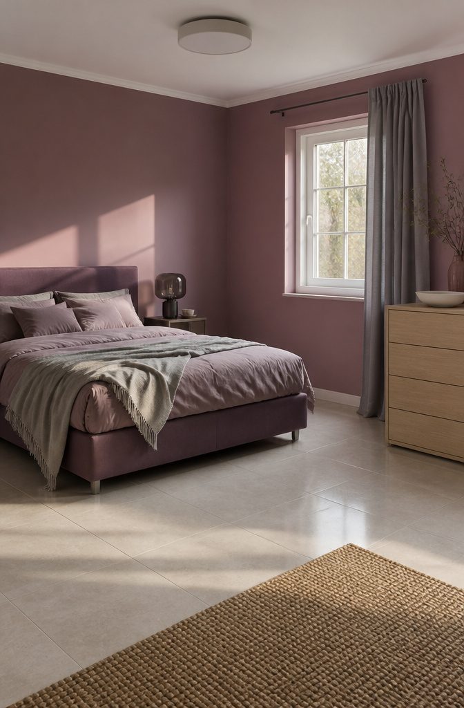
Pale lavender is romantic and tranquil, and it behaves like a neutral.
Benjamin Moore’s Spring Lilac is a good pale example, and solid purple upholstery in the same family carries the color through the room without clashing. Gray beside it keeps the sweetness in check.
Mauve is the grown-up version.
A muted mauve-purple feels composed and elegant, and it suits medium and larger bedrooms. Pearl white tiles and smoked glass details finish it.
In a small room, switch to a mauvey beige, which reads soothing and mature, especially under soft lighting. Satin cream or beige tiles and light oak keep it understated.
4. Warm White and Beige
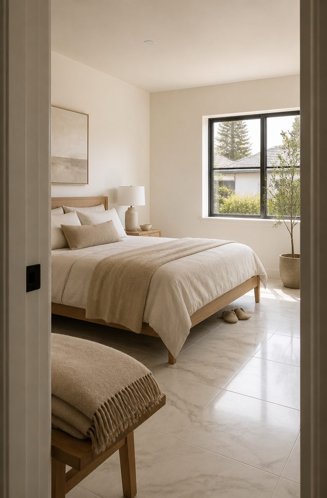
Warm white feels open and orderly, and it adapts to almost any bedroom style. Its one risk is looking clinical.
White or marble-look tiles with soft oak furniture keep it warm. Mountain Peak White by Benjamin Moore, used on both walls and ceiling, is a good example of the shade.
Beige leans calmer.
A mauve-and-beige blend reads soothing and mature, and it works especially well in a smaller room under soft lighting. Satin cream or beige tiles with light oak keep the finish understated.
For a sandy beige, Sandy Shores by Benjamin Moore over grass cloth adds texture and a beachy, old-fashioned feel.
5. Gray With White or Cream
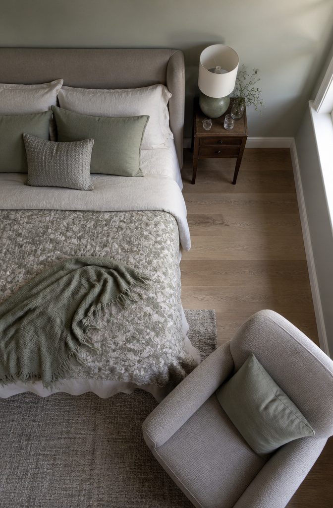
Gray stays warm when something in the mix isn’t pure gray. Benjamin Moore’s Horizon Gray is a light gray with a touch of sage, and with Swiss Coffee, a warm white, on the ceiling, it reads calm instead of chilly.
Choose a gray with a green or brown lean and pair it with a warm white or cream, not a stark one.
Contrast is what shifts between the two.
A soft gray-and-white room, like one with Farrow & Ball’s Pointing on the walls, looks tranquil and understated, but it has little drama. Patterned fabric on the bed or an armchair, plus textured linens, keeps it from going flat.
6. Pink With Gray or Brown
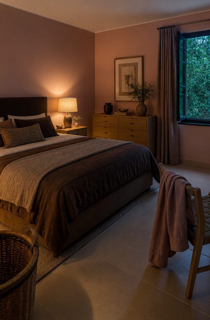
Baby pink with gray or white stays pastel and light. It reads calm and airy, and pink with beige gives a quieter version of the same look.
Swap the gray for brown and the room gets warmer and more grounded. Blush pink walls with cocoa-brown details add depth that the pastel versions lack, and the palette suits a medium-sized bedroom.
Put the brown in bedding, curtains, or a headboard so it’s cheap to adjust. Matte sand tile and brass accents finish the scheme and keep it cozy without looking heavy.
Pick gray if you want a bedroom that feels bright in the morning. Pick brown if the room is mostly used at night.
7. Terracotta and Warm Brown
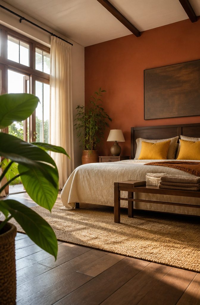
Clay and chocolate browns give a bedroom a cocooned, intimate feel, and they suit rooms with good ventilation. Sienna Clay by Benjamin Moore works as an accent wall, especially where light floods in from large windows.
Sandy Brown by Benjamin Moore covers all four walls well when you pair it with warm yellows and watery blues. Terracotta, warm yellows, and earth tones also sit comfortably with beige or wood.
Deep warm colors can close a room in.
Cream or ivory in the bedding, curtains, or tile keeps the walls from feeling heavy. A few indoor plants against the brown help balance it too.
8. Navy With Metallic Accents
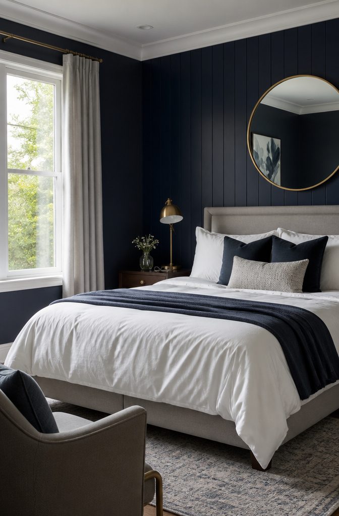
Navy walls with white bedding and metallic accents (brass lamps, a gold-framed mirror) make a bedroom look dramatic and tailored.
For the deepest version, paint one blue-black accent wall behind the bed and balance it with pale gray and white furnishings. That mix looks striking and calm instead of heavy.
Dark blue absorbs light, so this scheme works best in a room that gets plenty of natural daylight. In a dim bedroom, navy on all four walls can feel closed in, and you’ll switch on lamps by midafternoon.
If you want a blue that’s less severe, Benjamin Moore’s Woodlawn Blue is a soothing option to test on a wall first.
9. Deep Green With Gold
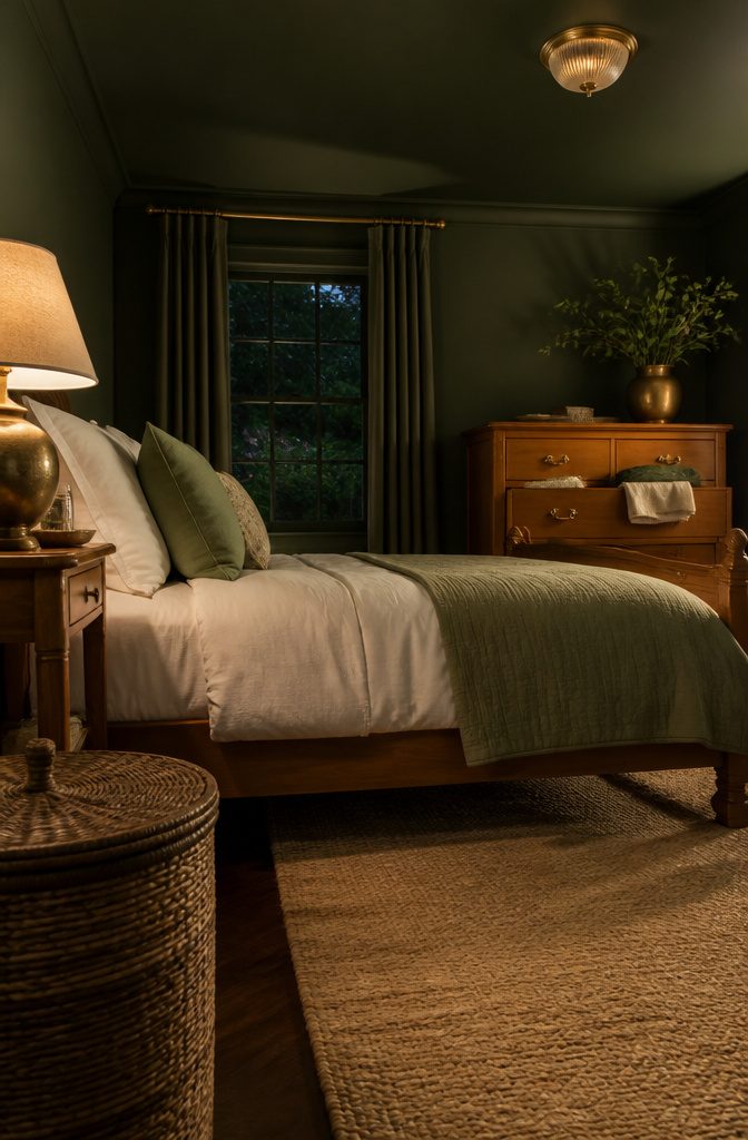
Deep moss green makes a bedroom feel grounded and restful, and it looks best under warm-toned bulbs. Cool light turns it flat and gray.
Honey-toned wood and woven textures bring out the natural feel. Add gold in small doses, like a lamp base, a mirror frame, or drawer pulls, so the green stays the main event.
For a fuller commitment, Benjamin Moore’s Palace Green on both walls and ceiling wraps the room in color. It suits a traditional bed, such as a Hepplewhite-style frame.
A brighter leafy green reads fresher and works better in a spacious room or a warm-weather refresh. Pair it with textured beige tile and rattan to keep it light.
10. Yellow With White or Green
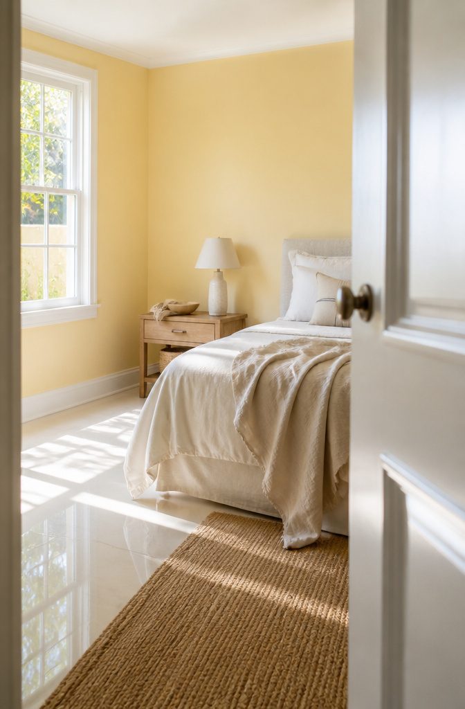
Pale butter yellow suits an east-facing bedroom, where morning sun warms it and the room feels light.
Pair it with white or cream bedding and trim. If your floor is tile, glossy ivory bounces light back up into the room.
For a sharper look, put a citrus yellow-green on one feature wall. This shade works best in bright rooms, so skip it in a dim bedroom.
Matte gray tiles, green tiles, and charcoal accessories keep it from reading as loud. Butter yellow is the safer choice if you’re painting every wall, and yellow-green is better kept to a single wall.
11. Blue and Green Together
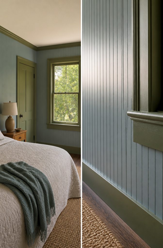
Blue and green sit side by side on the color wheel, and both read as cool and calm.
Keep them at similar softness, both muted or both slightly grayed, and the room holds together. A pale blue next to a saturated emerald splits the room into two competing colors.
A tested pairing is Philipsburg Blue by Benjamin Moore on beadboard walls with Newburg Green by Benjamin Moore on the trim. The slightly darker green outlines the woodwork and adds depth without a hard contrast.
A sage green with subtle blue undertones does the same job in one color. It cools a west-facing bedroom and suits brushed steel accents and stone-effect tile.
12. A Bold Accent Wall
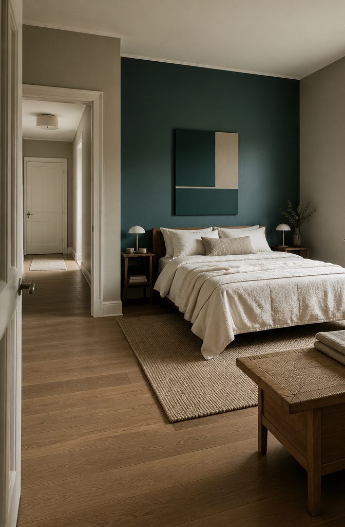
One deep wall against quieter surroundings gives a bedroom a focal point without making every surface bold.
The wall behind the bed is the usual pick, because the headboard already draws the eye there. Keep the other walls softer so the accent stands out.
Stick to 2 or 3 colors in total to keep the room balanced: the accent, a quiet wall shade, and one trim or bedding color.
A geometric shape or color-block panel adds interest if a solid wall feels flat. Color can also run onto trim, ceilings, or beams.
An accent wall is the low-risk way to try a bold shade. If it’s wrong, repainting one wall is a quick, cheap fix.
13. Wall Color Matched to Tile and Wood
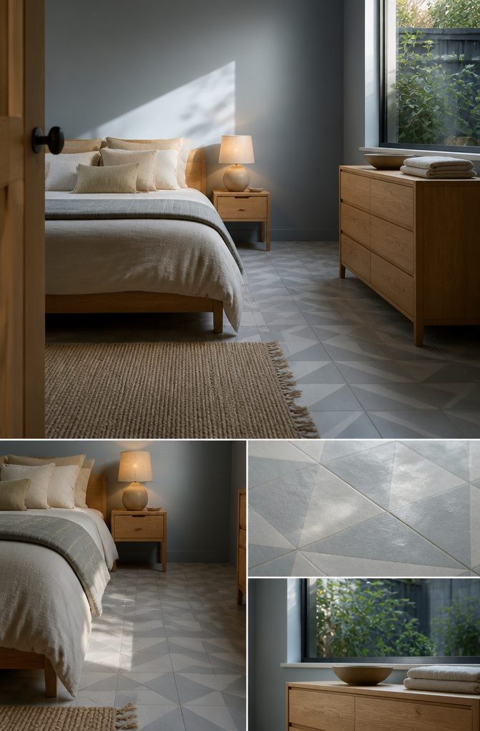
Tile outlasts paint: walls need repainting every 4–5 years, while tile can last 15–20. Choose the tile first and treat the wall color as the part you can change later.
A wall in the same color family as the tile gives the calmest result. If the wall is bold, keep the tile neutral or light so the two don’t compete.
Wood-look and marble-look tile suit earthy or pastel walls, and geometric patterns flatter gray, beige and blue. Save patterned tile for one spot, like the wall behind the bed.
Matte paint beside satin or semi-gloss tile softens reflections. Test samples in both daylight and lamplight before buying.
Light, Orientation, and Room Size
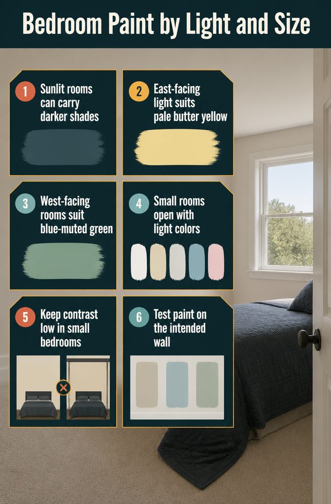
Match the shade to the light in the room before you buy a sample.
- Sunlit rooms can carry darker shades. A room with little natural light does better with lighter ones.
- East-facing rooms get morning sun, which suits pale butter yellow.
- West-facing rooms suit a muted green with blue undertones. Its cooling effect is the reason it works there.
- Small rooms feel more open in white, cream, off-white, light blue, or pale pink.
- In a small room, keep contrast low. A pale wall next to a dark bedspread or heavy trim makes the walls feel closer.
Test any pick on the wall you plan to paint, since the same color reads differently from room to room.
Colors by Room Use
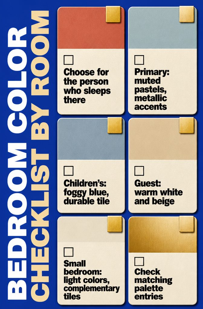
Pick the palette for the person who sleeps there, then check it against the matching entries above.
- Primary bedroom: Muted pastels with metallic accents read as refined. Soft blue walls, silk draperies and a single red window shade show that one bold note can still look polished.
- Children’s room: Foggy blue holds up as themes change. Pair it with durable vitrified tile and easy-clean finishes for active kids.
- Guest room: Stay neutral, like the warm white and beige pairing above, so the room suits any visitor.
- Small bedroom: Lighter colors with complementary tiles make the space feel larger.
Frequently Asked Questions
Which two-color combination is best for bedroom walls?
Beige with white is the safest pairing, and pink with gray is the popular pastel choice.
Pink and gray stays light and airy. Swapping the gray for brown gives a warmer, more grounded room.
What are the trending bedroom colors for 2026?
Calming neutrals, earthy greens, pastel lilacs, rich blues, and warm terracotta are the colors named for 2026, along with bold reds for a daring look.
Most of these appear in the schemes above, so pick the one that suits your room’s light.
What are the most relaxing bedroom colors?
Blue, green, lavender, and soft gray are the colors most associated with calm. Soft blue with white or cream, and sage green with warm neutrals, are easy places to start.
How do I choose the right colors for my bedroom?
Start with the light in the room, then its size, then what feels comfortable to you.
A sunlit room can carry darker shades, while a room with little daylight does better with lighter ones. Test a sample on the wall you plan to paint, because the same color looks different from room to room.
What is the best color scheme for a small bedroom?
White, cream, off-white, light blue, and pale pink make a small bedroom feel more open. Keep contrast low, since a pale wall beside a dark bedspread or heavy trim makes the walls seem closer.
How often should I repaint bedroom walls or replace tiles?
Repaint every 4–5 years; tile can last 15–20 years. Since tile outlasts paint, choose the tile first and treat the wall color as the part you can change later.
Should I use wall tiles or paint on bedroom walls?
Paint is easier to refresh, while tile lasts longer and adds texture.
You can use both, with tile in one area and paint on the rest. Matte paint next to satin or semi-gloss tile also softens reflections.
Which tile patterns work well with modern bedroom color schemes?
Stone-look tile pairs well with soft neutrals, and geometric patterns flatter gray, beige, and blue walls.
Wood-look and marble-look tile suit earthy or pastel colors. Save any pattern for one spot, such as the wall behind the bed.
Can I combine bold color walls with patterned tiles?
Yes, as long as the patterned tile is used sparingly, like on a single accent wall or behind the bed.
Keep the other surfaces quiet. Next to a bold wall, choose neutral or light tile so the two don’t compete.