
Summer is the soft, cool, smoky color season, running from deepest charcoal grey and dark blue spruce to the softest pinks and powder blues.
Your subtype (True, Light, Deep or Soft) marks your strongest colors by skin tone and contrast, but it doesn’t fence off the rest. Cool Summers wear slate grey instead of black and brown.
The Summer Palette
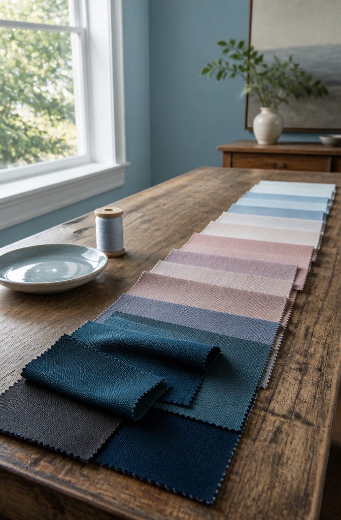
Summer is the soft, cool, smoky, subtle season, running from deepest charcoal grey and darkest blue spruce to the softest pinks and powder blues.
Cool (True) Summer is cool plus soft, and most guides split the season into subtypes that point to your strongest colors by skin tone and contrast level.
A subtype is a pointer, not a fence:
If you fall at one end of a palette, it doesn’t mean you can never go near colours from other areas of that palette – just that this particular area is the strongest for your individual skin tone and contrast level.
The rest of the Summer palette still harmonizes with your best colors.
The Four Summer Subtypes
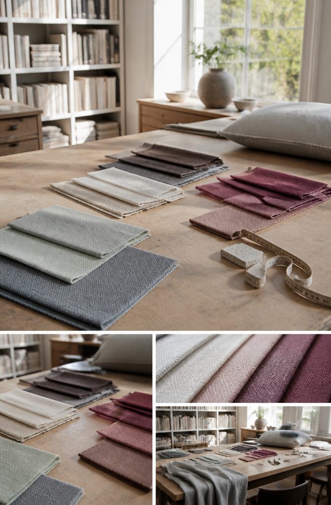
Each Summer subtype is defined by one dominant trait.
Light Summers are light in skin, hair and eyes together, so dark clothes or dyed hair look heavy and artificial on them. Deep Summers can pass for Winters.
| Subtype | Alias | Dominant trait | Eyes | Hair |
|---|---|---|---|---|
| True/Cool | Sweet Pea | Even cool, soft, light | Grey, blue, azure, light green | Ash, dark ash blonde to dark ash brown |
| Light | Pastel, Cotton Wool Ball | Lightness | Light | Light |
| Deep | Dark, Bright | Depth | Deep brown or grey | Often dark |
| Soft | Brown | Little contrast | Hazel or brown | Red-toned |
Colors for Each Subtype
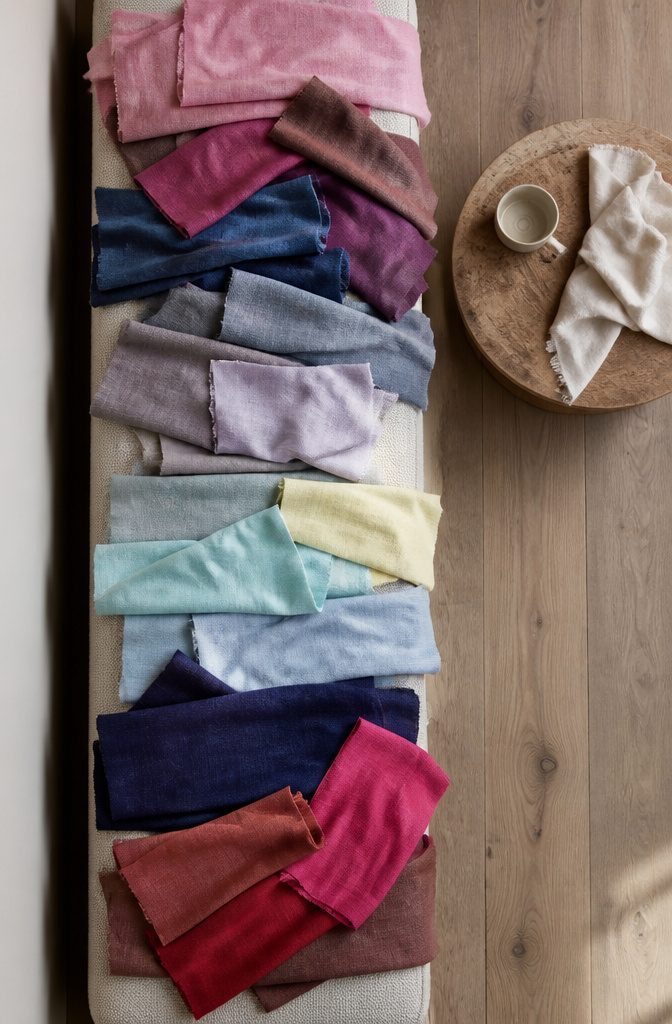
Each subtype pulls from the same cool, muted family but shifts the depth.
- True Summer: rose pinks, denim blues and pinky burgundy.
- Cool Summer: roses, taupe, Gainsboro, cool blush pinks, lavender purples, powder blues and ocean greens. Slate grey is the staple, a stand-in for black and brown, which don’t suit you.
- Light Summer: the palest yellows, light aquas, sky blues and lavender purples, with plenty of white added.
- Deep Summer: deep cool burgundies, soft navy, raspberry pinks and amethyst pinks.
- Soft Summer: rose browns, brown-tinted pinks, soft reds and berry tones.
For Cool Summer, skip black, neon yellow, scarlet red, orange red, peach and saddle browns.
How the Subtypes Differ
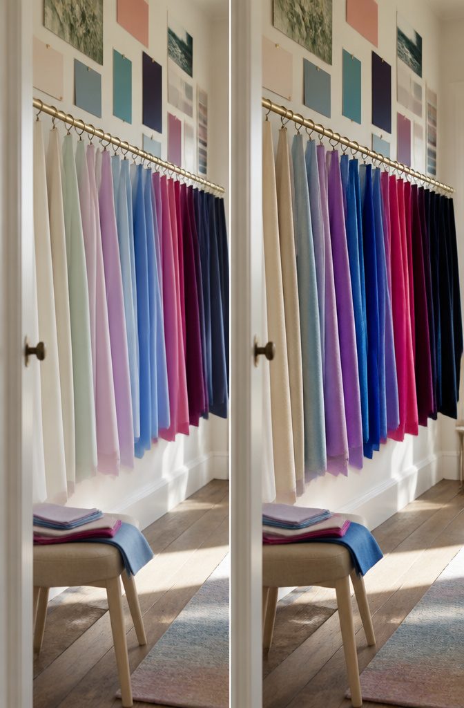
Light Summer leans toward Spring, Deep Summer toward Winter, and Soft Summer toward Autumn.
True Summer sits in the center of the wheel. True Summer is cooler, darker and softer than Light Summer, and more saturated and less muted than Soft Summer.
| Type | Leans toward | Next to True Summer |
|---|---|---|
| Light Summer | Spring | Lighter, less cool |
| True Summer | Center | Cool, soft, light-to-medium value |
| Soft Summer | Autumn | More muted |
| Deep Summer | Winter | n/a |
| Cool Winter | n/a | Deep, crisp, high contrast |
Cool Winter shares the cool undertone, but the split is softness versus clarity and intensity. Powder blue and lavender suit Summer; cobalt and fuchsia suit Winter.
Combine the Colors
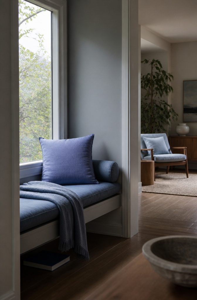
Start with tonal layering, and keep both contrast and the number of colors low within a single outfit. Two or three shades that sit close in depth look calmer on a Summer palette than a sharp light-and-dark split.
If a stronger color feels like too much, wear it tonally.
Periwinkle is the clearest case: pair it with softer denim blues and blue-greys, and they anchor it so the whole outfit reads as one quiet blue family instead of a single bright spot.
Monochrome outfits (one color in several depths) and analogous ones (colors that sit side by side on the color wheel) both give the soft, elegant, low-contrast effect this palette is built for.
A Guide, Not a Rule
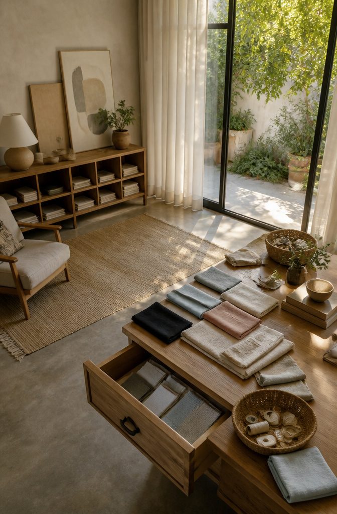
Your subtype points to the part of the Summer palette that is strongest for your skin tone and contrast level, but it doesn’t fence off the rest.
Colors from a neighboring palette still work, and a shade you love can stay in your rotation.
Black is possible for a Cool Summer but not ideal. If you wear it, keep your own colors closest to your face, such as a powder blue or soft pink top or scarf.
If the soft, smoky tones aren’t your taste, trim the palette down to the shades you like and wear only those.
Swap pieces in as old ones wear out instead of clearing your closet in one weekend. An in-person draping session gives the most accurate read on your type.
Cool Summer Wardrobe Basics
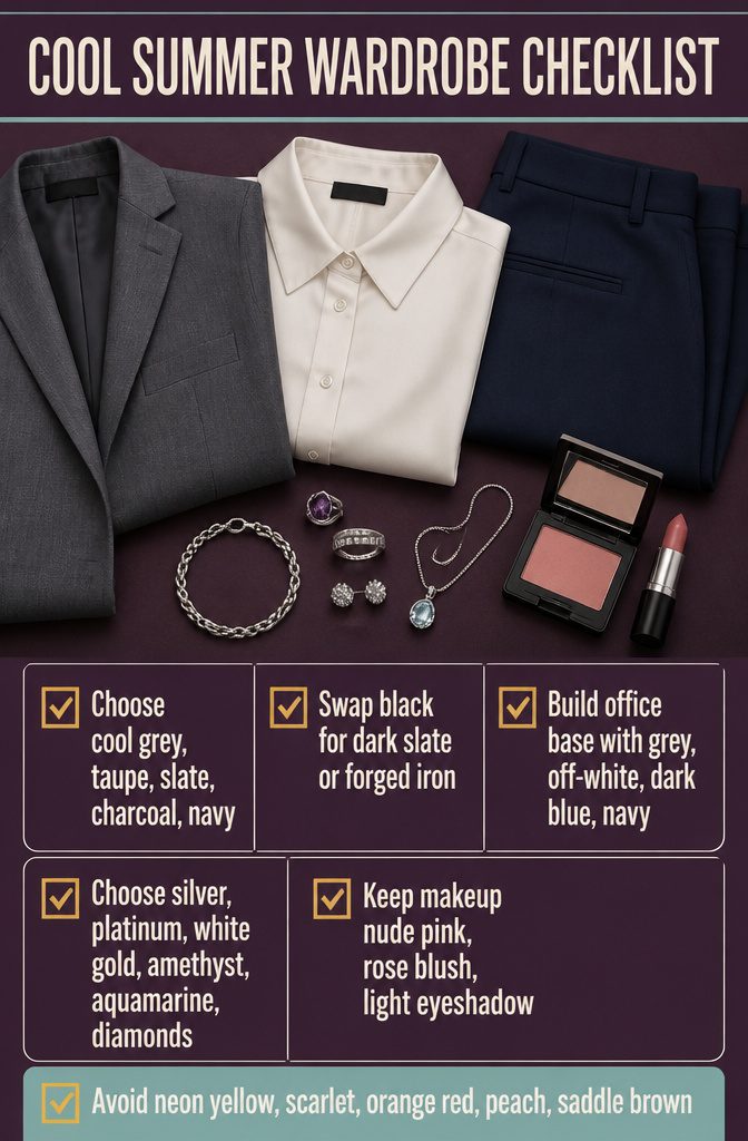
Cool Summer wardrobes run on soft, cool neutrals, with a lighter dark standing in for black.
- Neutrals: light cool greys, taupe browns, slate and charcoal greys, and navys.
- Where you’d reach for black, use dark slate grey or forged iron. Slate grey also replaces brown.
- Office base: grey, off-white, dark blue and navy. Add brighter or pastel colors on top.
- Jewelry: silver, platinum, white gold, amethyst, aquamarine and small diamonds.
- Makeup: nude pink lipstick, rose blush and subtle, light eyeshadow.
- Avoid neon yellow, scarlet red, orange red, peach and saddle browns. The first two are too saturated, and the rest are too warm for this palette.
Frequently Asked Questions
What makes Cool (True) Summer different from the other Summer types?
Coolness is its defining trait.
Its colors are cooler, darker and softer than Light Summer, and more saturated and less muted than Soft Summer. True Summer sits at the center of the wheel, while Light leans toward Spring, Soft toward Autumn and Deep toward Winter.
How do I know which summer color palette I am?
Compare your skin tone and contrast level with the 4 subtypes: True/Cool, Light, Deep and Soft.
Light Summers are light in skin, hair and eyes together. Deep Summers have deep brown or grey eyes and often dark hair.
Soft Summers show little contrast, with hazel or brown eyes and red-toned hair. An in-person draping session gives the most accurate read.
What colors look good in a summer color palette?
Soft, cool, smoky shades that run from deep charcoal grey and dark blue spruce to pale pinks and powder blues. Cool Summer leans on rose pinks, taupe, lavender, powder blue and ocean green, with slate grey as the staple neutral.
Light Summer favors pale yellows, light aquas and sky blues, Deep Summer favors soft navy and deep burgundy, and Soft Summer favors rose browns and berry tones.
Which colors are not good for a summer color palette?
Cool Summer should skip neon yellow, scarlet red, orange red, peach and saddle browns.
Neon yellow and scarlet red are too saturated, and the others are too warm. Black is possible but not ideal.
Do Summers wear gold or silver?
Cool Summer jewelry runs to silver, platinum and white gold, along with amethyst, aquamarine and small diamonds. Yellow gold is not on that list.
Should I avoid black if I’m a Summer?
You don’t have to, but black is not ideal for Cool Summer.
If you wear it, keep one of your own colors next to your face, such as a powder blue or soft pink top or scarf. Dark slate grey or forged iron can replace black in most outfits.
Can I only wear the colors in my summer palette?
No. Your subtype marks the strongest part of the palette for you, but the rest of the Summer palette still works, and so do colors from the neighboring Light and Soft Summer palettes.
You can also wear warm shades like orange or maroon if you like them. Confidence matters more than staying strictly inside the palette.
I hate these colors. Does that mean Summer isn’t my color type?
It is possible, since not everyone is drawn to their own colors. Work out what you dislike: pale neutrals, pastels, or a whole family such as pink, purple or blue.
Then leave those out and wear only the palette shades you like. A draping session can settle the question if you’re still unsure.
My current wardrobe doesn’t match a summer color palette. What should I do?
Change it gradually instead of replacing everything at once.
Swap in palette pieces as old ones wear out. Your current clothes took time and money to buy, so keep getting use from them.