
The options run from two-color tape blocking to damask stenciling and wet-blended ombre, and your choice depends on your patience and how easily you need to undo it.
Color blocking reverses with one coat of the original color. Textured finishes hide flaws but need the whole wall redone after a gouge.
1. Classic or Contemporary Style
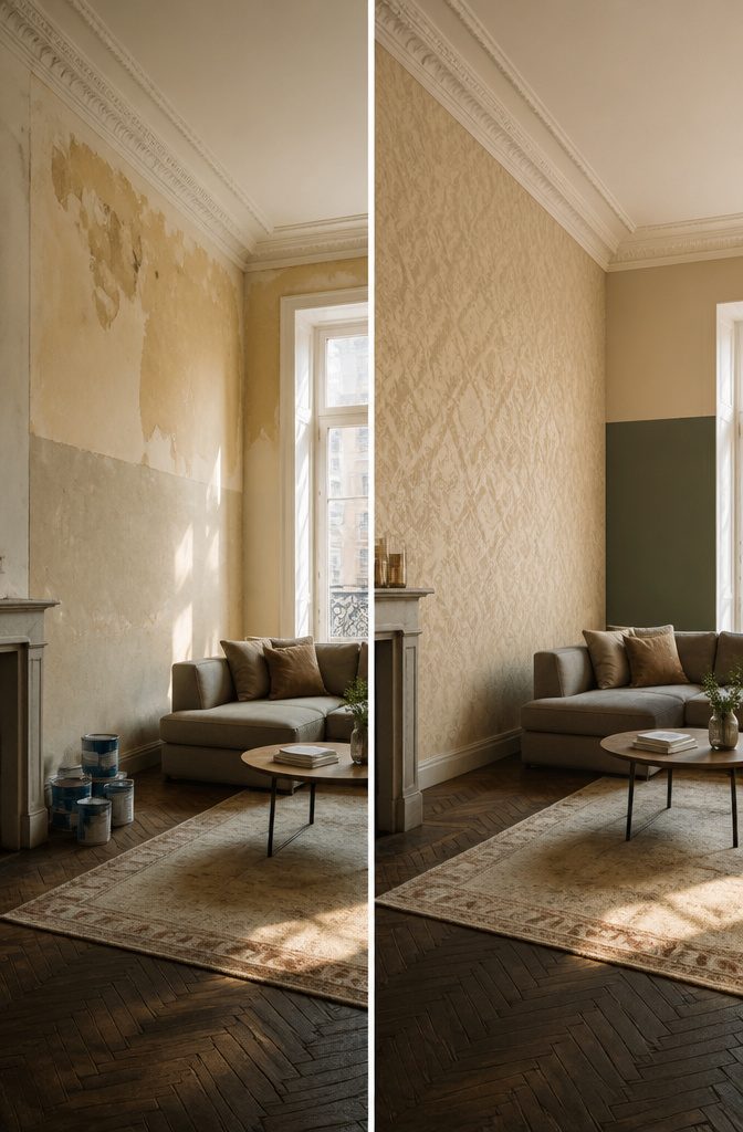
Victorian damask in muted beige looks timeless because the pattern is tone-on-tone: a slightly darker or glossier beige over a beige ground. It suits rooms with crown molding, tall windows, or older furniture.
It is slow to paint, though. A stencil has to be lined up and repeated across the whole wall, and any drift shows.
Sleek color-block panels suit newer apartments, flat-front furniture, and open rooms with little trim. For a renter on a weekend budget, color-blocking wins.
Painter’s tape, two paint colors, and straight edges are the whole job, and covering it with a single coat of the original color at move-out is simple. Choose damask only if you enjoy fine, patient detail work.
2. Geometric and Color Blocking
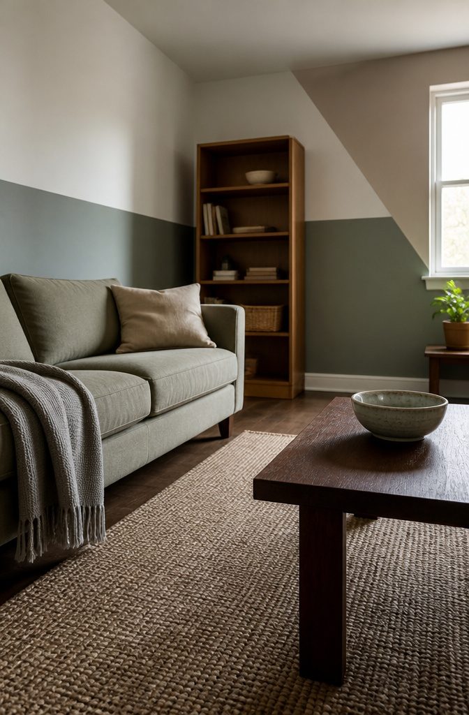
A single-color monochrome wall draws attention to the shape of the room and its furniture, and it’s the easiest look to get right. Chevron stripes add rhythm, while geometric blocks and two-tone walls read as custom rather than cookie-cutter.
On a tight budget, paint only the lower half of the wall.
Half-wall color blocking uses less paint than a full wall and still looks deliberate. A taped diagonal split follows the same logic: two colors and one straight line.
Painter’s tape gives you crisp edges if you press the edge down firmly before painting.
For the second color, start from your sofa or rug shade and turn the color wheel 90° to find a complementary accent that sits well against the trim.
3. Textured and 3D Effects
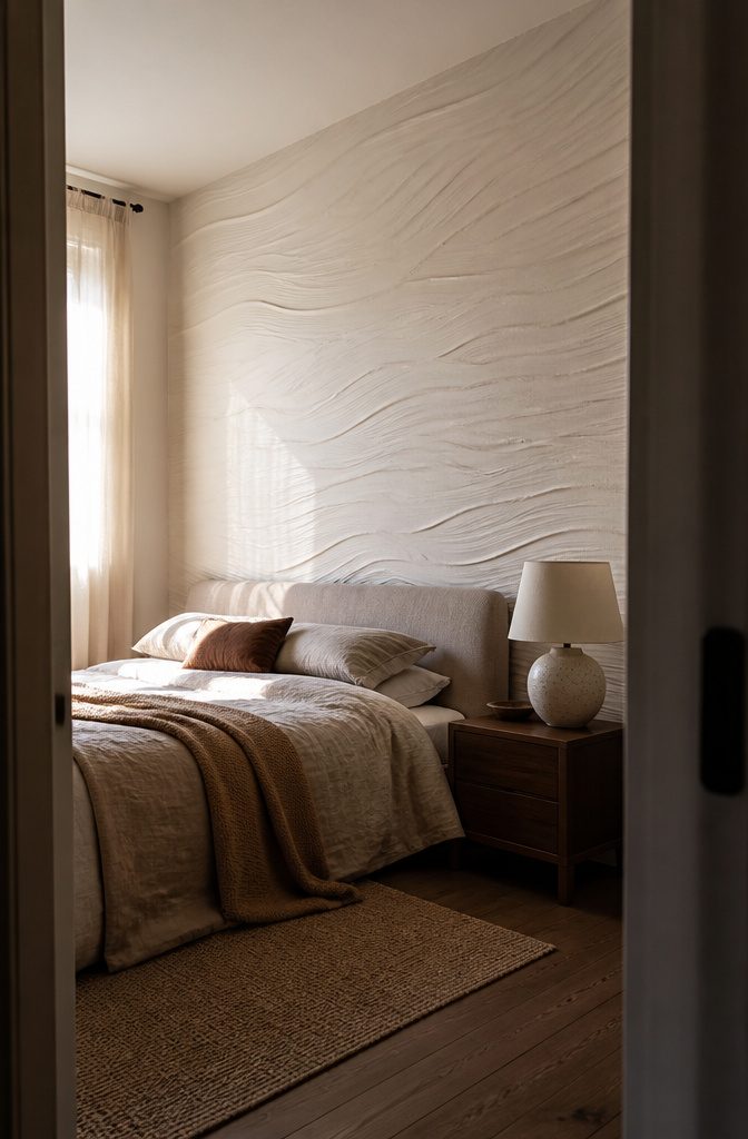
Combed and rag-rolled finishes give a wall depth that flat paint can’t, and sculpted plaster ripples push that into real relief.
Textured paint also hides imperfections, so it suits feature walls and older homes with uneven surfaces. The price is repair, and Livspace puts it plainly:
Maintenance: May require repainting if damaged or stained. Touch-ups can be done, but matching texture may be tricky.
— Livspace
Expect to redo the whole wall after a gouge, not patch one spot.
Application takes more time than rolling flat paint, and custom effects usually call for skilled hands. In a bedroom, a subtle suede or sand texture adds depth without overpowering the color.
4. Accent Walls
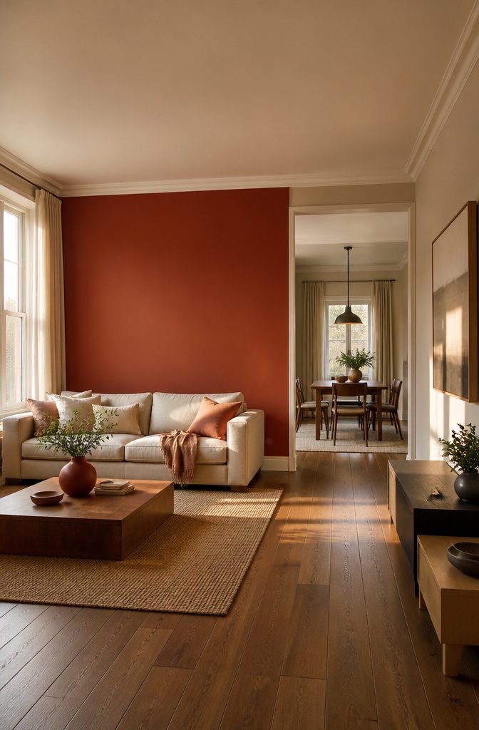
A single brick-red panel or a sculpted plaster ripple can anchor a whole room, so give it the wall your eye hits first: the one you face when you walk in, or the one behind the sofa or bed.
Skip walls chopped up by several doors and windows, since the color has no open surface to work on. Deep jewel tones follow the same rule.
Pick trim and surrounding walls with the same undertone as the accent. Warm brick red looks calmer beside a warm white than a stark cool one.
Matching the trim tone softens the boldness. Then repeat the hero shade once or twice elsewhere, in a pillow, a frame, or a vase, so the wall feels planned.
5. Ombre and Gradient Walls
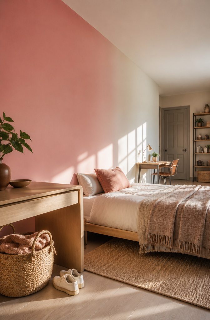
Sunrise pink fading into ivory, or midnight blue sinking into charcoal, gives a wall a sense of motion that a flat coat can’t.
In an open-plan apartment, a gradient can gently mark off a sleeping or work area without a divider. Choose adjacent hues that share undertones, because colors with clashing undertones turn muddy where they meet.
Ombre is harder than most designs in this list. The blend has to happen while the paint is wet, so you work in small sections and need more time than a flat coat takes.
Practice the fade on a scrap board first. A gradient also hides scuffs, which makes it a smart choice for a hallway.
6. Warm and Earthy Palettes
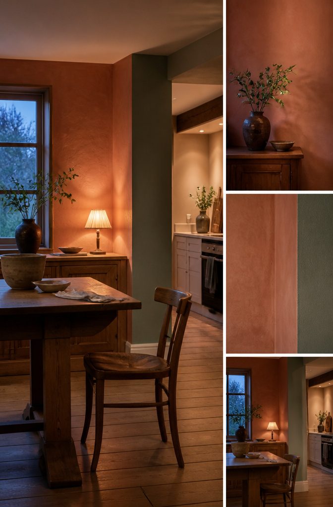
Terracotta on a dining room wall stimulates appetite, so it earns its place where you eat and can feel heavy in a room you only pass through.
Toasted peach brightens a gloomy corner, which makes it a good pick for a hallway or a room that never gets direct sun.
Ochre looks golden under lamplight and closer to mustard in daylight, so brush a large swatch on two different walls and check it morning and night before you buy a gallon.
Sage and clay brown are the quieter pair. Sage softens the stronger warm shades beside it, and clay brown grounds a room the way wood trim does.
On the label, look for clay, limewash and metallic paint lines. Clay and limewash give a chalky, slightly cloudy finish, and a metallic line adds a faint shimmer that works best on a single wall.
7. Cool and Calm Palettes
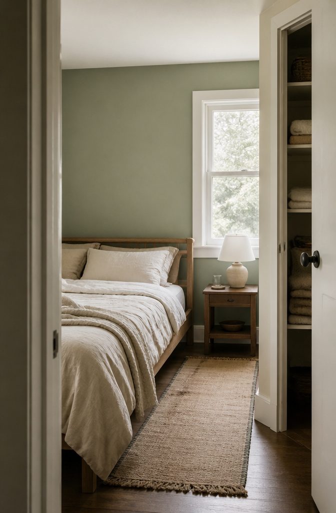
Light shades suit small spaces. Pale tones make a room feel bigger and brighten dim corners.
For a small room, pale ivory paired with pastel sage is a safe combination: the ivory keeps the walls open, and the sage adds color without closing the space in.
Cloudy greys, misty sages and soft blues all look best beside white trim or natural wood furniture, which keeps the cool tones from feeling flat or chilly. If plain grey feels dull, Digital Lilac is a trending alternative.
It’s a muted mauve-grey that stays calm and reads as a color. Pick it for a bedroom or a bathroom, where you want a quiet mood.
8. Living Room Designs
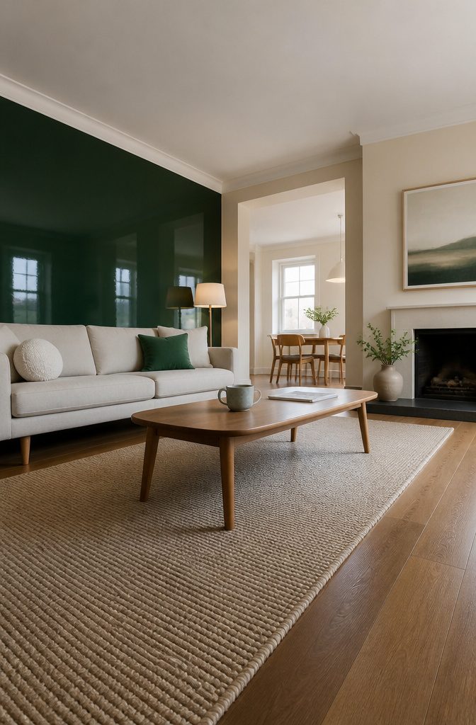
Start with the sofa or rug and pull one color from it. Then pick a relationship: matching walls on either side of a fireplace give symmetry, while a deep wall behind a pale sofa gives contrast.
Emerald, sapphire or maroon in high-gloss suits medium to large rooms, and one feature wall is enough for a shade that bold.
Small rooms do better with mushroom grey, beige or ivory in matte or satin, which visually expand the space. Terracotta, sage and clay brown in matte suit natural wood floors if the undertones lean the same way, warm or cool.
Painting the trim in a similar hue ties it together. Ombré or geometric walls suit social rooms.
9. Bedroom Designs
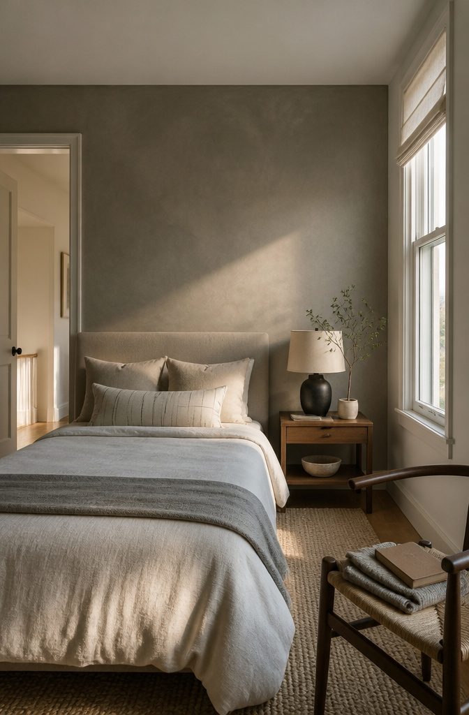
Calm colors suit the three main walls of a bedroom, with one bolder color or a texture behind the bed.
A matte finish fits best here, since satin and gloss lean toward vibrancy and cleaning ease rather than rest. For the bed wall, a subtle suede or sand texture adds depth without making the room feel busy.
Room size and light change which shade works. A small bedroom with little daylight can turn gloomy in a deep color, so keep the main walls light and save the darker tone for the bed wall.
A bright room can carry a richer shade. Paint a swatch on the wall and check it in morning and evening light before you buy gallons.
10. Kids’ Rooms and Studies
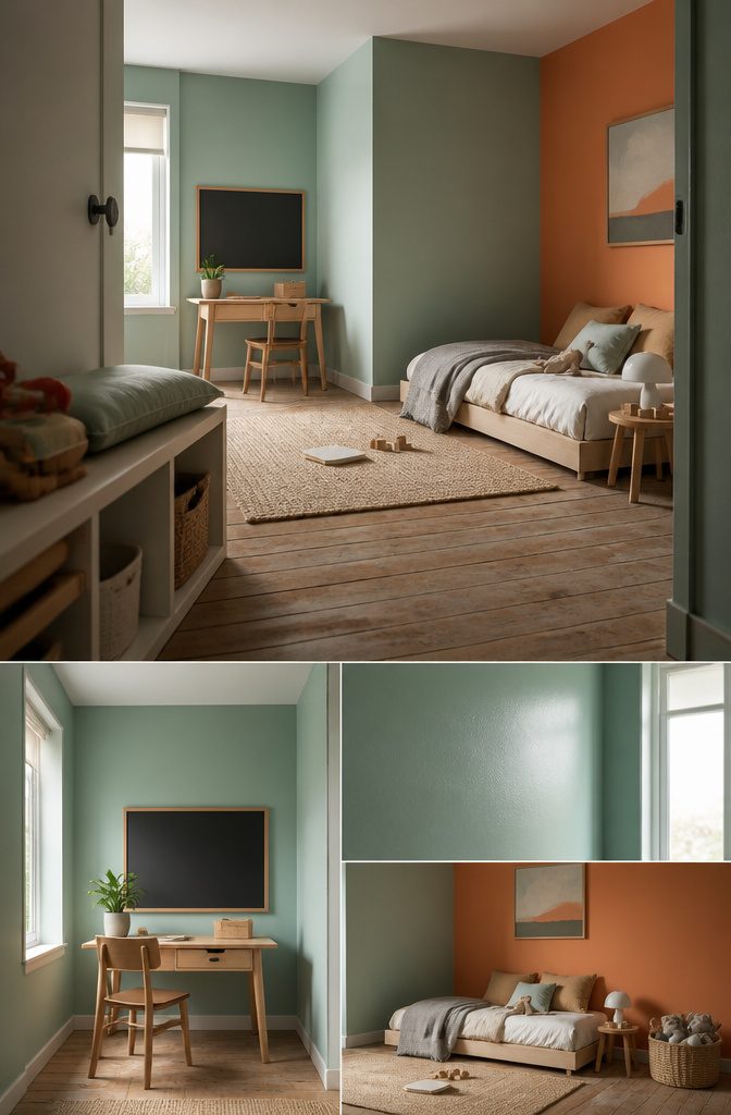
Mint and tangerine work in a kids’ room because the cool green steadies the orange.
Paint three walls mint and keep tangerine to the wall behind the bed or a single stripe by the door, so the orange reads as play instead of noise.
A chalkboard panel suits both a play corner and a study wall. Paint a rectangle at kid height, tape the edges for a clean line, and let the paint cure fully before the first piece of chalk touches it.
Younger kids draw on it now, and later it holds spelling lists and homework schedules.
For kid-proofing, use a scrubbable satin or semi-gloss on the walls, at least in the zone where hands and crayons land. Flat paint looks softer but shows every scuff and marks when you wipe it.
11. Kitchen and Dining Walls
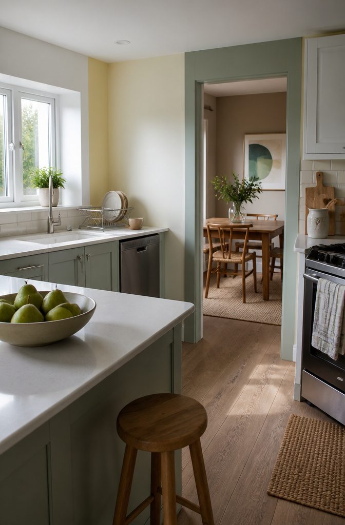
Kitchens up to 80 sq ft look bigger in soft white or pale yellow, so keep the main walls neutral and add color with a pop of blue or green.
Steam and splatter land on these walls, so use satin or matte, and wipe the walls down often.
Dining rooms can handle deeper color.
Terracotta gives the room warmth, and beige, muted green or warm taupe are quieter choices. Satin is the finish to pick here too, since it holds up to frequent cleaning after family dinners.
In an open plan, paint the kitchen in eggshell and repeat the living-room shades, such as grey-blue, sage or dusty coral, so the whole space reads as one room.
12. Stencils, Stripes, and 12-Inch Borders
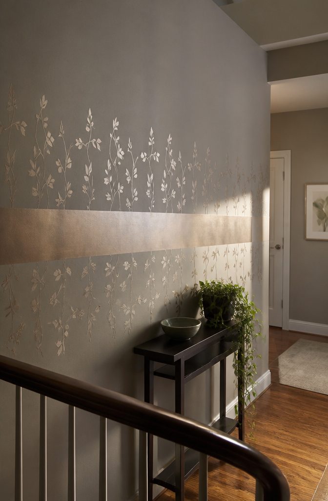
A matte base with metallic stencil vines gives a plain wall a luxe edge, and it is one of the cheapest ways to make a rental or starter home feel like yours.
The matte surface lets the metallic pattern catch the light instead of competing with a glossy background.
For tall walls, run a 12-inch border at mid-height to break the wall into two zones.
Mark the band with painter’s tape, press the edges down firmly, and paint inside it. Stripes use the same tape method, just repeated.
Both looks cost little in materials: a stencil, tape and a small amount of paint. They cost a lot in patience.
Every stencil repeat has to be lined up by hand, and every tape line has to be level. Rush either one and the vines drift and the edges look crooked.
13. Paint Paired With Wallpaper
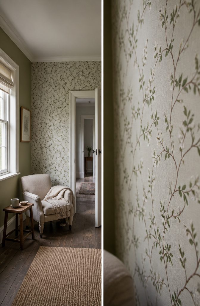
Paint three walls and paper the fourth, then pull the paint color from the wallpaper itself. Choose a quieter shade from the print so the paper stands out as the feature and the plain walls don’t compete with it.
Wallpaper wins on range, with patterns from florals to graphics, and it covers a large area faster when the print is big. It wipes clean, and a damaged patch can be replaced, though premium papers cost more.
Textured paint is cheaper and hides wall flaws, which suits older homes. But a damaged texture is hard to repair, so skip it on walls that get bumped.
Paint Finishes by Room
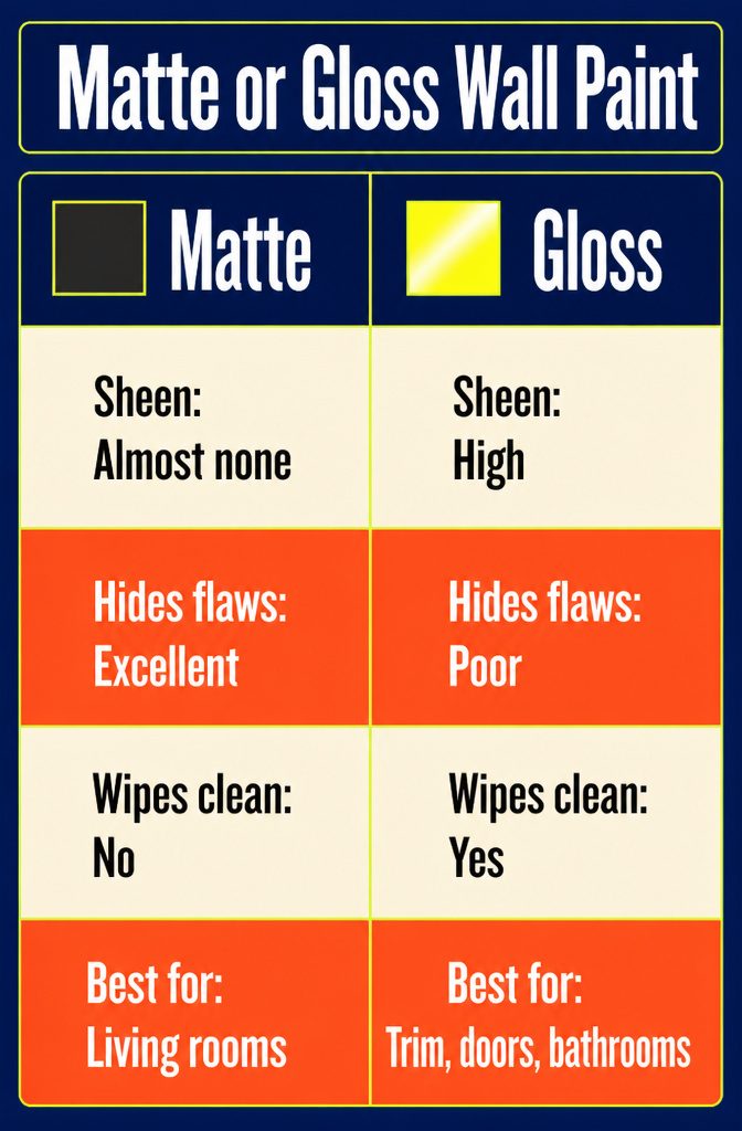
Matte hides bumps and patches, while gloss shows every one. Choose by traffic first, then by how smooth your walls are.
| Finish | Sheen | Hides flaws | Wipes clean | Best for |
|---|---|---|---|---|
| Matte | Almost none | Excellent | No | Bedrooms, living rooms |
| Satin | Soft | Fair | Yes | Hallways, kitchens, kids’ rooms |
| Gloss | High | Poor | Yes | Trim, doors, bathrooms |
Eggshell sits between matte and satin and suits living rooms that see some wear. For busy rooms, satin is the safest wall finish.
Latex and acrylic paints clean up with soap and water, while oil-based paint needs mineral spirits, so latex is easier for a weekend job. In bathrooms, buy a paint labeled moisture-resistant.
Tools and Prep for Weekend Painting
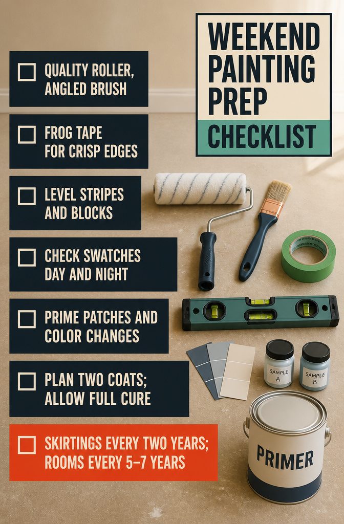
Gather this before Saturday morning:
- Rollers and brushes: A quality roller cover covers better and sheds less lint. Add an angled brush for corners and trim.
- Painter’s tape: Frog Tape gives crisp lines along trim and ceilings.
- Level: A laser level or a phone spirit-level app keeps stripes, blocks and stencils straight.
- Samples: Check swatches on the wall in daylight and under lamps at night.
- Primer: Use it on patched spots and before a big color change.
- Coats and drying: Plan on 2 coats. Paint is dry to the touch in a few hours but cures over several days, so wait before scrubbing or pushing furniture against it.
- Repaint schedule: Touch up high-traffic skirtings every 2 years and repaint full rooms every 5–7 years. Change accent shades only and keep the main color.
Frequently Asked Questions
What is the best wall paint color combination for small rooms?
Pale ivory with pastel sage is a safe choice.
The ivory keeps the walls looking open, and the sage adds color without closing the space in. Light shades also brighten dim corners.
How do I choose a wall paint design for my living room?
Pull one color from your sofa or rug, then pick between symmetry and contrast.
Matching walls on either side of a fireplace give symmetry, and a deep wall behind a pale sofa gives contrast. A bold shade like emerald or sapphire is enough on a single feature wall.
Which is better, plain paint or wall design patterns?
It depends on the room.
Patterns such as ombré or geometric walls suit social rooms like the living room, while calm, plainer walls suit bedrooms. In a bedroom, keep the main walls calm and put one bolder color or a texture behind the bed.
What are some budget-friendly wall painting ideas?
Half-wall color blocking is the cheapest look to start with, because painting only the lower half uses less paint and still looks deliberate.
A taped diagonal split also needs just two colors and one straight line. Stencils and 12-inch borders cost little in materials, though they take patience.
How do I coordinate wall colors with flooring and trim?
Match undertones, keeping warm shades with warm and cool with cool, and paint the trim in a similar hue to tie the room together.
For example, terracotta, sage and clay brown in matte suit natural wood floors when their undertones lean the same way as the wood.
Are textured wall paints good for bedrooms?
Yes, as long as the texture is subtle.
A suede or sand texture behind the bed adds depth without making the room feel busy. Keep in mind that a damaged texture is hard to patch, so plan on redoing the whole wall after a gouge.
What tools do I need for DIY wall paint designs?
You need a quality roller, an angled brush for corners and trim, and painter’s tape for crisp edges.
Add a level (a laser level or a phone spirit-level app) to keep stripes, blocks and stencils straight. Primer helps on patched spots and before a big color change, and stencils cover pattern work.
What’s the difference between wall paint color and wall design?
Color is the hue itself.
Design is how you use it: the layout, pattern or texture. One terracotta can be a flat coat, a half-wall block or a stenciled pattern, and each reads differently.
How often should interior walls be repainted?
Repaint full rooms every 5–7 years.
High-traffic areas such as hallways and skirtings need a touch-up about every 2 years. You can refresh just the accent shades and keep the main color.
Can I use wallpaper with wall paint designs?
Yes.
Paint three walls and put wallpaper on the fourth, then take the paint color from the paper. Choose a quieter shade from the print so the wallpaper stays the feature.
Which paint lines offer the best color range for wall designs?
Look for lines labeled clay, limewash or metallic. Clay and limewash give a chalky, slightly cloudy finish, and metallic paint adds a faint shimmer that works best on one wall.
What is the most popular wall color in 2025?
Digital Lilac is the trending pick.
It is a muted mauve-grey that stays calm but still reads as a color, which makes it a good alternative to plain grey. It suits a bedroom or bathroom, where you want a quiet mood.
How do I choose wall paint for different rooms?
Choose by traffic and moisture first.
Matte works in bedrooms and living rooms, satin suits hallways, kitchens and kids’ rooms, and eggshell fits living rooms that see some wear. In bathrooms, buy a paint labeled moisture-resistant.
What types of wall paint are best?
Latex and acrylic paints are the easiest choice for a weekend job because they clean up with soap and water.
Oil-based paint needs mineral spirits for cleanup. Natural-ingredient eco-friendly paints are another option.
How many coats of paint should I apply to walls?
Plan on 2 coats. Use primer first on patched spots and before a big color change, and expect the number of coats to vary with the starting wall color.
How long does wall paint take to dry?
Paint is usually dry to the touch in a few hours, but it takes several days to cure fully. Wait until it has cured before scrubbing the wall or pushing furniture against it.