
A kitchen with cabinets in two colors, usually lighter uppers over darker lowers, though an island or pantry wall can carry the second color instead.
It works when one color leads: about 70% light neutral and 30% bolder shade, with the dark kept to the lowers in a small kitchen. White over navy is the most popular pairing.
Light Uppers, Darker Lowers
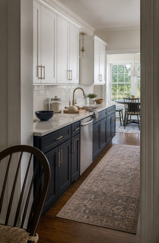
Light uppers over darker lowers is the lowest-risk way to start with two tone kitchen cabinets, and it suits almost every home style. Pale uppers draw the eye up, so the room reads taller and more open.
A darker base grounds the room and hides scuffs and spills where they happen most. Crisp white over deep navy or rich charcoal gray is the classic pairing, and cream over sage green or gray is a softer take.
This layout can also make a small kitchen feel larger. Keep the darker color on the lowers only, and don’t split the room wall by wall, which breaks it into sections.
Recommended Products

CABINET TRANSFORMATION: Refresh outdated cabinets, vanities, furniture and trim with rich Pure White color and a smooth semi-gloss finish
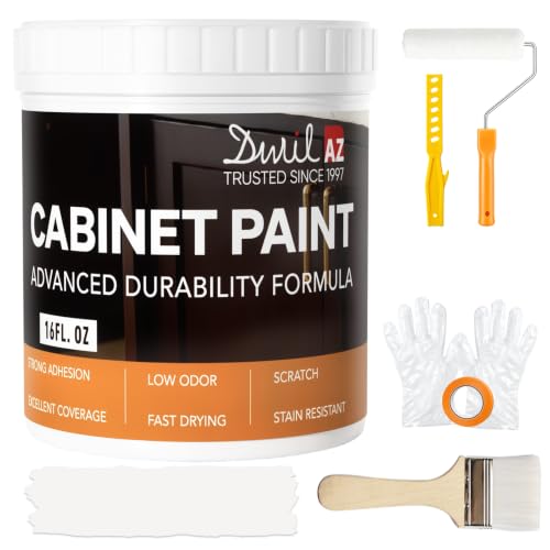
𝙉𝙊𝙏𝙀: Intentional headspace allows room for stirring, dipping, and transit. The stated paint quantity remains unchanged. If you have any questions, please contact our customer service team.

Hearthstone is a warm greige, satin finish cabinet paint - part of our Rustic Collection.
A Contrasting Island
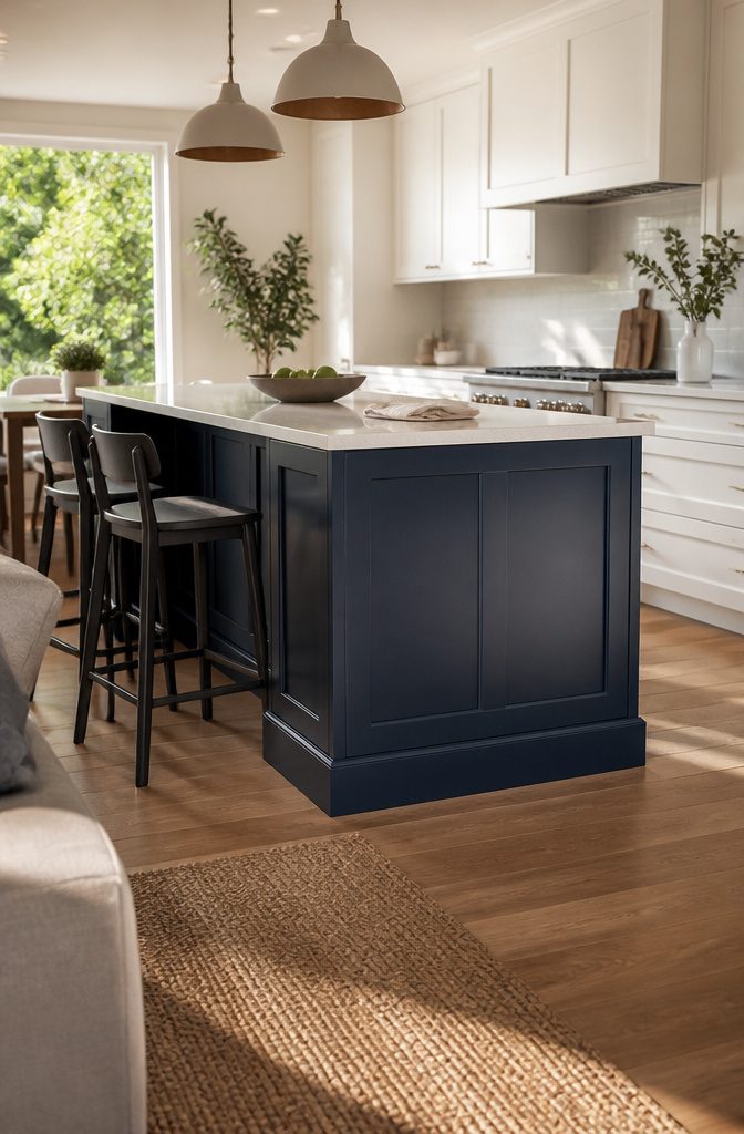
Keep the perimeter cabinets one color and paint only the island, and it reads as a freestanding piece of furniture instead of another stretch of the cabinet run.
With white perimeter cabinets, the island colors to consider are navy, black, gray, green, or natural wood.
Whichever you choose, repeat that color elsewhere in the room, such as bar stools, a rug, or a pendant light, so the island looks planned and not stranded.
This is also the easiest way to try two tones. One island is the fewest cabinets you will ever repaint, and it is simple to change later.
The limit is reach: the second color stays in one spot, so you get a focal point but not a layered look. It works best in open-concept kitchens.
Recommended Products

Glass Doors Design Cabinet: Give a timeless look to your interior by adding this glass doors elegant blue paint storage cabinet. Its original design exude a unique charm and...
A Pantry Wall in a Second Color
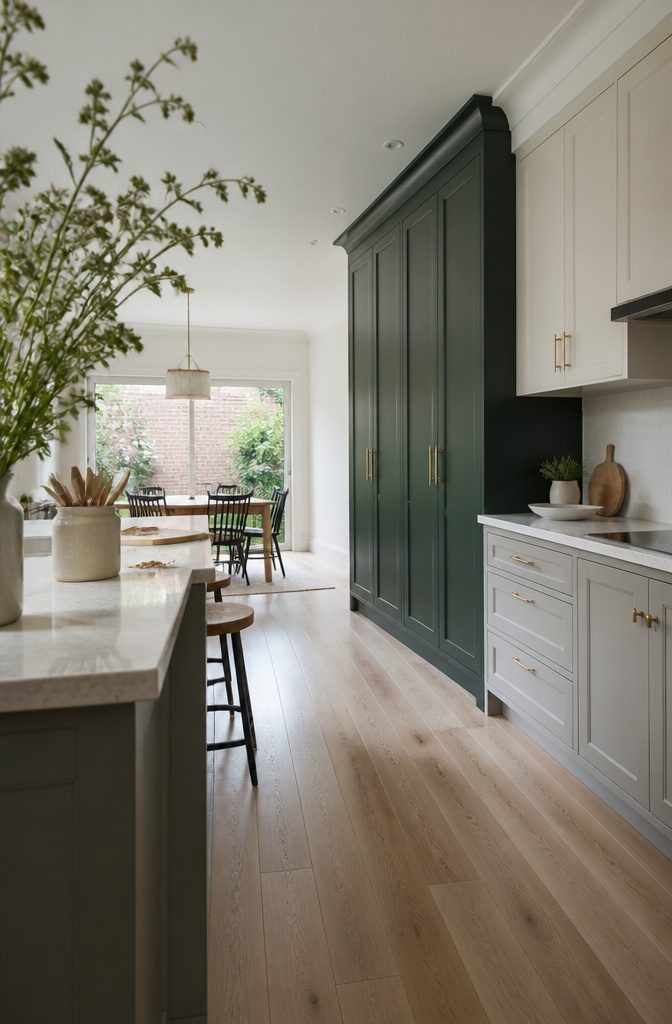
Painting the tall cabinets a different color from the base and upper cabinets makes a pantry wall look like built-in furniture instead of one more run of boxes.
It works best on a full pantry wall in a larger or open-plan kitchen, where the room can take stronger contrast without feeling chopped up.
Choose a second color that clearly differs from the perimeter. A near match reads as a paint mistake, not a decision.
A small galley gets less out of this.
It has little wall to spare, and a kitchen without a real pantry wall has no tall run to set apart. In those rooms, a contrasting island or darker lowers will do more for the money.
White and Natural Wood
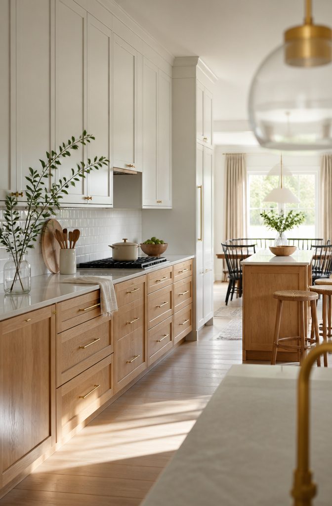
White uppers over natural oak or other wood lowers is the softest two-tone look.
The white reflects light, and the wood keeps the room from feeling sterile. Light quartz counters, brushed brass hardware and simple subway tile fit it well.
If you want less wood, a white perimeter with a wood island suits open layouts.
The island becomes the focal point without overpowering the room. Matching wood stools, woven textures and warm pendant lights add to the effect.
For a richer version, swap bright white for cream or ivory and pair it with walnut or another deep brown.
Where wood meets other warm finishes, greige works as the bridge, sitting between the two tones instead of competing with either.
White and Navy
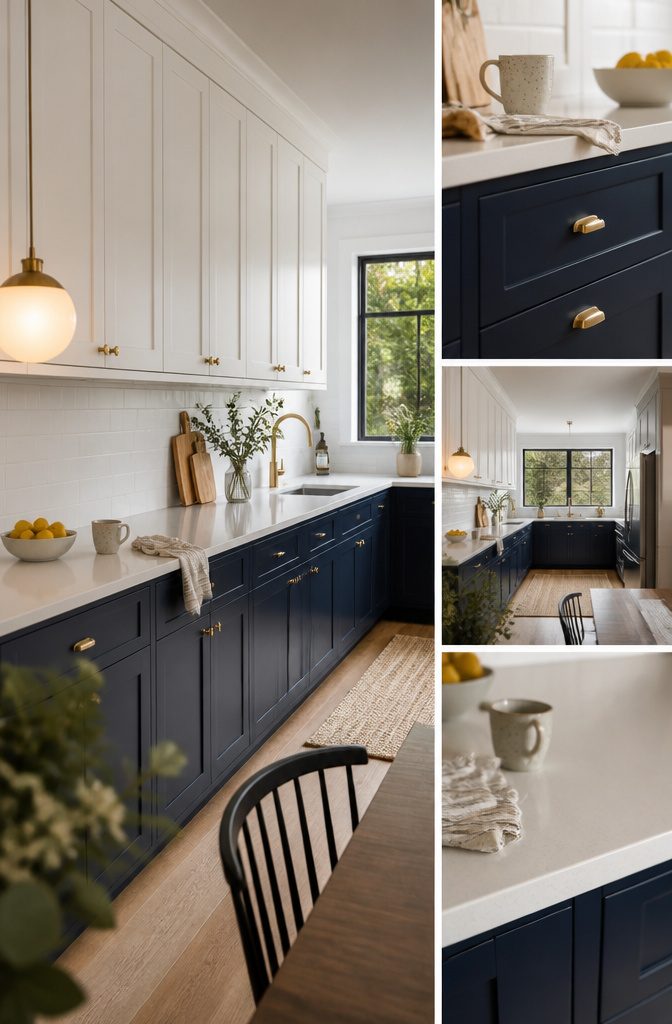
White and navy is the most popular two-tone pairing.
Navy hides wear on the lowers, where the daily knocks land, and white uppers keep the room bright. Use the same Shaker door in both colors, so only the paint changes and the pairing looks planned.
Light quartz counters with chrome or brass hardware suit it. Navy also works on an island alone, with all-white perimeter cabinets.
For a more muted top half, swap the white uppers for light gray and tie the two together with brass or matte black pulls.
For cool against warm, set navy lowers against wood or light brown cabinetry, then add brass hardware and a white backsplash so the blue stays rich instead of heavy.
White and Black
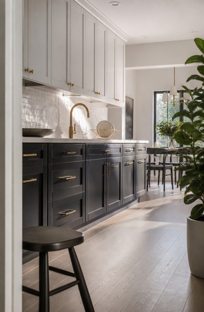
White and black is the highest-contrast pairing, and it works best with black held to the lowers or an island and white everywhere else.
Keep the counters and backsplash light so the room stays balanced. Matte black hardware blends in for a modern look, while brass keeps the pairing from reading cold.
Sheen decides how much upkeep you take on.
Matte black shows fingerprints most, and semi-gloss or satin wipes clean most easily. Darker lowers also hide scuffs.
Maroon lowers under white uppers are another deep option, and they pull the eye upward. If you won’t wipe down cabinets regularly, skip high contrast and choose a softer pairing.
Gray and White
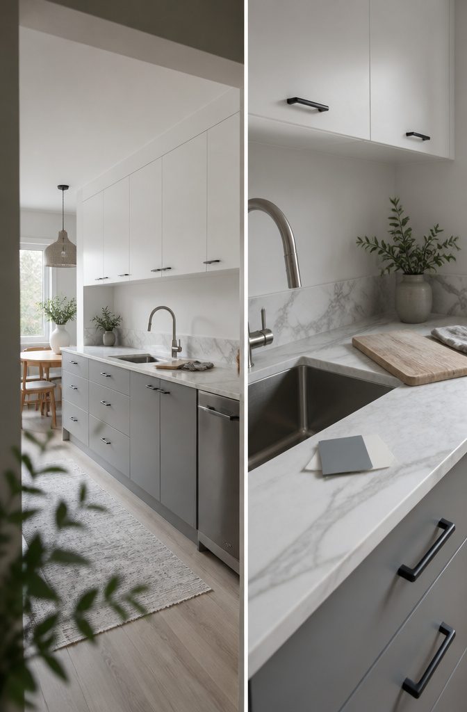
Gray and white is the lower-risk pairing, quieter than black and white and easy on the eyes. It suits modern and transitional kitchens, and it sits well with stainless steel, matte black, and geometric hardware.
Undertone decides whether it works. A cool gray leans blue and looks crisp beside a bright white.
A warm gray leans beige and looks muddy there, so pair it with a creamier white. Test the gray and white together in your kitchen’s own light before you buy paint.
For softer takes, soft pink with gray reads gentle, and concrete-texture cabinets against white give an industrial feel. Marble counters or a marble backsplash make either pairing a focal point.
White and Green
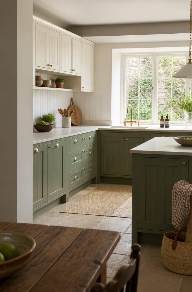
Sage lowers with cream or ivory uppers suit farmhouse, cottage, French country and other traditional kitchens.
The green gives a calm, earthy base, and the lighter uppers keep the room from looking dull. Beadboard, open shelving and warm brass hardware finish the look, which works especially well in U-shaped or L-shaped kitchens with an island.
In a small kitchen, white with mint green is the cheerful choice. It adds a splash of color and keeps the room bright and open.
For something bolder, use deep forest green lowers with white or cream uppers and brass hardware.
Olive lowers under white uppers sit in between, earthy but lighter. Muted green with white is also replacing stark black-and-white pairings in newer kitchens.
Cream, Black, or Blue With Wood
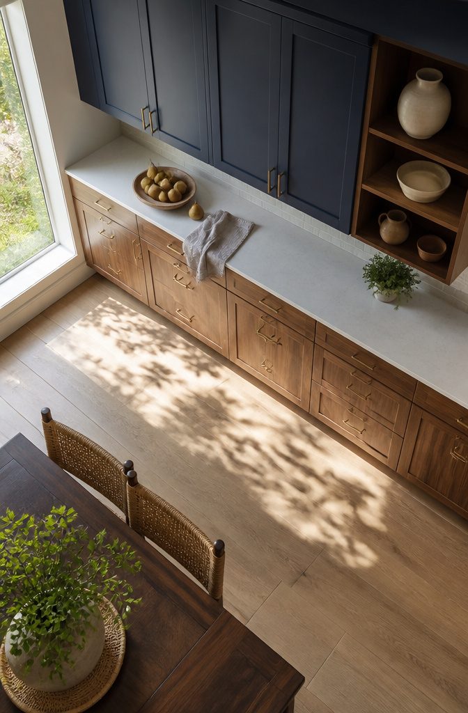
Black uppers over wood lowers suit large kitchens with strong natural light.
The wood warms the black and keeps it from feeling heavy, and light counters or open shelving finish the look. In a small or dim kitchen, skip it, because black on top will close the room in.
Deep blues like indigo or midnight pair well with natural walnut or oak, and the combination reads coastal or modern rustic. Blue with chestnut brown also adds warmth and dimension.
In both cases, light neutral countertops keep the two strong colors from competing. Charcoal against light oak follows the same logic: cool and dark on one side, warm and light on the other.
Balance the Two Colors
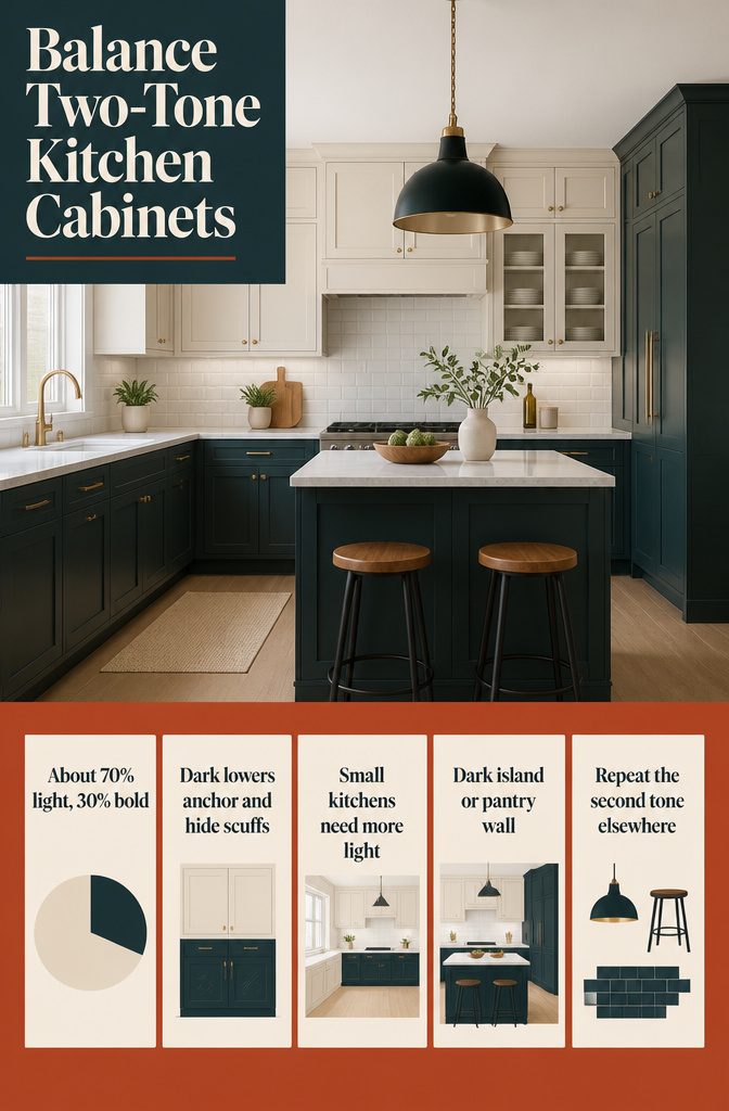
Let one color lead. A 70/30 split works: about 70% of the cabinetry in the lighter neutral and 30% in the bolder color.
Put the darker tone on the base cabinets, where it anchors the room and hides scuffs, and keep the lighter tone on the uppers so the room stays open.
In a small kitchen, lean even further toward the light color and limit the dark one to the lowers or a small island.
The second color can also leave the lowers. A dark island against a light perimeter becomes a focal point, and a pantry wall in a different color marks its own zone.
Either way, repeat the second tone elsewhere in the room, in bar stools, a light fixture or a backsplash accent, so it looks planned.
Match Your Kitchen’s Light and Finishes
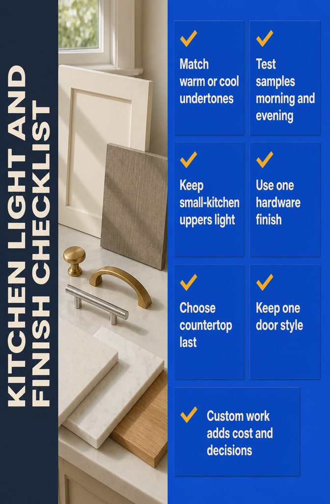
Check these against your kitchen:
- Match undertones: warm oak goes with warm white or cream, cool gray wood with crisp white.
- Test samples side by side in your kitchen’s morning and evening light. Screens hide undertones.
- In a small kitchen, keep the uppers light and put the darker color on the lowers. Skip wall-by-wall splits, which chop the room up.
- Use one hardware finish on both colors: brass for warm palettes, chrome or nickel for cool.
- Choose the countertop last: light quartz, marble-look, or wood.
- Keep one door style. Shaker suits nearly every pairing.
Standard finishes cost about the same as one color.
Custom designs and specialty materials add design and labor costs. Expect more decisions, too.
Frequently Asked Questions
Are two tone kitchen cabinets still in style?
Yes. Sources describe them as a standard design choice rather than a passing trend, and they still appear on 2026 design lists.
The pairings have softened: white with natural wood or muted green is replacing stark black and white. Harsh contrast with mismatched undertones is what has fallen out of favor.
Should upper or lower cabinets be darker?
In most kitchens the lowers should be darker. There is no strict rule, but dark lowers anchor the room and hide scuffs, while light uppers keep the top of the room bright and open.
Dark uppers can feel top-heavy, though black uppers over wood lowers work in a large kitchen with strong natural light.
What is the best color combination for two tone kitchen cabinets?
White and navy is the most popular, white and natural wood is the softest, white and black has the highest contrast, and gray and white is the lowest-risk choice.
The best one for you depends on your countertops, flooring and how much contrast you want.
What are the trendy two tone kitchen cabinet colors right now?
White with natural wood, muted green and navy are the pairings sources name most often, and black with natural wood is a bolder option.
Pair one timeless neutral or a wood with the trending hue, and avoid combining two trendy colors.
Do two tone cabinets make a small kitchen look smaller?
They can make it look larger if you keep the light color above and the darker color on the lowers.
Avoid splitting a small kitchen wall by wall with two colors, because that breaks the room into sections and makes it feel smaller.
How do I pick two cabinet colors that go together?
Match undertones first: warm with warm, cool with cool.
Then decide how much contrast you want, high like white and black or soft like white and gray. Hold both samples side by side in your kitchen’s morning and evening light, since screens hide undertones.
What color should a kitchen island be with white cabinets?
Navy, black, gray, green and natural wood all work with white perimeter cabinets.
Navy and black give strong contrast, gray is subtle, and wood or green add warmth. Repeat the island color once elsewhere, such as in bar stools, a pendant light or a backsplash accent, so it looks planned.
Can you do two tone with wood cabinets?
Yes. White, black, green and navy all pair with wood.
White uppers over oak lowers is the softest version, and a white perimeter with a wood island is an easy way to start. Black uppers over wood lowers suit large kitchens with plenty of natural light.
What hardware goes with two tone cabinets?
Use a single hardware finish on both colors.
Brass suits warm palettes, including navy, green and wood pairings, while chrome or brushed nickel suits cool ones such as white and gray. Matte black works with white and wood or white and gray.
What countertop goes with two tone cabinets?
Light quartz is the safest pick because it suits almost any pairing.
Marble-look surfaces and wood also work. Choose the countertop last so it suits both cabinet colors, and veining that includes both colors can tie the look together.
Do two tone cabinets cost more than single-color cabinets?
Standard finishes cost about the same as one color.
Custom designs and specialty materials add design and labor costs. Painting only an island is the cheapest way to try the look, since it involves the fewest cabinets.