
The ideas run from swapping brass cabinet pulls and laying a runner to building custom cabinets, and what you’re allowed to change decides where you start.
Renters stay with hardware, rugs, removable wallpaper and shelves. Owners should check trim, ceiling height and windows first: a tin ceiling suits a Victorian, not a low-ceilinged rental.
1. Warm Metals and Contrasting Counters
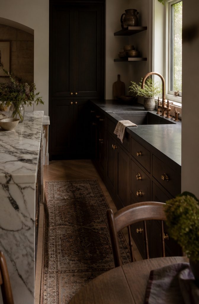
A kitchen with one counter material and one metal tends to read as purely utilitarian.
Amber Interiors splits the counters between marble and soapstone and sets brass and copper against them. Two stones and two warm metals give the eye more to settle on, and the metals take the chill off the stone.
What keeps that mix from feeling hard is the vintage runner. It adds a soft, aged layer underfoot that the stone and metal can’t supply.
Renters can borrow the look without touching a countertop.
Swap cabinet pulls and knobs for brass or copper, keep the originals in a labeled bag for move-out, and lay a runner in front of the sink. Counters are the landlord’s call, but hardware and a rug are yours.
2. Shaker Cabinets in Two Tones
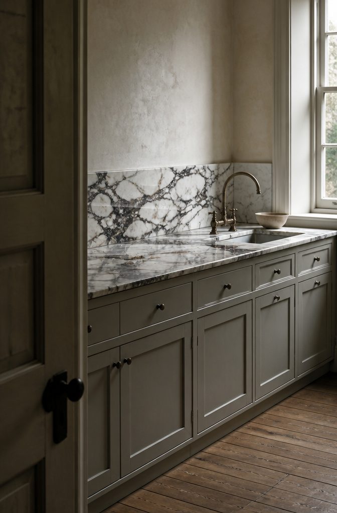
Shaker doors are plain and flat-paneled, which is why they sit so easily in a period home.
Paint them a muddy gray and finish the walls in a lighter limewash, and the two tones land close enough that the eye reads one soft backdrop.
Keep the contrast low so the marble is the only element with a pattern. Deeply veined stone is already busy, and quiet gray-on-gray paint lets it be the focal point without the room feeling crowded.
This look suits older homes. The traditional door style and soft, chalky walls match the age of the house, so the kitchen feels settled rather than styled.
3. Reeded-Glass Cabinet Doors
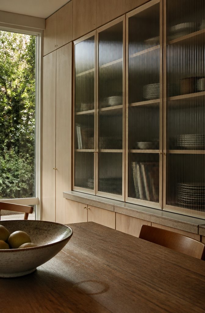
Rows of solid cabinet doors can make a kitchen feel heavy, and reeded glass breaks that up. The vertical ridges blur whatever sits behind them, so you see color and shape but not detail.
Ashe Leandro uses it for display cabinets, where cookbooks and everyday dishes read as soft shapes. You don’t have to dust and style the shelves to perfection every week.
The blur forgives, but it doesn’t erase. Silhouettes still show, so a leaning stack of takeout menus or a jumble of mismatched lids will look like exactly that.
Keep cookbooks and plain dishware behind the glass, group items by height, and send the real clutter to closed cabinets. A little organized mess looks intentional through reeded glass.
4. A Statement Island
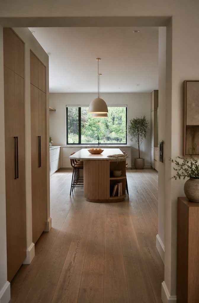
This look only works in a kitchen with room to spare, since an island with seating needs open floor on every side.
Curved edges soften the corners people brush past while cooking, which matters most when the island sits in a main walking path. Split the storage.
Closed cabinets hide small appliances and everyday clutter, and open shelves hold the few bowls or cookbooks worth displaying. Keep the open section small, because whatever sits there is on view all day.
Oversized fixtures overhead, such as large pendants, make the island the focal point.
Add just enough stools for a casual dinner party, and stop there. Extra seats crowd the walkway and push the island from gathering spot to obstacle.
5. Painted and Natural Wood Together
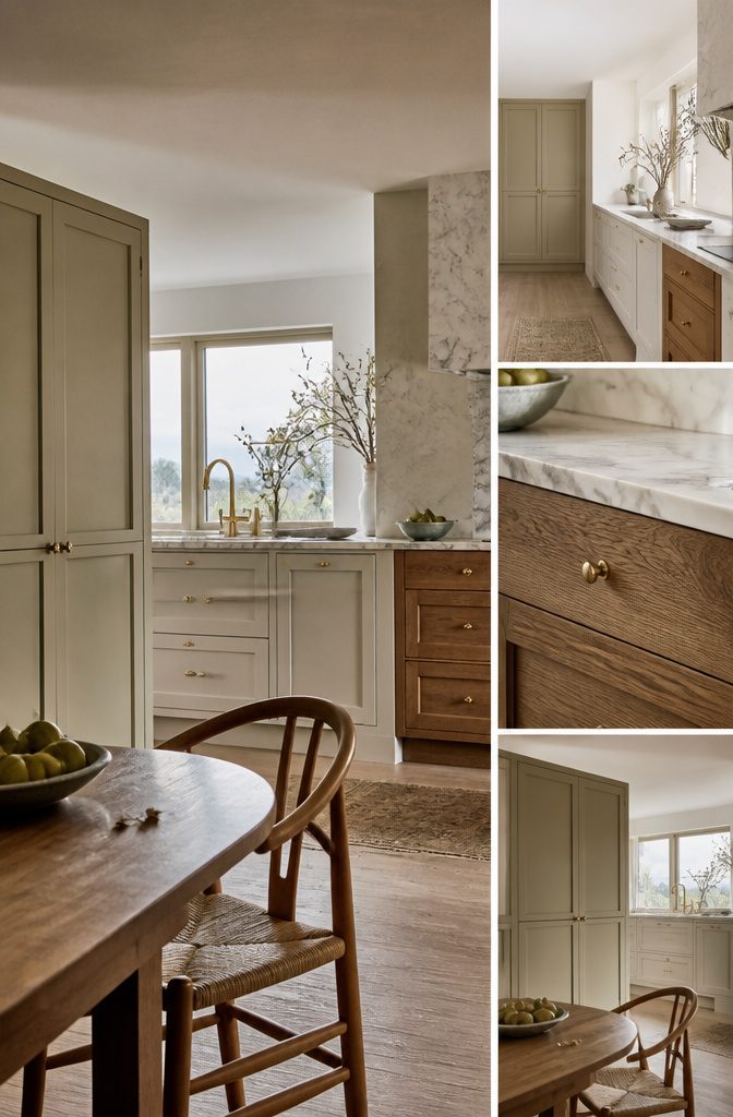
Christina Cole and Co. combines painted and natural wood cabinetry in one kitchen, and marble is the star.
The limewashed pantry is the quiet part of the mix. It is subtler than the stone, so it supports the room without competing with it.
You can copy that balance. Choose one dominant material and keep every other finish quieter than it.
If marble or another veined stone carries the drama, give the cabinets a calm treatment: painted wood on the main run, natural wood in a smaller spot, and a muted finish like limewash on the pantry.
Two loud surfaces compete, while one loud surface with two quiet ones looks planned. Natural wood also warms painted cabinets, and paint keeps a wood-heavy kitchen from feeling dark.
6. A Shelf for Art and Ceramics
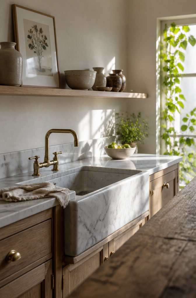
Give one open shelf one job: art and ceramics only, with no dish soap, sponge, or scrub brush.
A framed print and a few favorite bowls or vases make the shelf read like one in a living room, and that is what makes the kitchen feel like a room instead of a work zone.
One bottle of dish soap next to the vase breaks the effect.
The cleaning gear belongs at the sink. A flush farmhouse marble sink pulls the eye in a kitchen like this, so it can carry the practical side of the room.
Store the soap and brushes in the cabinet below or tucked beside the basin, and leave the shelf purely for looking.
7. Unexpected, Room-Like Details
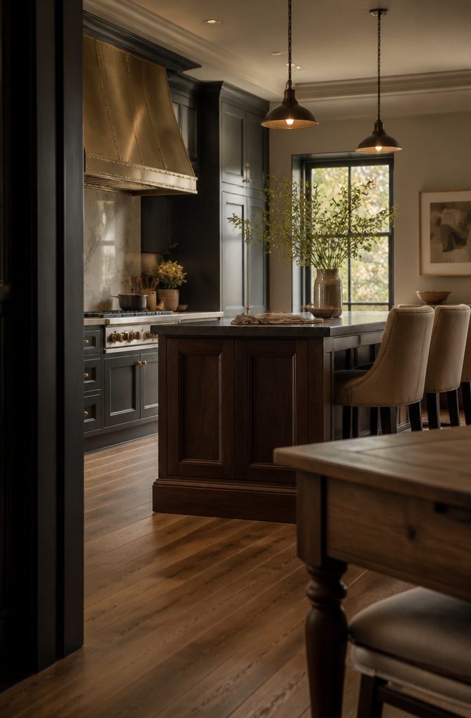
A kitchen stops reading as a work zone once a few pieces look like they came from a living room.
Katie Rosenfeld’s version pairs a statement brass range hood with industrial lighting and upholstered seating. The mahogany island is the surprise, since most islands match the cabinets and this one deliberately doesn’t.
Of the four, upholstered seating is the easiest to copy. A cushioned stool or chair moves with you when you rent, and it adds comfort that hard stools can’t.
Place it at the far end of the island or in a corner, well away from the sink and range, because fabric absorbs splashes and grease.
Wipeable performance fabric is the safer pick if the seat sits anywhere near the cooking.
8. A Colorful Backsplash
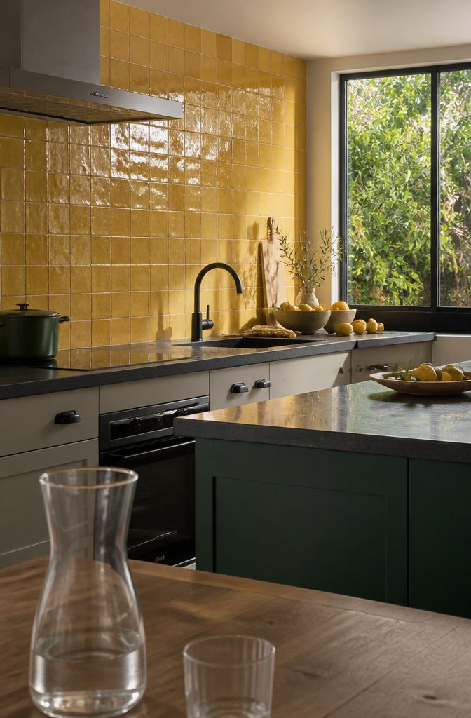
Neutral cabinetry is the safe long-term choice, and that frees the backsplash to carry the color.
Landed Interiors pairs punchy yellow Zellige tile with a deep green island, and the quiet cabinets let those two colors read as the whole palette.
Put the saturated color on one surface, here the tile, and let everything around it recede.
Zellige is handmade, so its surface is uneven and catches light differently across the wall. A flat, machine-made yellow tile can’t do that.
Color this loud is harder to live with than white, so pick a yellow you’ll still like in a year. The deep green island gives it a dark counterweight.
9. Materials from the Home’s Architecture
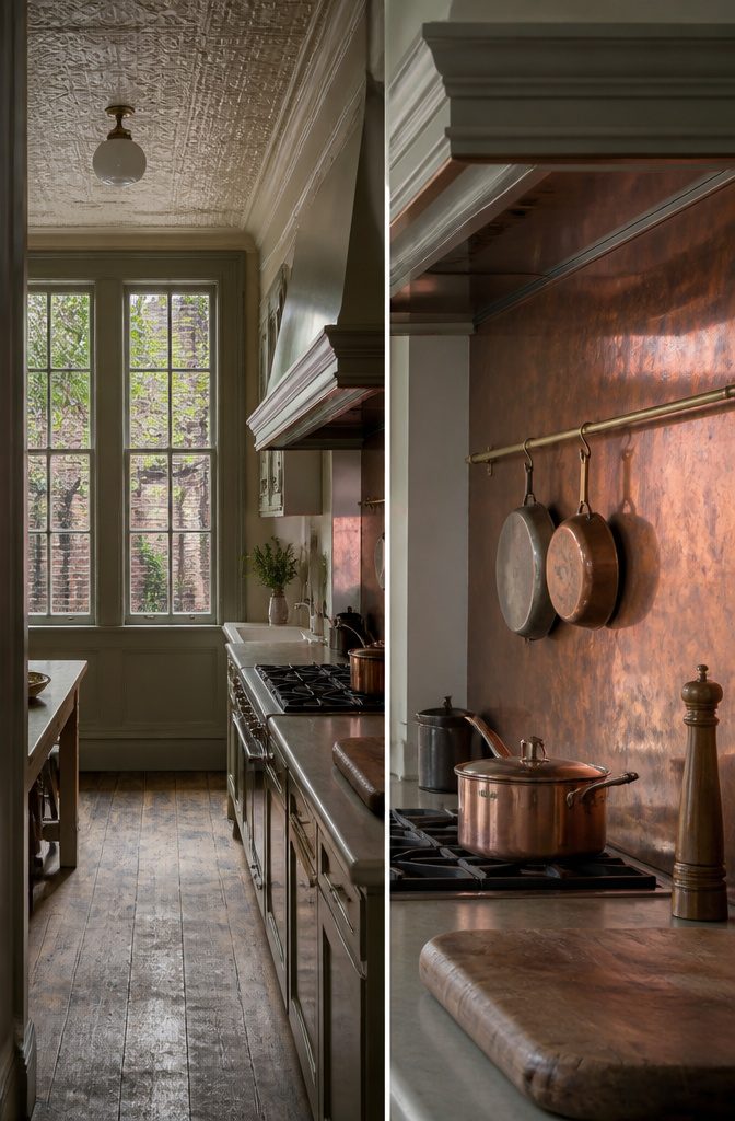
A century-old Victorian points toward a copper backsplash and a painted tin ceiling. Both are materials the house could have had originally, so they sit comfortably with old plaster and wood instead of arguing with them.
Before you buy anything, check the trim, the ceiling height and the windows.
Wide, layered trim and tall ceilings can carry traditional metals and pattern overhead. Flat, plain trim and a low ceiling, common in newer rentals, want quieter materials, because a busy tin pattern will make the room feel lower.
Windows date a house fastest: wood sashes with divided panes lean old, while large single-pane vinyl or aluminum frames lean newer. Choose the backsplash to match whichever you find.
10. Wallpaper and Layered Display
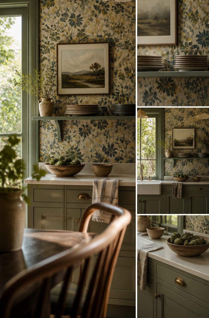
Rita Konig treats wallpaper as the playful layer in a kitchen, and its best quality is that it’s the easiest finish to swap.
Paint a cabinet or tile a wall and you live with the choice for years. A papered wall can change when your taste does.
For renters, that makes it the lowest-commitment way to add pattern. Pick a removable version and check your lease first.
Once the paper is up, hang framed artwork over it and add your favorite tableware nearby, such as plates on a shelf or a bowl on the counter.
The mix of art, dishes, and pattern makes the room look collected rather than staged. If the pattern is busy, keep the frames simple so the wall doesn’t compete with itself.
11. Natural Materials and Texture
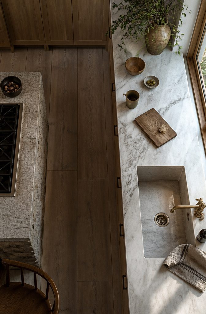
Wood, stone and marble give you three kinds of pattern without adding a single paint color. Designer Sean Anderson combines all three and says you can have a riot with the textures the earth gave us.
His condition is that each one is left in its bare state. Wood brings straight or swirling grain, stone brings a rougher, uneven surface, and marble brings veining that runs in loose, irregular lines.
Finish adds another layer of texture.
Polished marble reflects light and looks glossy, while honed marble has a soft matte face that sits quietly beside wood. Use one polished surface and keep the rest honed or matte, so the textures contrast instead of competing for attention.
12. Charm with Functional Details
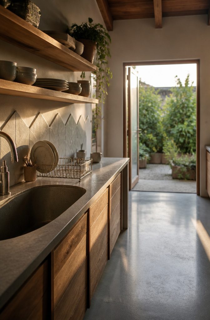
A dish rack, a run of open shelving, and a backsplash cut in a playful shape give a kitchen personality, and the best of them earn their place by doing a job.
The rack keeps wet dishes off the counter. Open shelves hold the plates and mugs you reach for every day.
Both are weekend projects, and for a renter they are the easy wins, since a rack sits on the counter and shelves leave only a few screw holes to patch.
The custom work is where the kitchen becomes yours. Cabinets built to your wall fit the space instead of leaving gaps.
Built-in seating gives you somewhere to sit without crowding the floor. Lighting placed over the spots where you chop, wash, and read makes the room easier to use.
Plan the Layout and Finishes
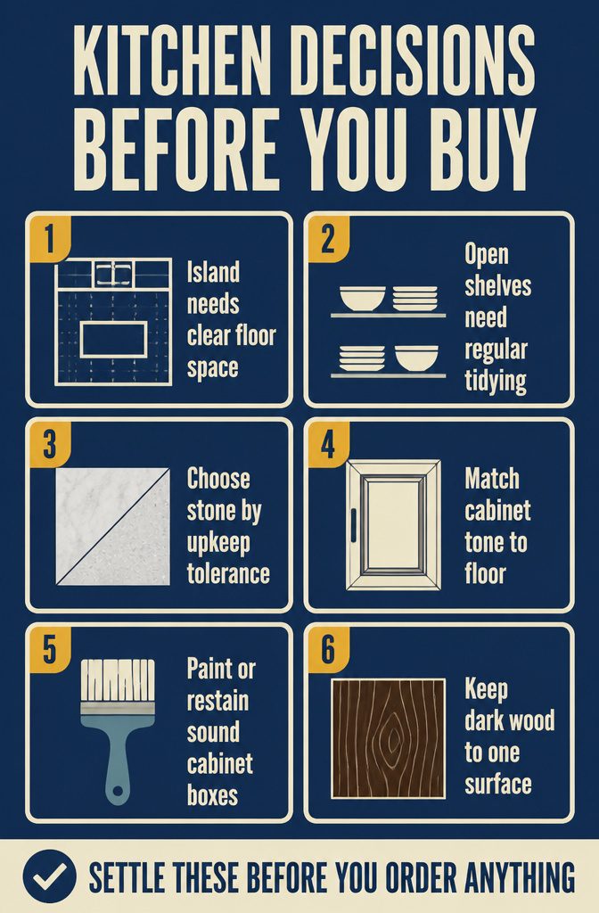
Settle these before you order anything:
- Layout. An island needs open floor on every side. A galley keeps everything within a few steps. Choose by your room, then shop for cabinets.
- Uppers or open shelving. Closed uppers hide clutter. Open shelves put dishes and ceramics on display, so they need regular tidying.
- Marble or quartz. Both read light. Weigh the look you want against the upkeep you’ll tolerate.
- Door style and color. Match the cabinet tone to your floor. Owners on Reddit with red-toned cabinets over hickory floors suggest either a light brown that echoes the floor with cream tile, or cream paint with a darker backsplash.
- Existing cabinets. If the boxes are sound, paint or restain before you reface or replace.
- Dark wood. Mismatched dark woods make a kitchen feel heavy. Let one surface go dark and keep the others light.
Guided Design or Blank Slate
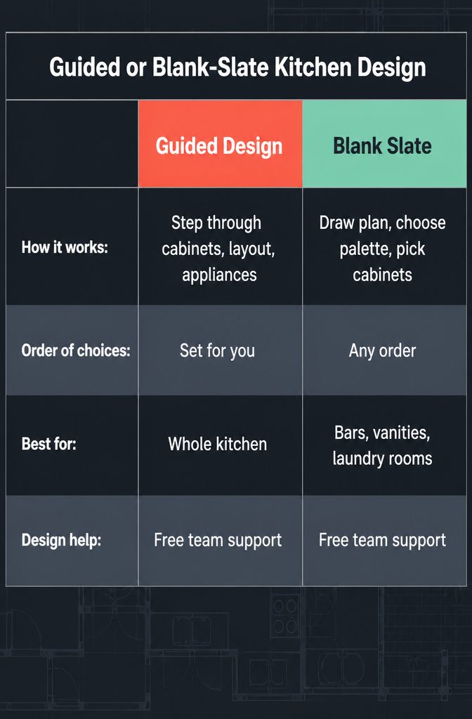
Create-A-Kitchen is a 3D design tool and virtual planner with two modes.
Guided Design suits a full kitchen, since it sets the order of decisions for you. Blank Slate suits small projects where you already know what you want.
| Guided Design | Blank Slate | |
|---|---|---|
| How it works | Step by step through cabinets, layout and appliances | Draw a floor plan, choose a color palette and pick cabinets |
| Order of choices | Set for you | Any order |
| Best for | A whole kitchen | Bars, vanities, laundry rooms |
If you get stuck in either mode, the site offers free help from its design team.
Frequently Asked Questions
Should I choose a kitchen island or a galley layout?
Pick based on your room. An island needs open floor on every side and works best in a kitchen with room to spare, while a galley keeps everything within a few steps.
Cabinets Create-A-Kitchen planner lets you build the layout virtually and preview it before you buy anything.
Are upper cabinets or open shelving better for a kitchen?
Closed uppers are better if you want clutter out of sight.
Open shelves put dishes and ceramics on display, so they need regular tidying. You can also split the two: closed cabinets for small appliances and everyday items, and a small open section for the few pieces worth showing.
Is marble or quartz better for kitchen countertops?
Neither is the clear winner.
Both read light, so the choice comes down to the look you want against the upkeep you’re willing to take on. Veined marble is a strong focal point, so if you choose it, keep the cabinets and other finishes quieter.