
These ideas run from $14.99 pillows and a 15-minute seasonal swap to a $548 mirror and a full repaint, and the direction your room faces decides where to start.
A dim north-facing room needs a warm neutral like oatmeal or cream to avoid reading sterile; swatch it in morning, afternoon and lamplight.
1. Wall Colors and Undertones
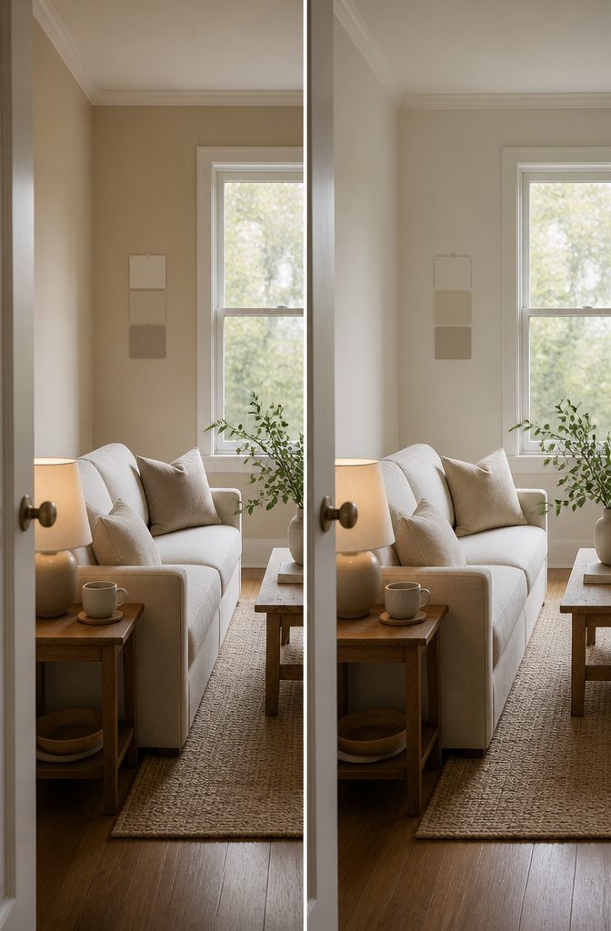
Check which way the room faces before you pick a neutral, because that decides warm or cool.
North-facing rooms that lack natural light work best with warmer tones to counteract the darkness and coolness. With light-filled south-facing rooms, you can be more experimental as both cool-toned and warmer-toned colors will work.
In a dim room, choose a warm neutral like soft beige, oatmeal, ivory or cream so it doesn’t read sterile. Bright rooms can handle greige, warm gray, pale gray, off-white or soft white.
Aim for warm without looking yellow and cool without looking stark. Always swatch a color before committing, and check it in morning, afternoon and lamplight.
Recommended Products


QUALITY MATERIAL: The pillow cover is composed of a soft and comfy corduroy which is a kind of polyester fabric, features a cute and elegant boho stripe design. Our pillow covers are of good workmanship, they are tightly sewn without loose threads.

Premium Chenille: Crafted from substantial, high-grade chenille, these decorative pillow covers offer a luxuriously soft, velvety touch and a beautiful drape. Features impeccable stitching with zero loose threads, delivering a premium, heavyweight feel that elevates any space.
2. A Range of Neutral Tones
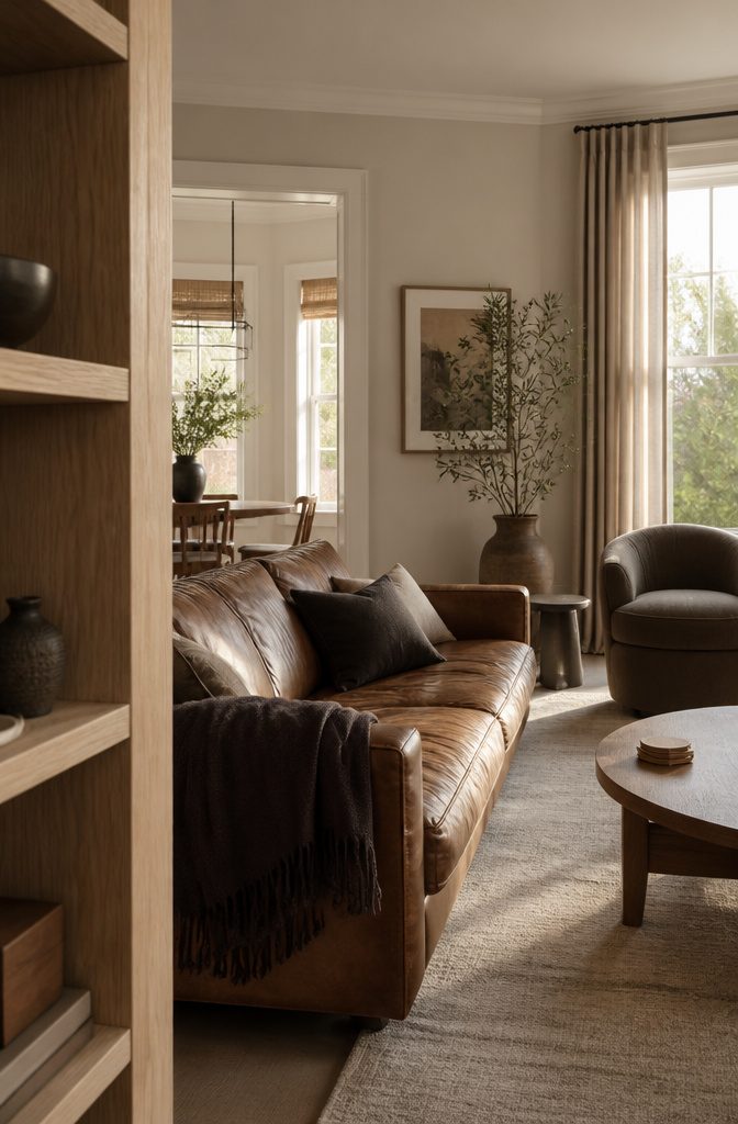
Pair light neutrals with at least one deeper one. Cream walls and white trim look fresh beside an aged leather sofa and wood pieces, and the brown adds depth without the harshness of black.
Charcoal, espresso, and deep taupe work well in pillows, throws, or an accent chair, where they ground a room that would otherwise feel too airy.
Taupe, beige, and ivory are the usual picks. Pure neutrals include grays, blacks, browns, and whites, and tan is a near-neutral, a pure neutral with a touch of a primary color.
A room where every surface is the same shade reads flat or cold. Swatch paint first to see how it behaves in your light.
3. Monochrome Scheme
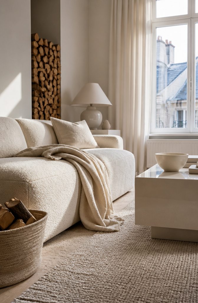
Pick one family, such as all cream, all warm gray, or all white, and keep every large piece inside it.
A single tone leaves very little visual clutter, so the room looks bigger and brighter. That suits anyone who wants a quiet space, and it works especially well in a small living room.
The main risk is a flat room.
Vary the finishes, not the color. Set a rough weave beside a smooth fabric, a matte wall beside something glossy, and a heavy throw against a sleek surface.
A stack of logs adds bark texture and a little brown without disturbing a white scheme. If the room still feels dull, add another material before you add another color.
4. Layered Textures
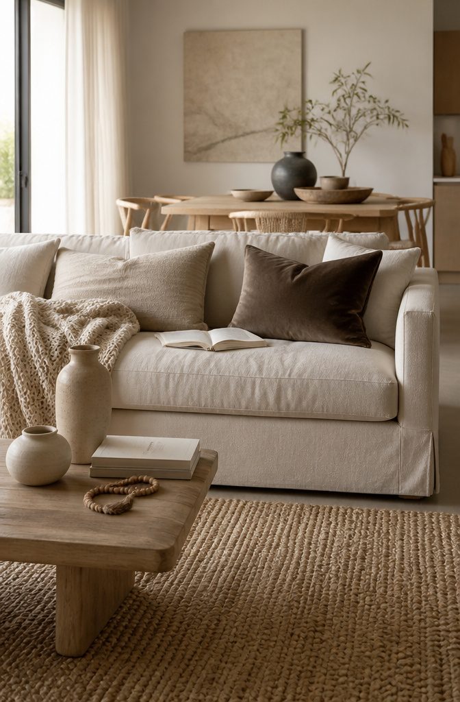
A room of all neutrals goes flat when every surface feels the same, so vary the touch before you vary the color. Set something smooth or tufted next to something slubby: linen cushions, an open-knit throw, a velvet pillow.
Linen burlap is a relaxed woven fabric made from the flax plant, and it’s strong enough for a sofa. Matte leather cushions, beaded or tasseled accents, and ceramic vases add contrast in finish.
Start with cushions and throws, the cheapest layer and the easiest to swap.
Put darker covers on a light sofa and lighter ones on a dark sofa. Mix 3 different fabrics before you buy a fourth of the same.
5. Rugs and Soft Furnishings
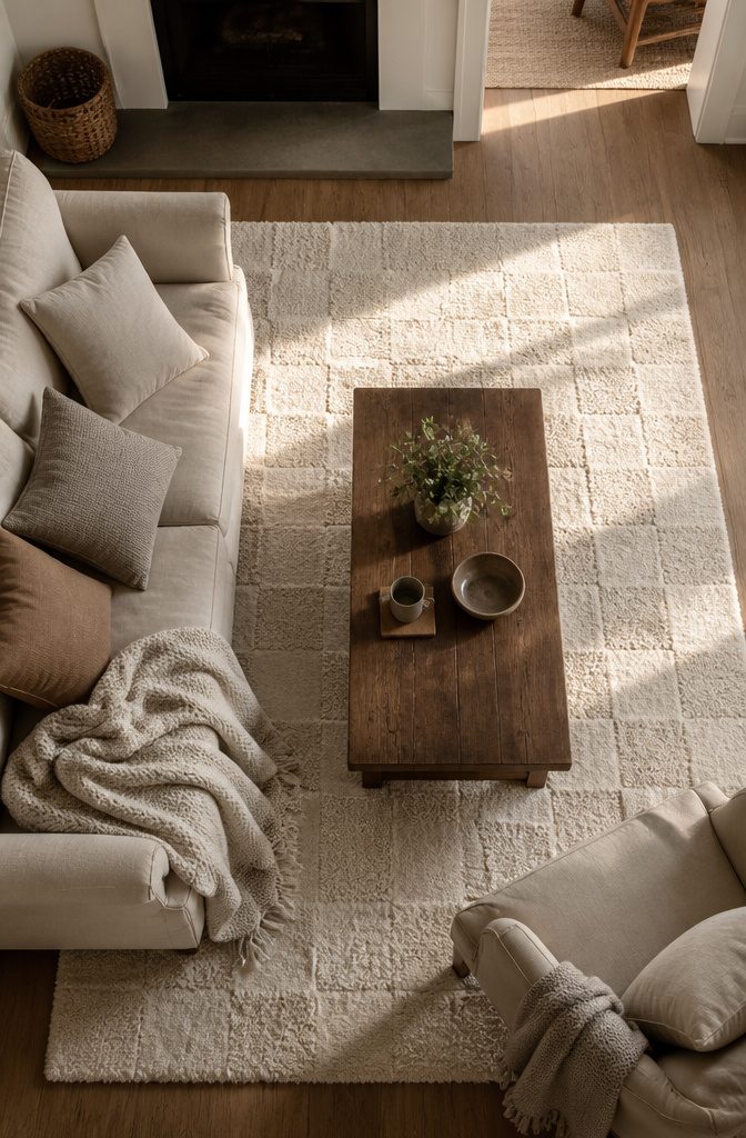
Pillows and throws give the most change per dollar.
A 100% cotton pillow, 18 by 18 inches, costs $14.99, so 3 in shades a step lighter or darker than your sofa come to about $45. A 50 by 60 inch throw over an armchair adds another texture within reach.
The rug costs more and does more to define the room. Bigger is better: an 8 by 10 makes a living room feel larger, while a 6 by 9 can mark off a fireplace or desk corner.
Choose wool, jute, cotton, or sheepskin in a texture that contrasts with your floor, such as something fluffy on hardwood. For pattern in a small room, a 5 by 7 checkerboard rug runs $199.
6. Natural Materials and Greenery
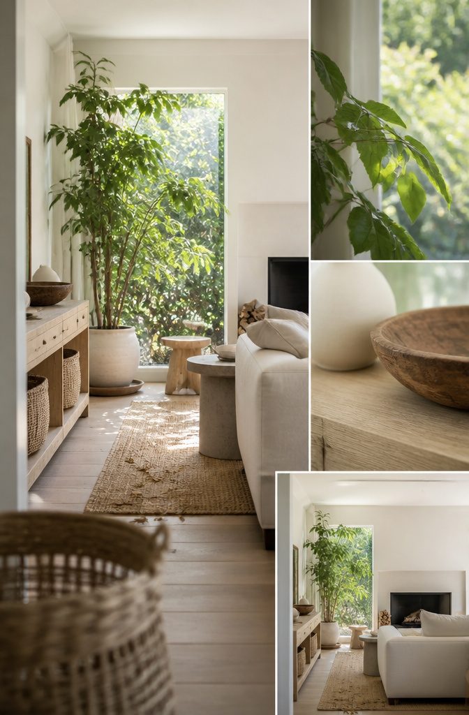
Light wood and wicker keep a neutral room open, so choose a pale wood stool or console and a few wicker baskets before anything dark.
Wood cladding on one wall looks good, but it suits owners; renters get the same warmth from freestanding pieces. A jute rug adds a dry, coarse grain against a smooth sofa, and wool or sheepskin softens it underfoot.
For green, a tall houseplant in a ceramic pot is the easiest win. It draws the eye up and gives a pale room a color it can’t make itself.
Fresh flowers on the coffee table work the same way. A stack of logs by the fireplace adds bark texture for free, and a concrete side table brings in cool, heavy stone.
7. Architectural Focal Points
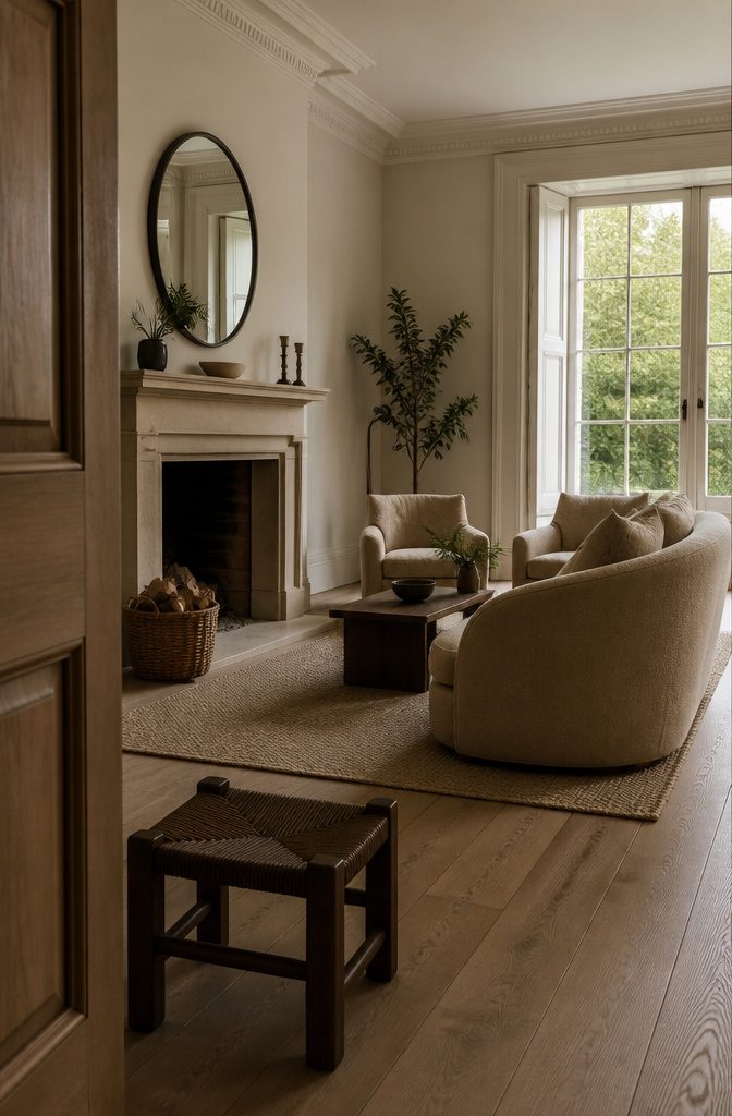
A fireplace, a bay or sash window, or a run of wood beams already does the job of a focal point, so build around it.
Face the sofa and chairs toward the feature and balance both sides evenly. A symmetrical layout lets a fireplace anchor the room.
Then keep everything else quiet: a sofa with soft curves, tones close enough that nothing competes with the feature, and no fussy pillows or heavy curtains over a window you want seen.
A round mirror above a mantel adds one curve against the clean lines.
If the room has no feature, create a center.
A striking ceiling light draws the eye inward when the palette has little color. A low, oversized footstool between two sofas gives the seating a middle.
8. Lighting and Mirrors
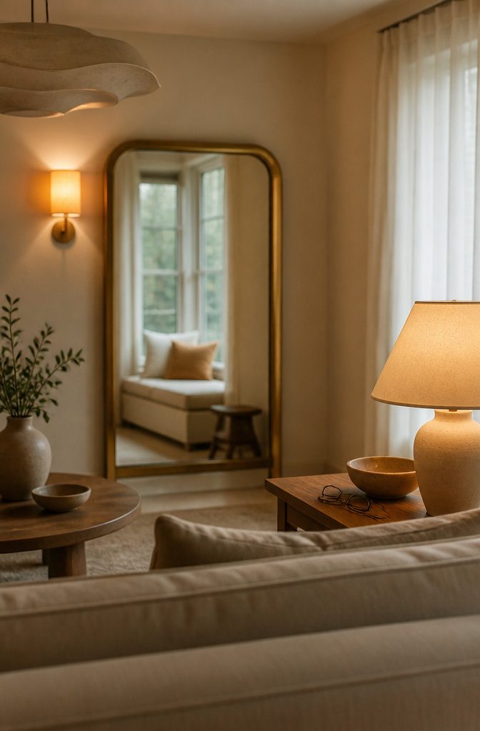
Sheers let in more light than heavier curtains and scatter it into soft, shifting patches that add depth to a neutral room.
Hang a mirror beside or opposite the window so it catches daylight and throws it back across the room.
The Gleaming Primrose Gold Mirror measures 39.25 inches high by 39 inches wide, is made of iron and glass, and starts at $548. Its gold frame adds warmth a pale wall lacks.
At night, layer table lamps, sconces, and a mirror rather than leaning on one ceiling light.
Warm bulbs push a flat beige wall toward honey and cream. Mix ambient, task, and accent light, with one sculptural fixture as the focal point.
9. Restrained Color Accents
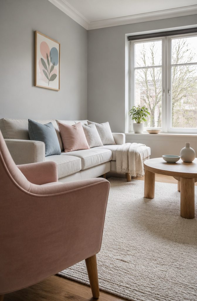
Keep about 80% of the room neutral and give the other 20% to contrast colors.
Cushions, art, plants, and one accent chair can carry that 20%, and you can swap any of them without repainting or replacing the sofa. Limit yourself to a handful of accent shades.
Your choice of color depends on the mood you want.
For a calm room, soft pastels work best against a crisp, cool-toned neutral like clean white or light grey. Baby blue and blush pink on light grey look grown-up rather than sugary.
Green, from plants or striped cushions, adds contrast without noise. Gold lighting or metal decor adds shine.
For a livelier room, go brighter. Bold colors pop harder against neutrals, and warm or cool both work.
10. Black Contrast Accents
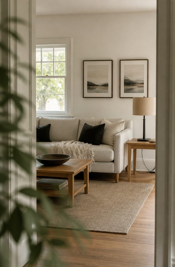
Black sharpens a quiet room fast, but only in small doses. Keep about 80% of the room neutral and let black make up the rest, through a lamp base, throw pillows, or a slim piece of furniture.
Picture frames are the cheapest place to start.
A black frame against a cream or light wall makes the print inside stand out, and swapping frames costs far less than repainting. A black lamp base is the next easy step, followed by a pillow or two.
Black has overtaken the neutrals once it dominates your sightline. Repeating it in a few places looks planned, while a single black item in one corner looks like an accident.
11. Art and Personal Accessories
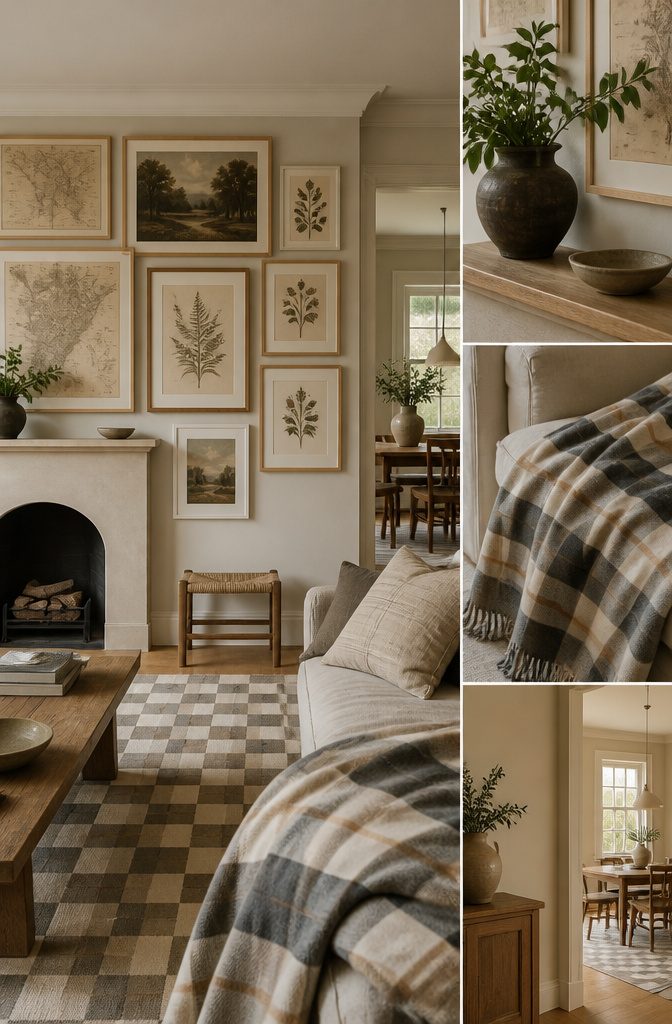
Frames do as much work as the art in a neutral room. White or untreated oak suits a light, beachy look, and black frames stand out against pale walls.
For art that stays inside the palette, try tea-stained maps or vintage prints. A single gallery wall of them adds character without adding color.
Renters can lay the arrangement out on the floor first, then hang it with removable adhesive strips rated for each frame’s weight.
Larger frames can lean on a shelf or mantel instead. Even spacing and aligned edges give a tailored look.
Pattern works the same way.
A checkerboard rug and a plaid throw fit when both stay in tans, creams and grays. A patterned sofa also hides wear better than one pale solid.
12. A Distinct Style Direction
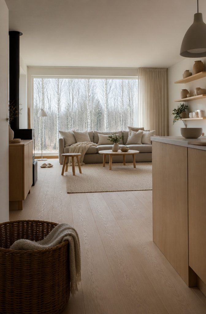
A neutral room can read as luxe, minimalist, farmhouse, or Scandinavian-cozy, and these are four different looks, not a rule you have to follow. Pick one and let it decide your materials and how much you put out.
Luxe leans on polish: velvet or bouclé upholstery, brass or satin metal, and a tufted sofa or wingback chair. Minimalist keeps matte finishes, clean lines, and mostly bare surfaces.
Farmhouse adds weathered wood and linen slipcovers. Scandinavian-cozy pairs pale wood with wool throws and plenty of small objects.
Stick to one direction. A glossy luxe sofa beside rustic farmhouse accents looks like indecision, not layering.
Small Living Rooms
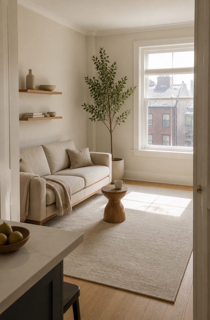
Small rooms reward restraint. Lighter, brighter neutrals such as dove gray or soft beige throw more light around, and bare surfaces and clear shelves keep the room looking bigger and brighter.
Choose a larger rug rather than a small one, since a big rug makes a small living room feel bigger.
A 450 square foot apartment living room shows how few pieces it takes. A shapely wooden stool and a tall indoor tree in a ceramic pot carry the whole look.
The tree draws the eye up, which adds the illusion of height, and its green softens a light room. Pick one tall plant instead of several small ones that crowd the floor.
Seasonal Swaps
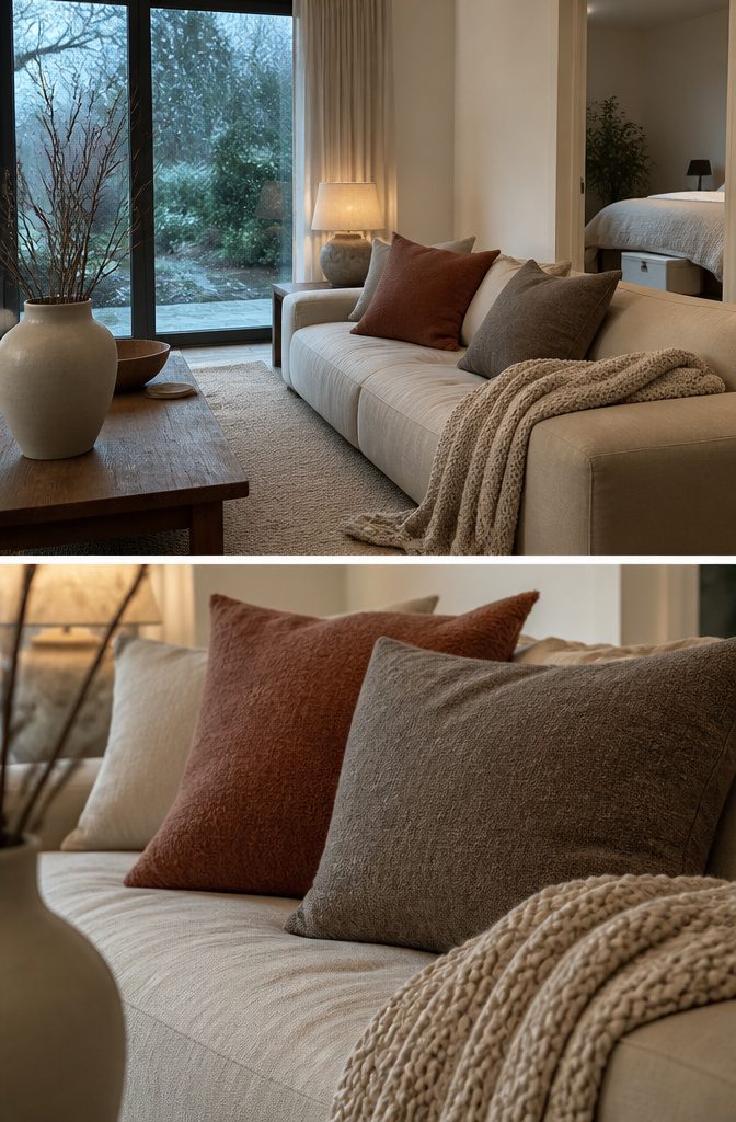
Keep the walls, sofa, and large furniture neutral, and let the pillows and throws carry the seasons. Two new pillows at $14.99 each come to about $30, so a swap fits a small budget and a single Saturday morning.
Buy 2 pillows per season rather than a whole new set, and keep the other pillows you already own as the base that stays put.
For fall and winter, go heavier: a chunky knit throw and pillows in wool or corduroy.
For spring and summer, switch to lighter linen or cotton in paler tones. Store the off-season pieces in a lidded bin under the bed so the next swap takes 15 minutes.
Frequently Asked Questions
What is a neutral color?
A neutral color has low intensity or saturation, so it works with most other colors. Pure neutrals are grays, blacks, browns, and whites.
Near-neutrals, such as tan, are a pure neutral with a touch of a primary color. Both make good backdrops for a living room.
What are the best neutral colors for living room walls?
It depends on how much daylight the room gets. A dim or north-facing room does best with a warm neutral such as soft beige, oatmeal, ivory, or cream, which keeps it from feeling sterile.
A bright room can handle greige, warm gray, pale gray, off-white, or soft white. Test a swatch in morning, afternoon, and lamplight before you paint.
What neutral colors make a room look bigger?
Lighter, brighter neutrals make a room look bigger because they bounce more light around.
If you’d rather not use white, dove gray and soft beige both open up a small living room. A larger rug and clear surfaces add to the effect.
What colors go with neutrals?
Any color can go with a neutral base, so choose by mood. For a calm room, use soft pastels such as baby blue or blush pink against clean white or light gray.
For a livelier room, use brighter colors, which stand out more against neutrals. Keep about 80% of the room neutral and give the other 20% to color.