
Navy and blush is the safest pick, since it fits a barn, ballroom, or backyard tent without depending on the setting.
Couples marrying at the water should swap the blush for yellow and a second blue. Those colors echo the sand and sea, but they look arbitrary at an inland venue.
1. Green and Gold Palettes
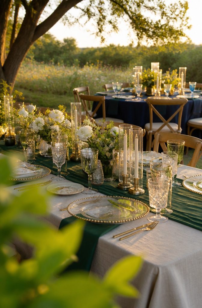
Emerald, cream, and gold recalls a mountainside field at sunset. Emerald and cream stay subtle, so gold is the one color that stands out.
The mix suits any summertime wedding because it echoes everything blooming outside. Skip it if you want navy-level depth, since this palette stays light and creamy.
Green, navy, pale blue, and gold is the better choice for an outdoor wedding. Navy and gold come in few shades, so the green is the color you adjust to match your decor.
Navy gives bold contrast against natural greens, and dusty blue adds a trendy, modern note. Skip it if you want a lighter, creamier look, because the navy will darken the whole scheme.
Recommended Products

Pre-made artificial bridesmaid bouquets for wedding. 1 pack handmade flowers bouquet made of a mix of high quality silk and plastic type material

Set of 4 artificial bridesmaid bouquets for wedding. 4 pack handmade flowers bouquet made of a mix of high quality silk and plastic type material

❤️ Floral Set: This set features a diverse mix of handcrafted flowers, including various types and colors of faux silk and foam blossoms, as well as greenery. Ideal for bridal and bridesmaid bouquets, floral arrangements, table centerpieces, and more.
2. Sage Green and Ivory
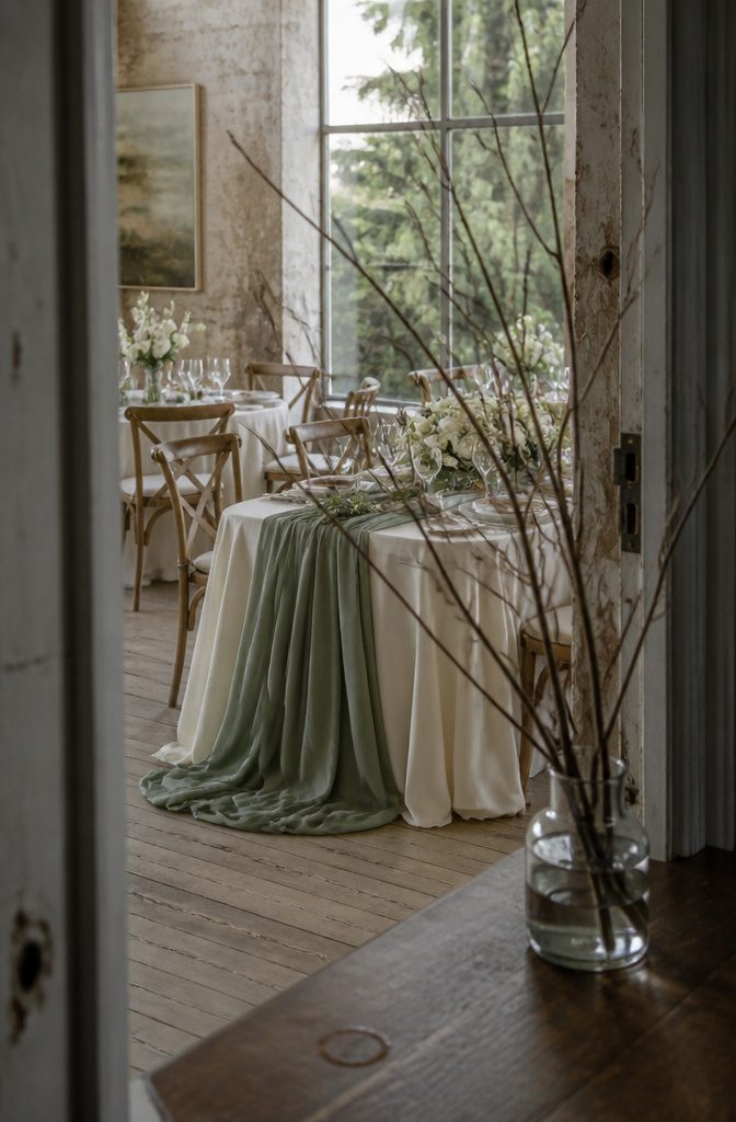
Sage green and ivory is the calmer of the two. Sage greenery around ivory flowers looks elegant and timeless, and the pair suits winter and spring weddings.
It also works with metallics or pastels if you want a third color later. Use the sage in bridesmaid dresses or the greenery, and carry it to the groom with a boutonniere.
Adding burgundy gives you contrast.
Burgundy, ivory, and sage stays laid-back and subtle, yet it catches the eye without getting bright. Choose it if plain green and cream looks flat to you.
If you want saturated, high-energy color, both palettes will probably feel too quiet.
3. Terracotta and Burnt Orange
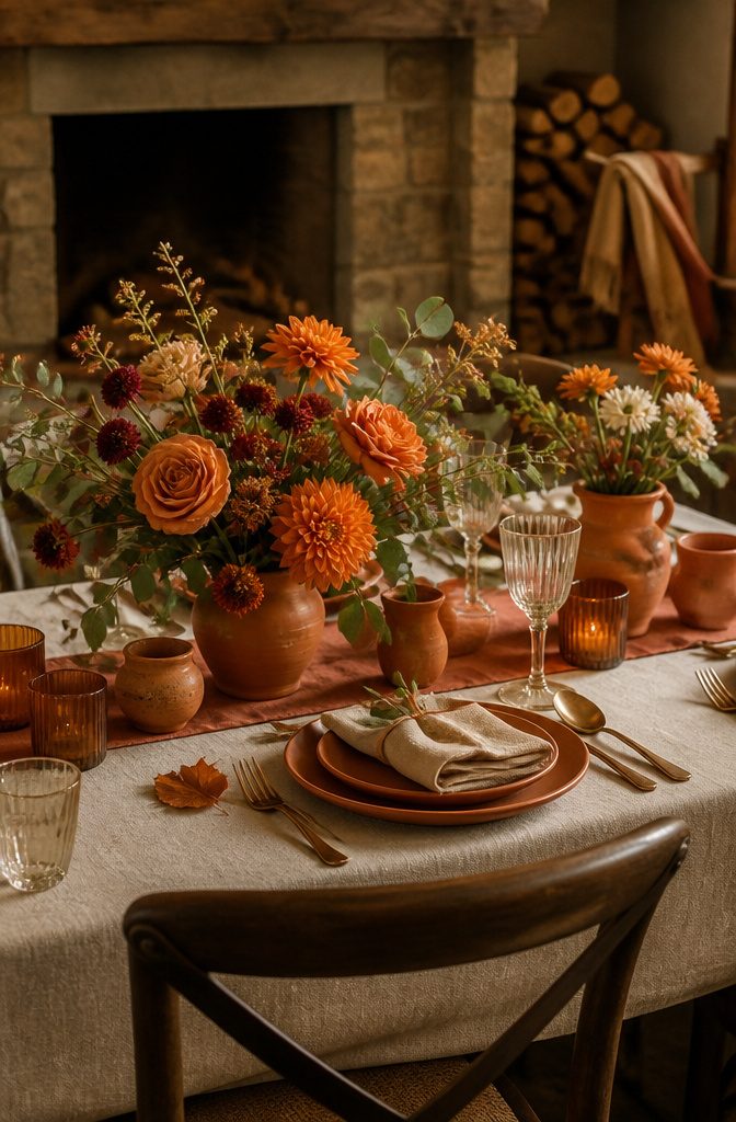
Terracotta or burgundy paired with ivory, light sage, or both gives a fall or winter wedding a warm, inviting look.
The softer neutrals make the deep shades pop without making the palette feel dark. Terracotta has been trending for a while, so it’s an easy pick if you want your photos to look current.
Burnt orange with cream is the gentler version. Cream keeps the orange from overpowering the room, and the result reads soft and romantic.
Both palettes are built for cool-weather dates. On a spring or summer date they can feel heavy, so if you’re marrying in warmer months, choose a lighter palette from this list.
4. Navy With Yellow or Blush
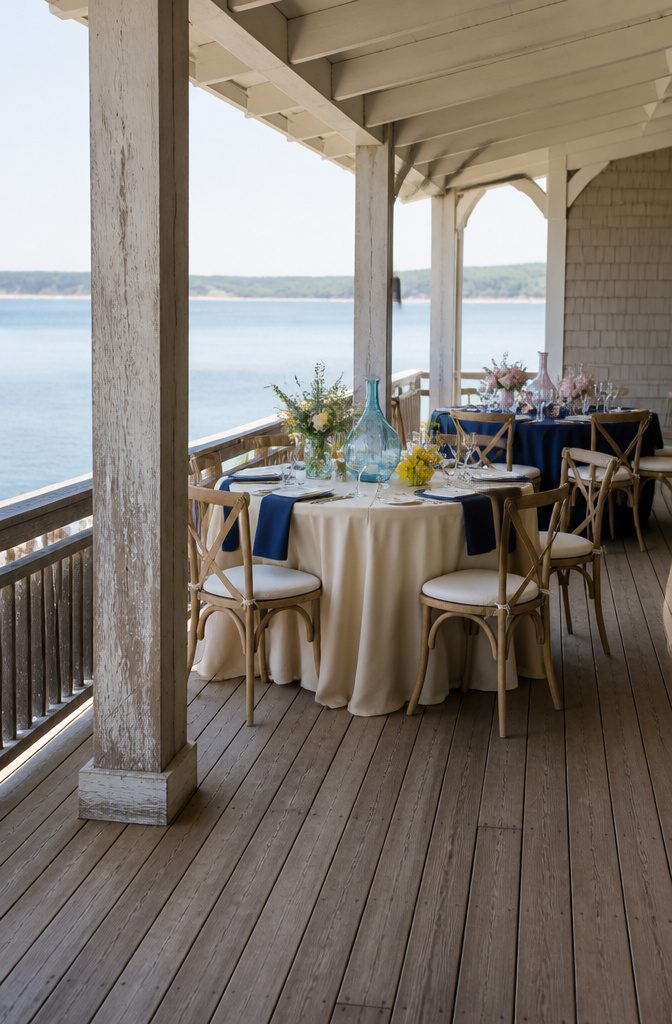
Navy, yellow, and a second, lighter blue belong at the water. Navy beside light blue echoes the ocean, and yellow picks up the sand and sun.
Inland, the same colors can feel like a theme with no reason behind it. The second blue is flexible, so choose whatever shade you like, from powder to sky.
Navy and blush travels to more venues. Navy is a classic, and a soft blush beside it balances masculine and feminine.
A barn, ballroom, or backyard tent can all carry it, since neither color depends on a particular setting. If your venue isn’t on the coast, this is the safer pick.
5. Peach With Sage or Coral
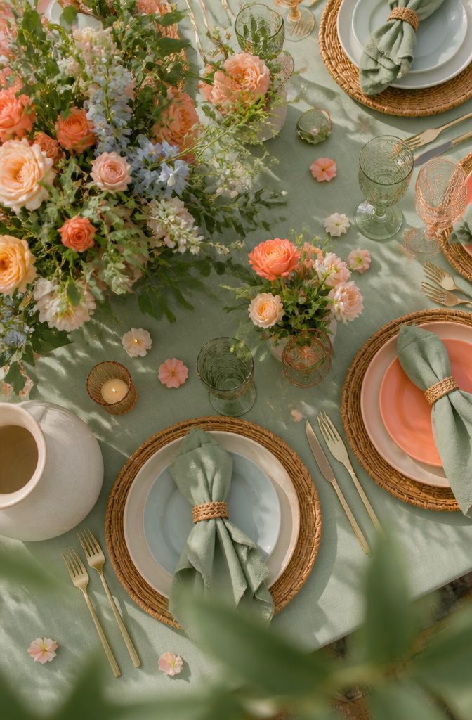
Peach and light blue read as soft neutrals, so a sage hue wrapped around them keeps the palette from going flat.
Make sage the anchor shade, since it also ties in any floral accents you add. Contrast is the weak spot: 3 pastels together look gentle, but their tones sit close, so a few stronger flowers help define the edges.
Peach and coral is easier to adapt.
Stay with one shade for a monochromatic look, or mix lighter and deeper tones, since both colors come in a wide range. Sage green bridesmaid dresses suit the pair, and a few coral touches carry it into the tablescapes.
6. Champagne, Black, and Jewel Tones
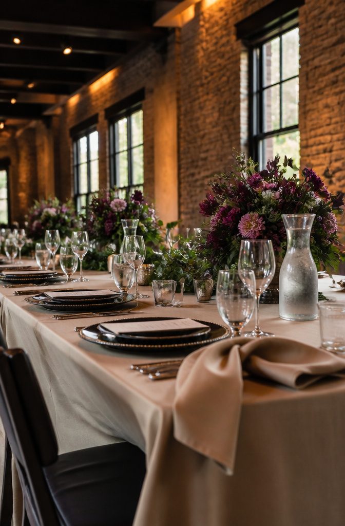
Champagne and green carry this palette, and black belongs in the accent role only.
A little black gives the day a royal, glamorous look, while too much makes it heavy. It suits simple, chic events, and you can layer in decorations without crowding the scheme.
Jewel tones with green go richer.
Deep shades like these have a depth pastels can’t match, but a full jewel palette can read dark. Add pops of berry to brighten it, and berry pink flowers are the easiest way to do that.
Skip both palettes if you want a light, airy feel. Black accents, jewel tones, and deep green all pull the look toward moody.
7. Lavender With Aqua or Celery
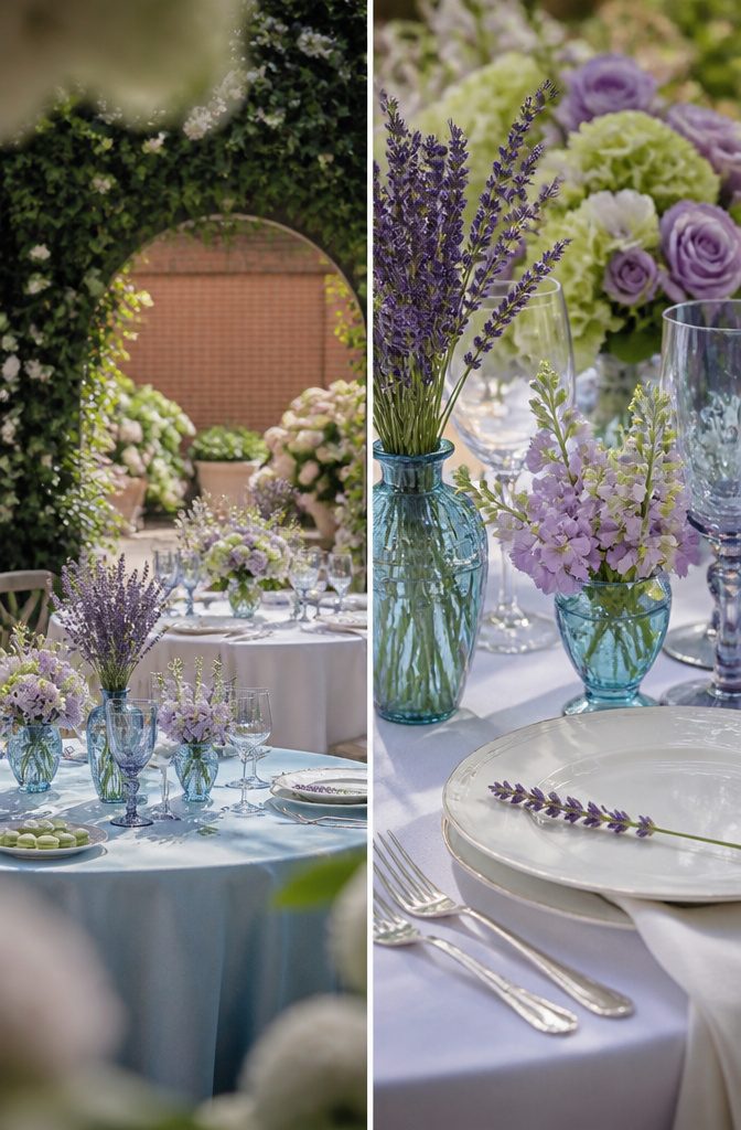
Pale lavender and aqua is the easier of the two pairings to carry through a whole event.
A loose handful of lavender flowers in a blue glass vessel covers the tables, and mix-and-match bridesmaid dresses cover the wedding party. The menu can echo the palette with pistachio or green tea macarons and lavender-infused cocktails.
Lilac, celery, and white is the riskier pairing, because purple and green can clash when both are bright. Choose pastel shades of each to soften the contrast.
The white tones sit well beside a wedding dress. The palette also stands out against green mountain backdrops and the red bricks of a city.
8. Purple, Violet, and Lime
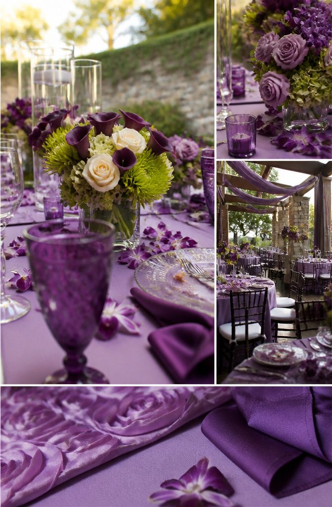
Mixing shades of one color is an easy way out if you can’t settle on a second hue.
Lavender paired with a lighter or darker purple looks effortless and a little regal, and it carries across gowns, bouquets, and table decor. Deep purple calla lilies work well as the darkest note.
Lime and violet is the loud version. Deep purple calla lilies next to Anastasia spider green blooms give a bright, high-contrast look, and ivory roses are what keep it balanced.
Without them, the two colors compete. Even with the ivory, this palette may be too much for couples who want a quiet room, so choose it only if you want color to be the main event.
9. Muted Mauve and Ash Rose
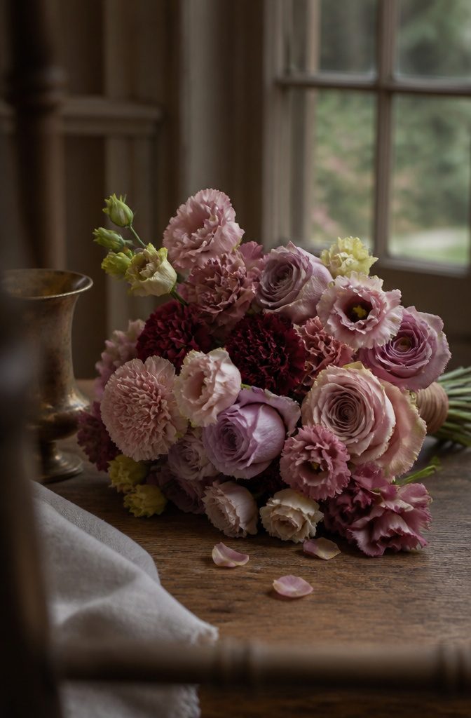
Muted mauves and dusty roses read soft and quiet, so the flowers you choose carry the personality.
- Pink-lavender and almost-mauve works in any season, spring included. It suits a vintage wedding and an elegant ballroom evening equally well.
- For that palette, pick dusty pink carnations, Esther light pink roses, and kiss of blush lisianthus.
- Ash rose and spiced apple runs deeper and moodier. Amnesia lavender novelty roses, secret garden roses, and burgundy carnations all sit in this family.
- With colors this close together, mix flower shapes, such as a ruffled carnation beside a rose, so the bouquet has depth.
10. Pink With Gold or Meadowlark
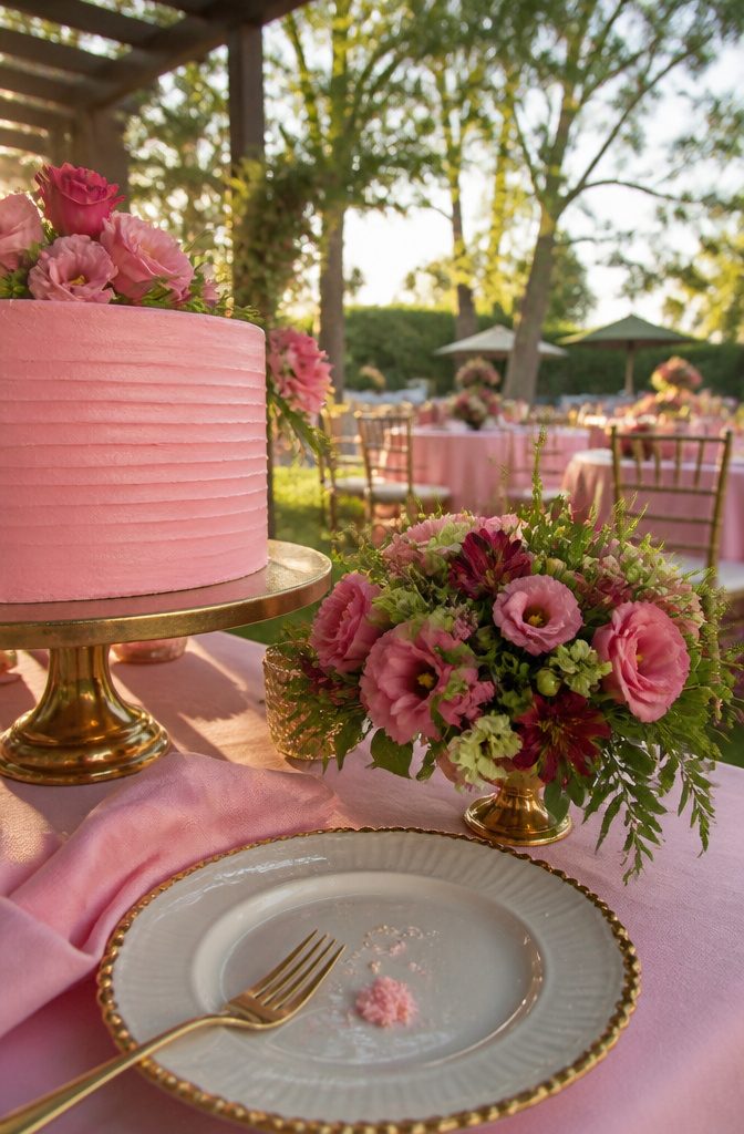
Gold and pink works across the whole day, from bridesmaid dresses to the cake, so a single pairing can tie your attire and dessert table together. Use gold as the accent and let pink carry the main color.
Meadowlark and rapture rose is the cheerful option, and it is easy to build from flowers. For the rapture rose shade, choose raspberry pink lisianthus, pink wax flowers, and merlot alstroemeria.
Bring in meadowlark as small touches with pear green hypericum berries, green mini lisianthus, and bells of Ireland. Keep the rose dominant and the meadowlark in the supporting role.
11. Multicolor and Late-Summer Brights
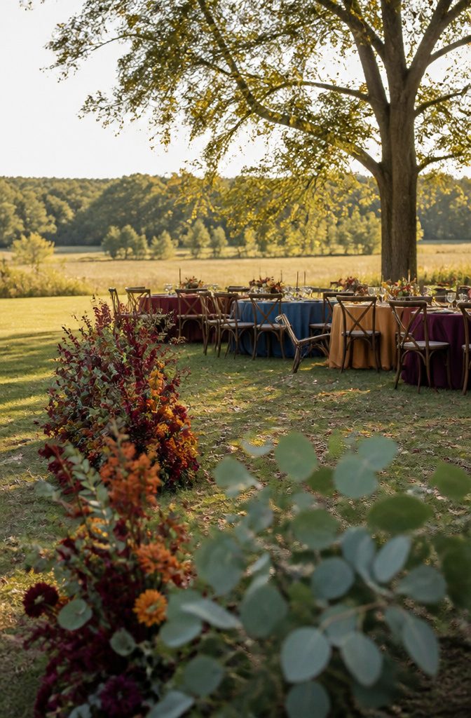
Burgundy, purple, mustard, blue, burnt orange, and green is the pick if you can’t choose. Each bridesmaid wears a different color, so the party reads as the whole range instead of a matched row.
Six colors take more planning to keep cohesive, though. Pick one color to lead in the flowers and let the other five show up in dresses and small accents, or the day looks scattered instead of layered.
For an outdoor wedding in late summer, orange, cranberry, and green is the easier palette.
The orange and cranberry stand out against eucalyptus, which makes aisle decorations the best place to use them. With only three colors, matching flowers, stationery, and attire is far simpler.
12. Bold Reds, Oranges, and Yellows
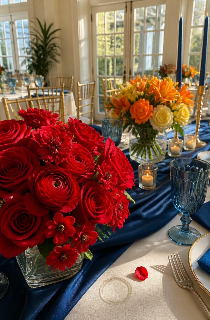
Cherry tomato red with royal blue works best when the blue stays out of the bouquet.
If you don’t like tinted flowers, put the blue in the bridesmaid dresses or the decor and keep the flowers red. Roses, bouvardia, and red ranunculus all fit that shade.
Yellow, orange, and ivory is the brighter pairing. Navy bridesmaid dresses give the bouquets a deep backdrop, so the yellow and orange stand out sharply, and the ivory gives the eye a place to rest.
Both palettes run at high energy.
If you want a hushed, soft-focus wedding, skip them. They suit couples who want color to be the first thing guests notice.
13. Nile Green and Dahlia
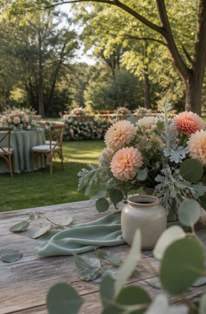
Nile green with blooming dahlia suits an outdoor wedding, where the soft green sits easily against real grass and trees.
Both colors are flexible. Peach is a good third color if the pair feels too plain, and it keeps the look warm instead of cool.
Greenery does the rest of the work.
Dusty miller and silver dollar eucalyptus add a silvery gray-green that sits between the Nile green and the dahlia tones, so bouquets and centerpieces look layered without a fourth color. Tuck a few stems into each arrangement and stop there.
Choosing a Palette
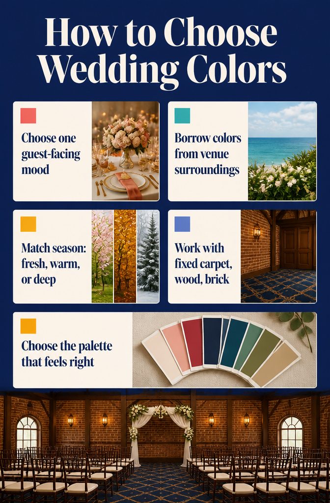
Start with the mood you want, then let the venue and date narrow the list.
- Pick the mood first. Glamorous, laid-back, romantic, elegant, and regal each pull toward different colors. Choose the one word you’d want a guest to use when leaving the room.
- Look at the setting. Seaside and outdoor weddings can borrow from what’s already there: water, sky, grass, flowers.
- Look at the season. Spring and summer lean light and fresh, late summer and fall lean warm, and winter suits deep, rich tones.
- Check the palette against the venue’s fixed colors, such as carpet, wood, or brick. Those won’t change.
- Settle on the palette that feels right to you. There are no wrong choices.
Where Your Colors Show Up
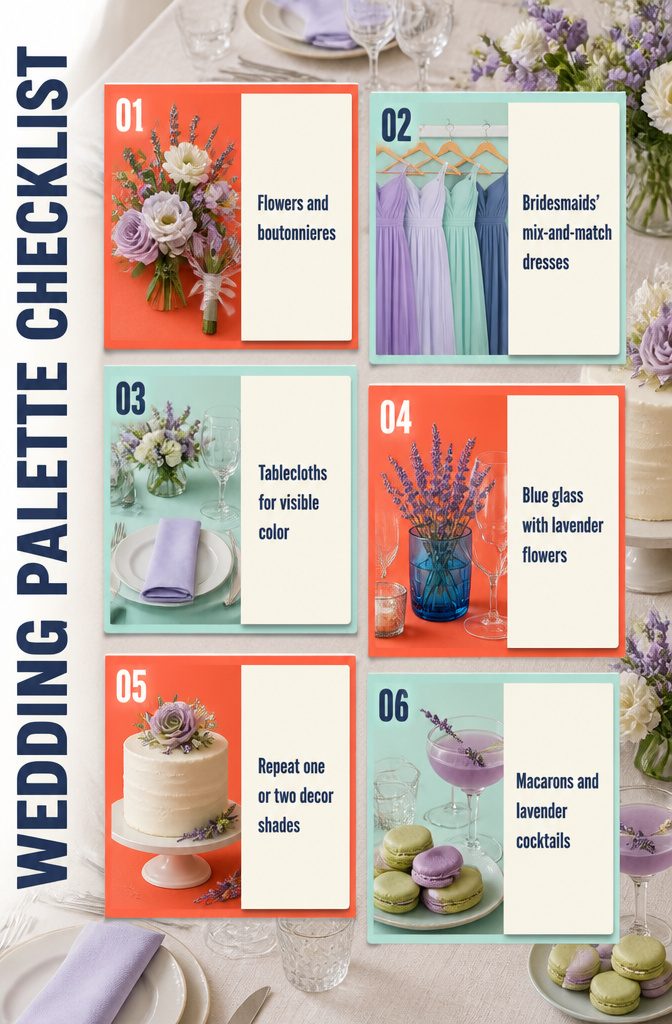
Your palette has to show up in more places than the bouquet. Check each of these:
- Flowers and boutonnieres: FiftyFlowers.com lets you shop flowers by color, so you can match stems to your palette before you order.
- Bridesmaids’ dresses: Mix-and-match dresses in different shades from one palette look planned without being identical.
- Linens: Tablecloths put your color in front of every guest.
- Glassware and tablescapes: A wild handful of lavender flowers in a blue glass vessel shows a two-color palette on one table.
- Cakes and decor: Repeat one or two palette shades here rather than all of them, so the table stays calm.
- Edible details: Pistachio or green tea macarons and lavender-infused cocktails carry a lavender-and-aqua palette into the food and drinks.
Frequently Asked Questions
How do I choose a color scheme for my wedding?
Pick the mood first, such as romantic, glamorous, or laid-back, then let the venue and date narrow the list.
Check each palette against colors the venue won’t change, like carpet, wood, or brick. There are no wrong choices, so settle on the palette that feels right to you.
What wedding colors work best for fall and winter?
Terracotta or burgundy with ivory or light sage gives a fall or winter wedding a warm look, and burnt orange with cream is the softer version.
The pale neutrals make the deep shades stand out without darkening the room. Sage green and ivory also suits winter.
What colors suit a spring or summer wedding?
Light, fresh palettes fit best.
Emerald, cream, and gold works for summer because it echoes what is blooming outside, and sage green with ivory suits spring. Terracotta and burnt orange can feel heavy on warm-weather dates.
What colors work for a beach or seaside wedding?
Navy, yellow, and a lighter blue belong at the water.
The blues echo the ocean and the yellow picks up the sand and sun. For an inland venue, navy and blush travels better, since it works in a barn, ballroom, or backyard tent.
Can I use more than 3 colors in my wedding palette?
Yes. A 6-color mix of burgundy, purple, mustard, blue, burnt orange, and green works if you plan it, with each bridesmaid wearing a different shade.
Pick 1 color to lead in the flowers and let the other 5 appear in dresses and small accents. A 3-color palette is simpler to match across flowers, stationery, and attire.
Where should my wedding colors appear besides the bouquet?
Carry them into bridesmaid dresses, linens, glassware and tablescapes, the cake, and the food and drinks.
On the cake and decor, repeat only 1 or 2 shades so the table stays calm. A lavender-and-aqua palette, for example, can show up in pistachio or green tea macarons and lavender-infused cocktails.