
Wall treatments here run from a $42 paper mache wolf head to a $1,500 screen print, and what the room is used for decides which one is yours.
Then check what limits it. Steam and grease rule out delicate paper near a stove, and humidity near a shower calls for moisture-tolerant materials.
1. Textured Wall Treatment
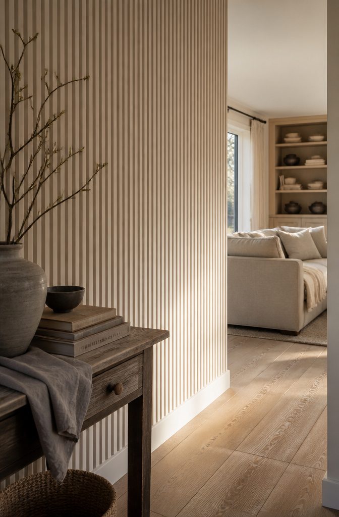
In a room of beiges, creams and soft grays, a flat wall gives the eye nothing to follow. Texture adds movement, and it gives light a surface to play across as the day changes.
A fluted accent wall made by hand with joint compound is a strong way to get there. The vertical lines pull the eye upward, so the ceiling looks higher.
The job is painstaking, and it rewards patience more than special tools. Keep it to one wall, since every ridge is made by hand.
Fluting looks best where color is quiet, since the texture then carries the wall.
In a neutral room, the ridges become the main event. Under a loud paint color, they compete with the color, and the hours you put in buy you less.
Recommended Products

【Stylish & Modern】This wall panels showcase distinctive slat design and wood texture. As a type of fluted wall panels and 3D wall panels, they instantly add a modern and chic vibe to bedroom, living room, office and any other space, effortlessly uplifting its aesthetic appeal and making your space stand out.

High Impact Visual Upgrade: includes 32 pcs of black 3D wall panels (12"x12" each), covering approx. 32 Sq.Ft; The modern fluted slat design adds dynamic depth and architectural elegance to boring flat walls, perfect for creating a stunning DIY feature wall in living rooms, bedrooms, or studios
2. Pick a Theme
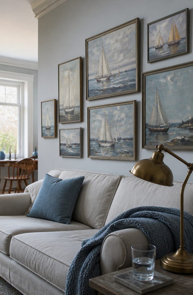
Art scattered around the house reads as leftovers, while the same pieces hung together read as a collection.
Interior designer Liz Williams took a homeowner’s inherited sailboat paintings, which had been spread through different rooms, and hung them on one living room wall.
The group made a stronger statement, looked intentional, and became the focal point of the room.
Gather pieces that share a subject before you buy anything new.
Check closets and other rooms for repeats, such as boats, botanicals, or family portraits. An inherited or existing collection counts as a theme, and it tells a story about where it came from that a mixed assortment can’t.
3. Rotate Your Artwork
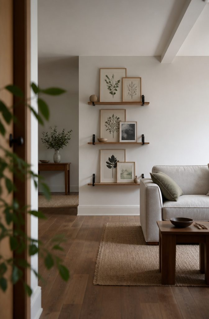
Swapping what hangs on the wall refreshes a room without replacing any larger furniture. Artist Lorien Stern changes her displayed work with her mood, and sometimes lives with pieces at home before they go to a gallery.
Her test is simple: if a piece makes you happy and you’d like to live with it, it will likely work in your space.
Rotation is easiest when nothing is locked in place. Floating shelves let you lean, restack, and replace instead of re-hanging.
The Ebern Designs River Ridge Metal Floating Shelf (set of 6) is $110 at Wayfair, reduced from $123 (11% off). Mount the set once, then change the display whenever the room feels stale.
4. Play With Scale
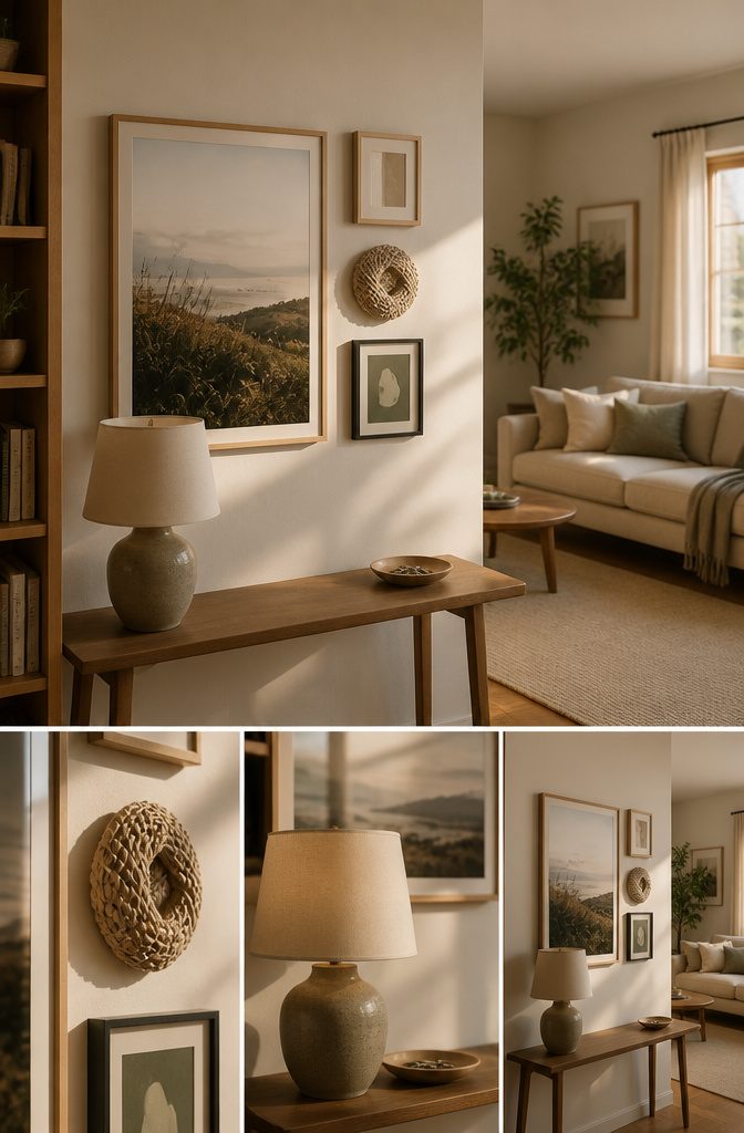
Pieces of matching size read as orderly and a little formal. Mix large and small and the wall turns playful and a bit unexpected, because your eye has to travel around instead of scanning one even row.
Vary the materials as well: a framed print beside a textured object or a dramatic light fixture adds a second layer of interest.
To keep the mix from looking random, keep the shifts in scale and material subtle, so each piece sits only a step away from its neighbor. Jumping from a huge canvas to a tiny postcard tends to look accidental.
Budget doesn’t limit this. Posters and family photographs work as well as one-of-a-kind artwork.
5. Pattern With Bright White
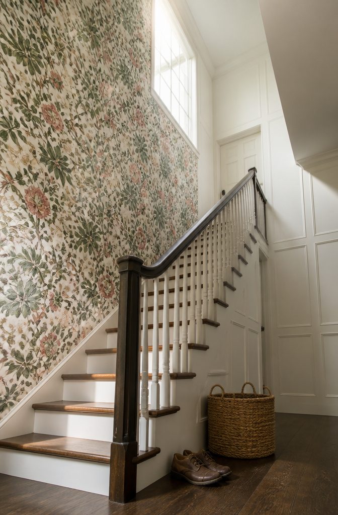
A busy wallpaper needs quiet neighbors. In a double height stair hall, designer Christine Markatos paired a loud patterned wallcovering with subdued white paneled walls.
The pattern supplies the drama, and the white keeps the space from feeling cluttered. A hall like that makes people slow down and look up instead of just passing through.
At home, put the pattern on one wall or zone and keep everything around it white.
Price splits the choice. Sanderson’s Wildflower Meadow Wallpaper costs $398 at Lulu and Georgia, and Anthropologie’s Mitchell Black Flourish Floral Wallpaper costs $118, a $280 difference.
On a weekend budget, the $118 floral is the easier yes. Pay for the Sanderson only if that exact print is the one you keep coming back to.
6. Work Around the Wall You Have
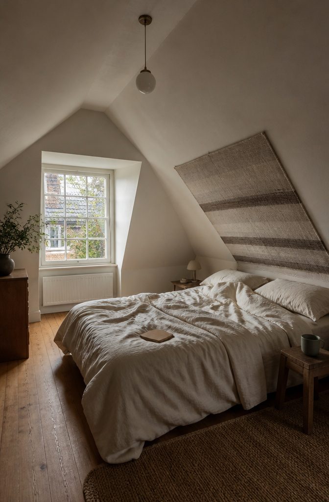
A sloped attic ceiling over a bed is a good reason to skip glass and frames. Designer Heather Peterson hung a heavy paper wall hanging there instead, because framed pieces above sleeping bodies made her nervous.
Just because your walls might present a challenge doesn’t mean you have to keep ’em plain.
Over a bed, choose a fabric or woven wall hanging over a frame. It adds life to a room that was already quiet.
In a living room with one wall of windows and another of cabinetry, the leftover wall does all the work.
Jessica Nicastro used one bold, colorful piece there as the focal point, which added depth and energy without crowding the room.
7. Natural Materials
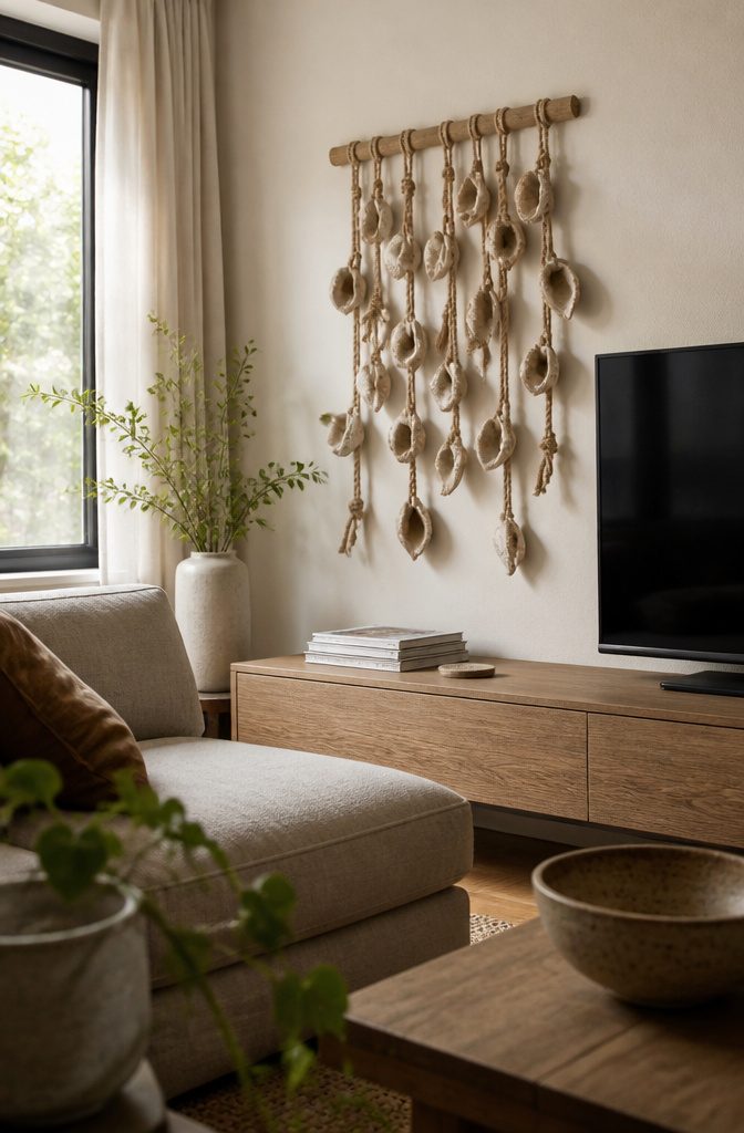
Stoneware shells, hemp rope, and a white oak bar give the MQuan Studio hanging texture and real depth.
Designer Andrea Goldman chose it for a living room with only one wall free for art, where it softens the TV and the more modern pieces around it.
A single open wall suits a dimensional piece like this, because it fills the space without a gallery of frames.
On a tighter budget, the Rava macramé wall hanging is the pick at $300, down from $500 (40% off) on Etsy.
The West Elm Geode Fiber Natural Dimensional Wall Art costs $500. Choose it only if you want the geode look in fiber more than macramé knots, since the Rava piece gives you the same handmade texture for $200 less.
8. Marble All the Way Up
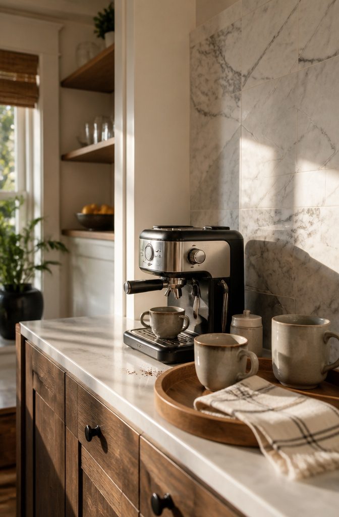
A coffee bar is a small wall, and that is why remnant marble wall pieces suit it.
Remnants are the leftover cuts from larger stone jobs, and a bar-sized stretch of wall needs only a few of them. You get the look of a full stone wall without paying for a full slab you would never use.
Designer Drew Michael Scott used this approach in a kitchen coffee bar because he wanted the corner to feel functional but still special.
Marble behind the mugs and machine marks out a spot you use every morning as something more than a stretch of counter.
Call a local stone yard and ask what remnants they have on hand before you settle on a layout.
9. Art That Shifts the Mood
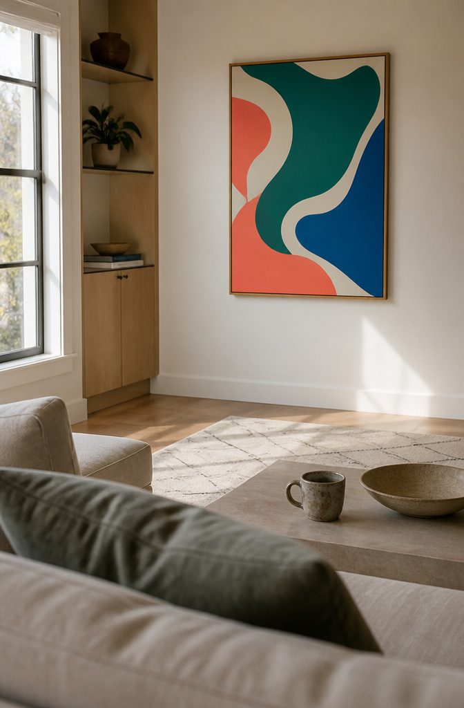
Choose the wall with the least competing for attention and let the art be the loudest thing on it.
When one wall is all windows and another is cabinetry, a single bright piece on the remaining wall becomes the focal point and adds depth and energy.
Keep the sofa and rugs calm so the room stays comfortable, and put the color in the frame.
Price doesn’t decide whether this works.
Mary O’Malley’s Emerald Eden Print is $43 at Artfully Walls. Deborah Roberts’s ‘Taking a Stand’ Screen Print is $1,500 on Artsy.
A $43 print can still carry the room if its color is strong and it hangs where your eye lands first. Spend the $1,500 only if you want that particular piece.
10. Highlight Your Obsessions
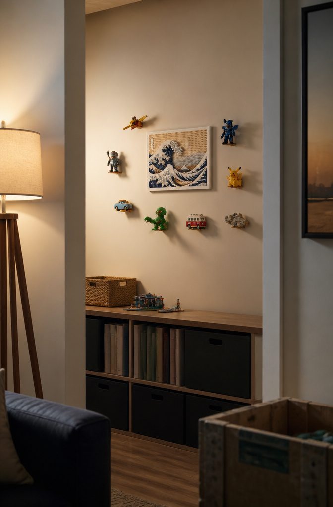
Collectibles can go on the wall instead of a shelf, as long as the hardware disappears.
In one bookshelf nook turned toy wall, a professional art installer fixed each mount behind its toy, so every piece reads as if it floats.
The hidden mounts are what keep a toy display from looking like a shelf of clutter. Visible brackets, wire, or tape pull the eye off the objects and make the group look like overflow.
If you want a starting piece, the LEGO Art Hokusai The Great Wave costs $100 at Amazon.
You build it yourself, and the finished wave hangs like a piece of art rather than a toy. Hang it alone first, then add collectibles around it.
11. Cover Your Walls in Cork
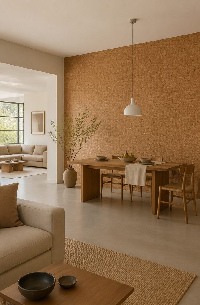
In an open floor plan, cork on the dining area wall marks where one zone ends and the next begins, with no partition needed.
Its natural grain adds warmth and organic movement, so the dining spot gets its own personality while staying part of the larger room.
Grasscloth and other natural wall coverings are the safer choice. Cork is funkier and less expected, which makes it the better pick if you want the dining area to stand out.
It also shows no visible joins, so the wall looks like one continuous surface. Keep it to the dining wall and leave the living area walls plain, so the contrast does the separating.
12. Add Dimension With Paper
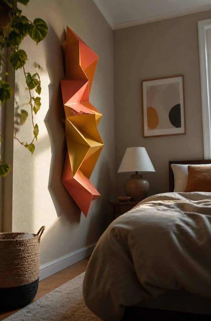
A flat print stays inside its frame. A paper sculpture sticks out from the wall, so it throws its own shadow and looks different from each side of the room as the light shifts.
In a bedroom by Nicole Forina Home, paper bug sculptures sit on top of the wallpaper as three-dimensional pops of color. The geometric folds and large scale keep them from reading as only a kids’ room joke.
Corners are the best place to try this. A bare corner or a narrow stretch of wall that nothing else uses suits one sculpture better than a framed print, which can look lost there.
The A Zoo In My Wall Paper Mache Wolf Head on Etsy is a low-cost way to start at $42.
13. A Cornucopia of Colors
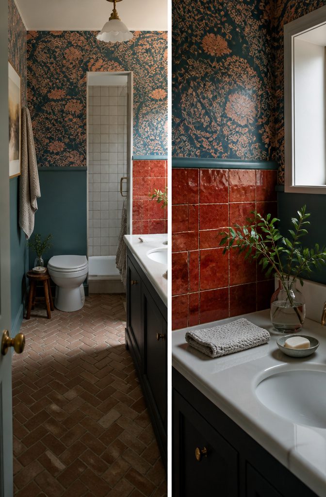
A small bathroom can carry three wall treatments at once if each does a different job. In a bathroom by Northwest Home, Morris & Co. wallpaper sits beside deep turquoise paint and bold red zellige tile.
The wallpaper supplies pattern, the paint gives the eye a flat color to rest on, and the tile adds texture and depth. Together they keep your eye moving around a tight room.
To copy the look, use paint as the calm layer between the pattern and the tile. Strawberry Thief wallpaper costs $382 at Lulu and Georgia and $385 at Rejuvenation.
Hex Zellige Rouge Hex Tile is $192 at Zia Tile. Keep the red tile to one wall or a small panel, and let paint cover the rest.
Let Your Quirks Show
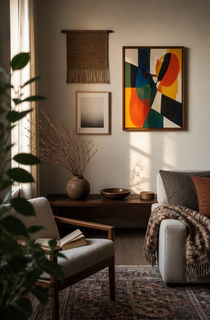
Art does not have to match the room. A piece chosen to echo the throw pillows tends to fade into the background, while one you picked because it made you stop gives the room something to react to.
Let at least one piece break the room’s palette, and the space reads as collected over time instead of ordered from a catalog.
Texture, pattern, color, and dimension do the rest.
A rough surface beside a smooth one, a bold print against a plain wall, or a frame that sits proud of the wall each add a layer the eye has to travel through.
Rooms with those layers look intentional and lived in. Rooms without them look like a showroom, however good the sofa is.
Match the Wall to the Room
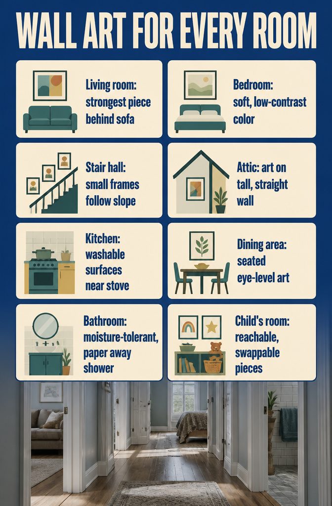
Choose the treatment by what the room is used for, then by what limits it.
- Living room: The wall behind the sofa is the one everyone faces, so give it the strongest piece.
- Bedroom: Use soft, low-contrast color behind the bed. It is the last thing you see before sleep.
- Stair hall: Walls here are passed, not sat in front of. A run of small frames that follows the slope beats one big piece.
- Attic: Slanted ceilings cut the usable wall. Hang art on the tall, straight section and leave the slope plain.
- Kitchen: Steam and grease rule out delicate paper near the stove. Pick washable surfaces.
- Dining area: Diners sit, so hang art at seated eye level.
- Bathroom: Humidity favors moisture-tolerant materials. Keep paper away from the shower.
- Child’s room: Hang swappable pieces low enough for a child to reach.